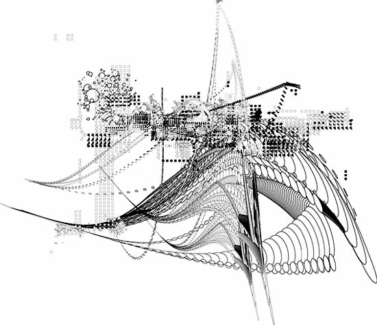
Stephen O'Malley, a designer and musician in
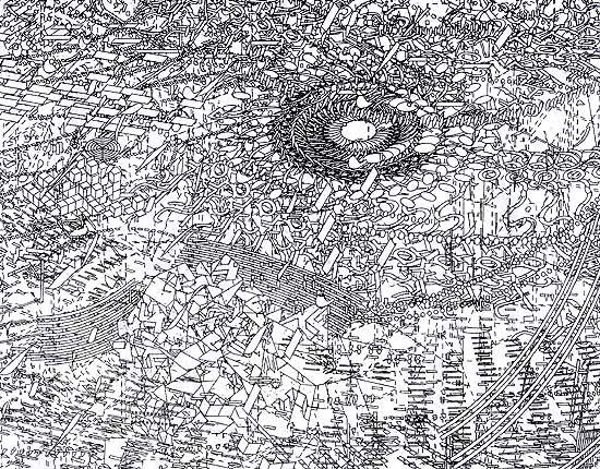
experimental outfits such as Khanate and Sunn O))), recently posted the above piece by Seldon Hunt, an Australian artist and graphic designer (a few more images are here--click on the link to "words" and scroll down; still more pics are in the news archives). Hunt has created record sleeves for the German label Drone records, among other projects. I'm pretty sure this work, which has a nice sci-fi lyricism to it, is done in Adobe Illustrator; it's definitely vector-based (drawn by means of defined curves) rather than pixel-based. This piece in particular is reminiscent of the work of New York artist Marsha Cottrell, who recently showed at Henry Urbach Architecture. Cottrell's work is much denser, limning an endless futuristic space in the vein of Rem Koolhaas's "delirious" urban spectacles. (The image below, completely packed with linear bizness, is a detail of a much larger piece.) While Cottrell's work is oddly controlled for something so "out there"; Hunt's evokes the spirit of Abstract Expressionism (or at least Rauschenberg) in its energy and formal variation. It may ultimately have more to do with the eye-grabbing immediacy of album graphics than Cottrell's ultra-refined, analytical architecture critique, but one can see an interesting dialogue between the two bodies of work. (Thanks to Brian Turner for the O'Malley link(s).)
I don't dispute your speculation but these would be tough to do in Illustrator.
With Hunt I'm speculating; I've written about Cottrell a few times before and know she uses Illustrator, for sure in a way that's difficult, and in conjunction with other programs. All her work from a few years ago was based on stretched and chopped punctuation marks from a word processing font file (dashes, brackets, semicolons, etc); she says the new pieces, including the one above, are still a later, mutated generation of those same marks, although I can no longer see it and don't believe it's much of an issue in the new work.
Some artists are reluctant to discuss the programs they use because they don't want to (a) advertise a product or (b) have their work reduced in people's minds to "things the programs do." The ones I'm thinking of just say "I use a combination of programs" and/or try to push existing programs beyond their intended parameters. Then there's the group that says you have to write your own programs, but that's another long post. As you know, my way around the product-identification problem is to use an obsolete but utterly familiar program (MSPaintbrush) and screw around with the printed output through collaging, overprinting, etc.
Same sort of "tools" discussion happens in the world of electronic music. From my perspective, "tools" is an interesting sidebar for practitioners and geeks. (I'm mostly the latter.) The art is the thing.
Would that the art world was so enlightened. The debates that occurred over electronic music 40 years ago are just hitting this medieval cloister. We're talking about a field that took 100 years to accept photography! Thus, when an artist exhibits a piece such as the ones above, the monk puts down his crow quill pen and lump of vine charcoal and the first thing he wants to know is "Duh, what program did you use?" When the artist says "Illustrator," the monk assumes anyone who bothers to learn the program can achieve exactly the same results, and in any case it's cheating, and gets back to work on that gothic scrollwork that was handed down by the friars from six centuries ago.
And in all fairness to the monks, when some digital artists try to eke a career out of one effect filter in Photoshop (counting on a certain level of tech-ignorance and mystification among their brethren) they really deserve to be called out. At some point the question "how did you do it?" inextricably overlaps with "why did you do it?" (I wrote this a while back and kinda sorta forgot to post it. Your discussion about tools--or what may for artists eventually become tools--on Jim's page made me think of it.)
Pixels are one of the basic building blocks of computer graphics. It's amazing what people can do working at that fundamental level (including things you've posted or linked here).
I've been wondering if someone will create art using the fundamental building blocks of video/image compression -- such as DCT coefficients.
Perhaps one could create works reminiscent of Vasarely with great economy of expression. On the other hand, thinking and visualzing in the coefficient domain is not very easy, and I'm not aware of any "coefficient editors".
On a tangential point, the folks working on new forms of video moving picture compression are wondering what to do about film grain, especially with high definition video sputtering to life. Is film grain a form a degradation which should be removed for the sake of compression efficiency and image quality, or is grain an integral part of the image that must be faithfully reproduced? Ultimately, I believe it is an artistic rather than an engineering question. And the answer is "yes".
I like that "coefficient grid": it's definitely a "found Vasarely" and more interesting in some ways because it has a specific meaning in a non-art context. I'm seriously deficient on the math/physics of coefficents; I know it's something like drag affecting a moving body or vehicle. I have no idea how an artist could use the vagaries of compression technology proactively. I've written about artists who make or identify geometric patterns out of the TV's rasterizing function (e.g., Carsten Nicolai AKA noto, also LoVid and Cory Arcangel), but that doesn't get into compression issues at all.
Tim Griffin curated a show I reviewed called "Compression", but he didn't go anywhere with compression per se. In his catalog essay, he raises the issue of compression being a one-way phenomenon (once information is removed it can't be replaced), which would seem to me to have interesting philosophical issues (e.g., doesn't that make it entropic?). It might be the basis for an interesting show--a metaphor for certain artistic and social practices--but Griffin's exhibit was all over the (bit)map, never dealing with the issue outside of that one mention. As for the issue of preserving grain, yes, you would want to do that to the extent possible (I hate to think of someone "sharpening" 28 Days Later). But when you make a jump from one medium to another (or even an original to a copy) extraneous issues always creep in that subtly affect content or interpretation. There's nothing really wrong with that. Some things make the jump to other media better than others--for reasons I would find hard to articulate, Robert Altman's Popeye kind of blew in the theatre but was great on video.
some sketches based (roughly) on DCT basis functions
Very nice. They make me think of African textiles and piano keys. I like 3166 especially (why is it so much larger on your page?). The math is still eluding me, though. What happens when a photo image is processed through these functions? Are these patterns related to something that's happening on the micro level? Or are they just visual manifestations of the formula, like the paisleys you get in Mandelbrot sets?
I've been playing with image attributes to control the display size. I draw the image as compactly as possible (MS paint), and then use html to "zoom". Inside the img tag there are fields for height and width. I've been using whole number multipliers to get from the native dimensions to the display dimensions so that (on most displays) the drastic transisition between black and white is maintained.
There are a few different ways to explain how DCT's relate to images. Let me know if this approach works for you ...
A good starting point for understanding image de-composition via DCT is the graphic equalizer used in audio. The entire audio spectrum may be divided into about 10 bands which are each one octave in width. Or into 30 bands which are each 1/3 octave in width. Or even more bands which are finer.
The job for a filter designer is to create a matched set of filters -- the sum of the outputs of the filters exactly matches the input.
With fine bands, the output of any one filter doesn't make much sense. You're only hearing a very small portion of the sound. But if the filter designer did a good job, the sum of all these funny sounding signals is a perfect reconstruction of the original sound.
Modern audio encoding (since the early 90's) is based on this idea. Matched filters break apart the sound perfectly, and the sum of all these bands is a perfect reconstruction of the original. By why go to all this effort? While in the "frequency domain", it's possible to perform tricks that take advantage of the limitations of the human ear.
For example, the human ear has a phenomenon called masking. Quiet sounds which are close in frequency to a loud sound are inaudible. (Has to do with the way the basilar membrane works inside the cochlea.) By using the bank-o-filters concept, it's possible to eliminate the stuff that can't be heard -- saving bits.
Image compression (JPEG, etc., etc.) is based on the same bank-o-filters concept. Audio is a one dimensional phenomenon (amplitude vs. time) but images are two dimensional (amplitude vs. x and y). So the filters have to be two-dimensional.
Two-dimensional spatial frequency is a difficult concept to get your head around. The diagram below may help. The block on the left is constant value (low frequency). The block on the right toggles back and forth between black and white on alternate pixels (high frequency).
native

zoom x3
But notice that in the vertical direction, each block has constant values. Thus the diagram represents a set of blocks with low vertical frequency and varying horizontal frequency.
Okay, so if that's what spatial frequency looks like, how does that relate to a real image? Images have regions of smooth transitions (low frequency), regions of fine detail (high frequency), and all sorts of mixtures thereof. The DCT is like the bank-o-filters in the audio equalizer. The DCT separates out these smooth transitions and fine detail with a set of band pass filters. The low and high frequency information can be processed separately based on knowledge of what the eye can and cannot see.
For an 8x8 block of pixels, the DCT produces an 8x8 block of coefficients. These coefficients correspond to how much energy the image has in each of the "frequency bands". The DCT basis functions are what the "frequency bands" look like.
With an image with very smooth tones (e.g. blue sky) the energy will be concentrated in the constant value (aka DC) coefficient. The amplitude of this coefficient will correspond to the brightness of the sky. The will also be some energy in the low frequency coefficients that corresponds to the variations is brightness of the sky. There will be more energy in the high frequency coefficients that may correspond to film grain or video camera noise, or perhaps a cloud in the sky.
If I want to save bits, I can throw away everything except the DC coefficient -- from 64 pixel values for an 8x8 block down to 1 coefficient. The downside is the picture won't look as good. It will have sort of a "blocky posterization" effect. At a more moderate level of compression, I may use a handful of the 64 coefficients to get a reasonable image and still have a huge amount of compression.
So, to sum up. The DCT is like a bank of filters, and breaks the image into low frequency (overall average brightness), high frequency (fine detail) and everything in-between. For an 8x8 block of pixels, I start with 64 defined pixel positions and 64 corresponding pixel amplitudes. When I use the DCT to convert from the pixel domain to the frequency domain, I get 64 coefficients which represent the amplitude of energy in 64 freqeuncy bands (defined by the basis functions). The contribution of any one coefficient is a funny looking 8x8 block of pixels that doesn't make very much sense by itself -- solid color, or horizontal strips, or vertical stripes, or checkerboard. But the sum of all 64 funny-looking 8x8 blocks (basis functions), each weighted by the energy in that frequency band (coefficient) will perfectly reconstruct an 8x8 block of pixels in the the original image. This transform is performed because it's easier to fool the eye if you throw away information in the spatial frequency domain.
Disclaimer: This is a conceptual description of using frequency decomposition to compress an image. I'm using a simplified octave-band decomposition rather than a proper transform (e.g. DCT). And I certainly haven't done the math to back up this particular approach. I used Lview to sub-sample, up-sample, add and subtract.
The dithering is an unintended artifact of the image editor.
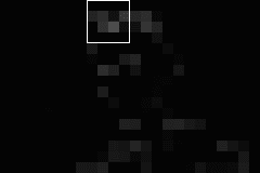
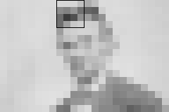
The original image is broken into 8 by 8 blocks. The size of an 8 x 8 block (of fat bits) is outlined in black. The amplitudes of the lowest frequency coefficients are shown in image1.
image1, lowest frequency

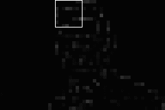
The next set of coefficients give the next level of detail. While the image above required one coefficient per 8 x 8 block, this image requires three coefficients per 8 x 8 block.
The three basis functions for these coefficients look like: a) 1 vertical stripe, b) 1 horizontal stripe, c) 4 square checkerboard. A weighted sum of these three basis functions can generate any arbitrary 2x2 pattern required at this spatial frequency.

image2, second frequency

The next set of coefficients are for higher frequency basis functions, and give even more detail. In this case five coefficients (and five basis functions) are required.
These basis functions look like: a) 2 vertical stripes, b) 2 horizontal stripes, c) 16 square checkerboard, and d,e) a pair of asymmetrical 8 rectangle checkerboards. A weighted sum of these 5 basis functions can generate any 4 x 4 pattern needed at this frequency.
image3, third frequency
The next set of coefficients complete the image.
Notice that much of the screen is black, or near black in images 2, 3, 4. This represents information that can be discarded (to save bits) with minimal impact to the final image. For those blocks that have any appreciable energy, up to 7 coefficients may be required. Again, these coefficients are weights for basis functions that look like stripes and checkerboards.
image4, fourth set of frequencies
sum2 = image1 + image2

sum3 = image1 + image2 + image3
sum4 = image1 + image2 + image3 + image4

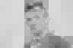
Actually, I threw away information along the way creating image1 through 4, so the image reconstucts like this. The dithering (small speckles) is an unintended artifact of the image editor.
If squint, you can probably recognize the fellow above. The distortions in the image below (loss of detail and addition of noise/errors) make identification much more challenging.
reconstruction after lossy processing of coefficients
i recall a computer art picture of alfred e newman's mug from mid 70's with maybe 12 pixels. u remember ?
What, me worry? Thanks, Mark, this is very helpful. I want to read it through a few more times and think about it, but one artist who comes immediately to mind who's been breaking down images into pixels for years is Chuck Close. His process is completely intuitive, though, it's not about trying to achieve the repeatable certainty that the kind of translation you're describing does. It's analogue. Although I'm betting that on some level he's thinking about some of the same issues: what's redundant or invisible within the image that can be discarded or generalized (actually all painters do this to some extent). Because he's only concerned with repeating the image once (and doesn't care about bandwidth), he doesn't need to come up with a strict formula. Tim Griffin mentioned the term "lossy" in his "Compression" exhibit essay, but didn't connect it to any specific artist's practice.
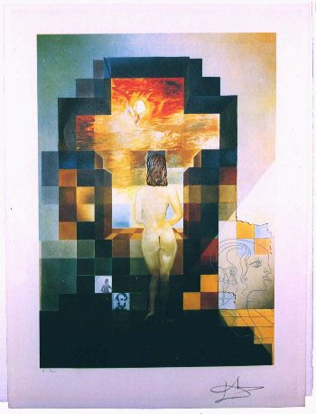
Perhaps the Newman was based on Lincoln in Dalivision (1977)? Or vice versa?
google searched aen images and mixed in w/ the gwb satires i found this. you may have to back up across the room to see him. its not the one i was thinking of though.
Chuck Close's grid paintings look image processed, but he claims to eschew technology. (What about that Poloroid camera, dude?)
Some of the grids have more detail, especially grids near edges/transitions such as lips, eyes, noses. Other grids are lossy, and lose details that are less relevant in defining a face. In fact, one could develop a "Close Transform" to automatically generate similar images.
(Added a small diagram above to show how coefficient-weighted basis functions are summed to generate arbitrary patterns).
are you thinking of hockney ?
I remember the A. E. Newman portrait, I think it was a poster, but not one of those that came with the super specials (sick)
|
Stephen O'Malley, a designer and musician in experimental outfits such as Khanate and Sunn O))), recently posted the above piece by Seldon Hunt, an Australian artist and graphic designer (a few more images are here--click on the link to "words" and scroll down; still more pics are in the news archives). Hunt has created record sleeves for the German label Drone records, among other projects. I'm pretty sure this work, which has a nice sci-fi lyricism to it, is done in Adobe Illustrator; it's definitely vector-based (drawn by means of defined curves) rather than pixel-based. This piece in particular is reminiscent of the work of New York artist Marsha Cottrell, who recently showed at Henry Urbach Architecture. Cottrell's work is much denser, limning an endless futuristic space in the vein of Rem Koolhaas's "delirious" urban spectacles. (The image below, completely packed with linear bizness, is a detail of a much larger piece.) While Cottrell's work is oddly controlled for something so "out there"; Hunt's evokes the spirit of Abstract Expressionism (or at least Rauschenberg) in its energy and formal variation. It may ultimately have more to do with the eye-grabbing immediacy of album graphics than Cottrell's ultra-refined, analytical architecture critique, but one can see an interesting dialogue between the two bodies of work. (Thanks to Brian Turner for the O'Malley link(s).)
- tom moody 6-26-2003 4:58 am
I don't dispute your speculation but these would be tough to do in Illustrator.
- steve 6-26-2003 1:24 pm
With Hunt I'm speculating; I've written about Cottrell a few times before and know she uses Illustrator, for sure in a way that's difficult, and in conjunction with other programs. All her work from a few years ago was based on stretched and chopped punctuation marks from a word processing font file (dashes, brackets, semicolons, etc); she says the new pieces, including the one above, are still a later, mutated generation of those same marks, although I can no longer see it and don't believe it's much of an issue in the new work.
Some artists are reluctant to discuss the programs they use because they don't want to (a) advertise a product or (b) have their work reduced in people's minds to "things the programs do." The ones I'm thinking of just say "I use a combination of programs" and/or try to push existing programs beyond their intended parameters. Then there's the group that says you have to write your own programs, but that's another long post. As you know, my way around the product-identification problem is to use an obsolete but utterly familiar program (MSPaintbrush) and screw around with the printed output through collaging, overprinting, etc.
- tom moody 6-26-2003 6:47 pm
Same sort of "tools" discussion happens in the world of electronic music. From my perspective, "tools" is an interesting sidebar for practitioners and geeks. (I'm mostly the latter.) The art is the thing.
- mark 6-26-2003 11:03 pm
Would that the art world was so enlightened. The debates that occurred over electronic music 40 years ago are just hitting this medieval cloister. We're talking about a field that took 100 years to accept photography! Thus, when an artist exhibits a piece such as the ones above, the monk puts down his crow quill pen and lump of vine charcoal and the first thing he wants to know is "Duh, what program did you use?" When the artist says "Illustrator," the monk assumes anyone who bothers to learn the program can achieve exactly the same results, and in any case it's cheating, and gets back to work on that gothic scrollwork that was handed down by the friars from six centuries ago.
And in all fairness to the monks, when some digital artists try to eke a career out of one effect filter in Photoshop (counting on a certain level of tech-ignorance and mystification among their brethren) they really deserve to be called out. At some point the question "how did you do it?" inextricably overlaps with "why did you do it?"
(I wrote this a while back and kinda sorta forgot to post it. Your discussion about tools--or what may for artists eventually become tools--on Jim's page made me think of it.)
- tom moody 7-19-2003 11:02 pm
Pixels are one of the basic building blocks of computer graphics. It's amazing what people can do working at that fundamental level (including things you've posted or linked here).
I've been wondering if someone will create art using the fundamental building blocks of video/image compression -- such as DCT coefficients.
Perhaps one could create works reminiscent of Vasarely with great economy of expression. On the other hand, thinking and visualzing in the coefficient domain is not very easy, and I'm not aware of any "coefficient editors".
On a tangential point, the folks working on new forms of
videomoving picture compression are wondering what to do about film grain, especially with high definition video sputtering to life. Is film grain a form a degradation which should be removed for the sake of compression efficiency and image quality, or is grain an integral part of the image that must be faithfully reproduced? Ultimately, I believe it is an artistic rather than an engineering question. And the answer is "yes".- mark 7-24-2003 8:38 am
I like that "coefficient grid": it's definitely a "found Vasarely" and more interesting in some ways because it has a specific meaning in a non-art context. I'm seriously deficient on the math/physics of coefficents; I know it's something like drag affecting a moving body or vehicle. I have no idea how an artist could use the vagaries of compression technology proactively. I've written about artists who make or identify geometric patterns out of the TV's rasterizing function (e.g., Carsten Nicolai AKA noto, also LoVid and Cory Arcangel), but that doesn't get into compression issues at all. Tim Griffin curated a show I reviewed called "Compression", but he didn't go anywhere with compression per se. In his catalog essay, he raises the issue of compression being a one-way phenomenon (once information is removed it can't be replaced), which would seem to me to have interesting philosophical issues (e.g., doesn't that make it entropic?). It might be the basis for an interesting show--a metaphor for certain artistic and social practices--but Griffin's exhibit was all over the (bit)map, never dealing with the issue outside of that one mention.
As for the issue of preserving grain, yes, you would want to do that to the extent possible (I hate to think of someone "sharpening" 28 Days Later). But when you make a jump from one medium to another (or even an original to a copy) extraneous issues always creep in that subtly affect content or interpretation. There's nothing really wrong with that. Some things make the jump to other media better than others--for reasons I would find hard to articulate, Robert Altman's Popeye kind of blew in the theatre but was great on video.
- tom moody 7-28-2003 8:51 pm
some sketches based (roughly) on DCT basis functions
- mark 8-01-2003 4:20 am
Very nice. They make me think of African textiles and piano keys. I like 3166 especially (why is it so much larger on your page?). The math is still eluding me, though. What happens when a photo image is processed through these functions? Are these patterns related to something that's happening on the micro level? Or are they just visual manifestations of the formula, like the paisleys you get in Mandelbrot sets?
- tom moody 8-01-2003 6:22 am
I've been playing with image attributes to control the display size. I draw the image as compactly as possible (MS paint), and then use html to "zoom". Inside the img tag there are fields for height and width. I've been using whole number multipliers to get from the native dimensions to the display dimensions so that (on most displays) the drastic transisition between black and white is maintained.
There are a few different ways to explain how DCT's relate to images. Let me know if this approach works for you ...
A good starting point for understanding image de-composition via DCT is the graphic equalizer used in audio. The entire audio spectrum may be divided into about 10 bands which are each one octave in width. Or into 30 bands which are each 1/3 octave in width. Or even more bands which are finer.
The job for a filter designer is to create a matched set of filters -- the sum of the outputs of the filters exactly matches the input.
With fine bands, the output of any one filter doesn't make much sense. You're only hearing a very small portion of the sound. But if the filter designer did a good job, the sum of all these funny sounding signals is a perfect reconstruction of the original sound.
Modern audio encoding (since the early 90's) is based on this idea. Matched filters break apart the sound perfectly, and the sum of all these bands is a perfect reconstruction of the original. By why go to all this effort? While in the "frequency domain", it's possible to perform tricks that take advantage of the limitations of the human ear.
For example, the human ear has a phenomenon called masking. Quiet sounds which are close in frequency to a loud sound are inaudible. (Has to do with the way the basilar membrane works inside the cochlea.) By using the bank-o-filters concept, it's possible to eliminate the stuff that can't be heard -- saving bits.
Image compression (JPEG, etc., etc.) is based on the same bank-o-filters concept. Audio is a one dimensional phenomenon (amplitude vs. time) but images are two dimensional (amplitude vs. x and y). So the filters have to be two-dimensional.
Two-dimensional spatial frequency is a difficult concept to get your head around. The diagram below may help. The block on the left is constant value (low frequency). The block on the right toggles back and forth between black and white on alternate pixels (high frequency).
zoom x3
But notice that in the vertical direction, each block has constant values. Thus the diagram represents a set of blocks with low vertical frequency and varying horizontal frequency.
Okay, so if that's what spatial frequency looks like, how does that relate to a real image? Images have regions of smooth transitions (low frequency), regions of fine detail (high frequency), and all sorts of mixtures thereof. The DCT is like the bank-o-filters in the audio equalizer. The DCT separates out these smooth transitions and fine detail with a set of band pass filters. The low and high frequency information can be processed separately based on knowledge of what the eye can and cannot see.
For an 8x8 block of pixels, the DCT produces an 8x8 block of coefficients. These coefficients correspond to how much energy the image has in each of the "frequency bands". The DCT basis functions are what the "frequency bands" look like.
With an image with very smooth tones (e.g. blue sky) the energy will be concentrated in the constant value (aka DC) coefficient. The amplitude of this coefficient will correspond to the brightness of the sky. The will also be some energy in the low frequency coefficients that corresponds to the variations is brightness of the sky. There will be more energy in the high frequency coefficients that may correspond to film grain or video camera noise, or perhaps a cloud in the sky.
If I want to save bits, I can throw away everything except the DC coefficient -- from 64 pixel values for an 8x8 block down to 1 coefficient. The downside is the picture won't look as good. It will have sort of a "blocky posterization" effect. At a more moderate level of compression, I may use a handful of the 64 coefficients to get a reasonable image and still have a huge amount of compression.
So, to sum up. The DCT is like a bank of filters, and breaks the image into low frequency (overall average brightness), high frequency (fine detail) and everything in-between. For an 8x8 block of pixels, I start with 64 defined pixel positions and 64 corresponding pixel amplitudes. When I use the DCT to convert from the pixel domain to the frequency domain, I get 64 coefficients which represent the amplitude of energy in 64 freqeuncy bands (defined by the basis functions). The contribution of any one coefficient is a funny looking 8x8 block of pixels that doesn't make very much sense by itself -- solid color, or horizontal strips, or vertical stripes, or checkerboard. But the sum of all 64 funny-looking 8x8 blocks (basis functions), each weighted by the energy in that frequency band (coefficient) will perfectly reconstruct an 8x8 block of pixels in the the original image. This transform is performed because it's easier to fool the eye if you throw away information in the spatial frequency domain.
- mark 8-01-2003 10:02 am
The original image is broken into 8 by 8 blocks. The size of an 8 x 8 block (of fat bits) is outlined in black. The amplitudes of the lowest frequency coefficients are shown in image1.
The next set of coefficients give the next level of detail. While the image above required one coefficient per 8 x 8 block, this image requires three coefficients per 8 x 8 block.
The three basis functions for these coefficients look like: a) 1 vertical stripe, b) 1 horizontal stripe, c) 4 square checkerboard. A weighted sum of these three basis functions can generate any arbitrary 2x2 pattern required at this spatial frequency.
The next set of coefficients are for higher frequency basis functions, and give even more detail. In this case five coefficients (and five basis functions) are required.
These basis functions look like: a) 2 vertical stripes, b) 2 horizontal stripes, c) 16 square checkerboard, and d,e) a pair of asymmetrical 8 rectangle checkerboards. A weighted sum of these 5 basis functions can generate any 4 x 4 pattern needed at this frequency.
The next set of coefficients complete the image.
Notice that much of the screen is black, or near black in images 2, 3, 4. This represents information that can be discarded (to save bits) with minimal impact to the final image. For those blocks that have any appreciable energy, up to 7 coefficients may be required. Again, these coefficients are weights for basis functions that look like stripes and checkerboards.
sum2 = image1 + image2
sum3 = image1 + image2 + image3
sum4 = image1 + image2 + image3 + image4
Actually, I threw away information along the way creating image1 through 4, so the image reconstucts like this. The dithering (small speckles) is an unintended artifact of the image editor.
If squint, you can probably recognize the fellow above. The distortions in the image below (loss of detail and addition of noise/errors) make identification much more challenging.
- mark 8-01-2003 2:29 pm
i recall a computer art picture of alfred e newman's mug from mid 70's with maybe 12 pixels. u remember ?
- bill 8-01-2003 9:02 pm
What, me worry? Thanks, Mark, this is very helpful. I want to read it through a few more times and think about it, but one artist who comes immediately to mind who's been breaking down images into pixels for years is Chuck Close. His process is completely intuitive, though, it's not about trying to achieve the repeatable certainty that the kind of translation you're describing does. It's analogue. Although I'm betting that on some level he's thinking about some of the same issues: what's redundant or invisible within the image that can be discarded or generalized (actually all painters do this to some extent). Because he's only concerned with repeating the image once (and doesn't care about bandwidth), he doesn't need to come up with a strict formula. Tim Griffin mentioned the term "lossy" in his "Compression" exhibit essay, but didn't connect it to any specific artist's practice.
- tom moody 8-01-2003 9:30 pm
Perhaps the Newman was based on Lincoln in Dalivision (1977)? Or vice versa?
- mark 8-02-2003 2:03 am
google searched aen images and mixed in w/ the gwb satires i found this. you may have to back up across the room to see him. its not the one i was thinking of though.
- bill 8-02-2003 2:28 am
Chuck Close's grid paintings look image processed, but he claims to eschew technology. (What about that Poloroid camera, dude?)
Some of the grids have more detail, especially grids near edges/transitions such as lips, eyes, noses. Other grids are lossy, and lose details that are less relevant in defining a face. In fact, one could develop a "Close Transform" to automatically generate similar images.
(Added a small diagram above to show how coefficient-weighted basis functions are summed to generate arbitrary patterns).
- mark 8-02-2003 4:15 am
are you thinking of hockney ?
- bill 8-02-2003 7:11 pm
I remember the A. E. Newman portrait, I think it was a poster, but not one of those that came with the super specials (sick)
- steve 8-03-2003 7:37 pm