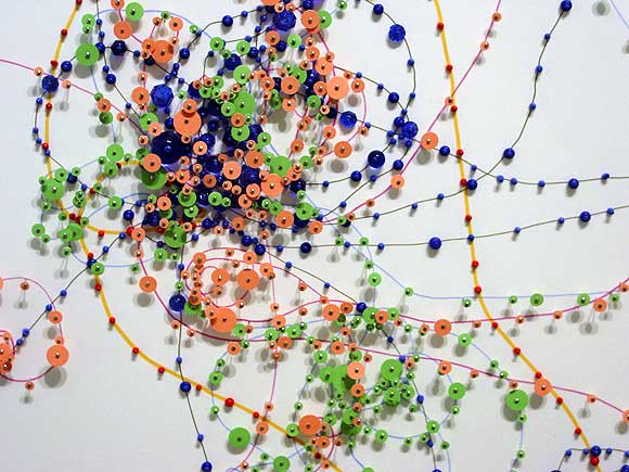
Janice Caswell at Schroeder Romero
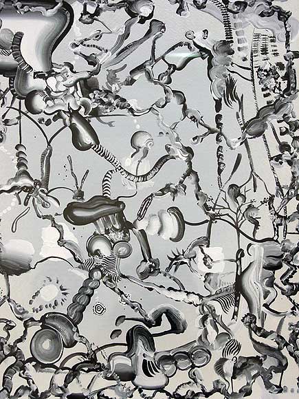
Tomoo Gokita at ATM
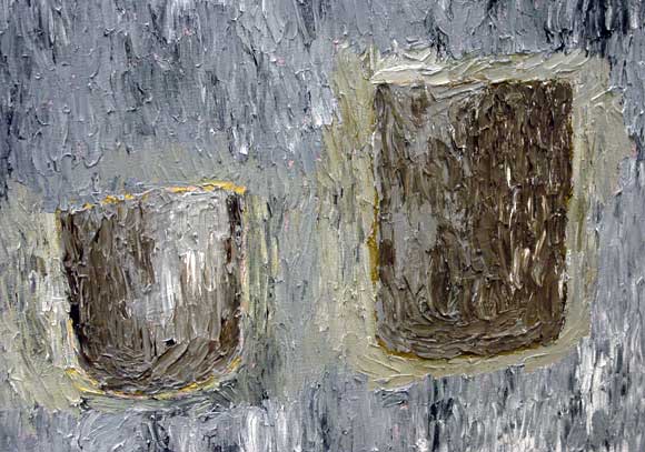
Fox Grimshaw at Marvelli
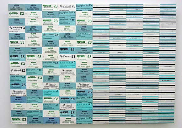
Padraig Timoney at Andrew Kreps
Walking around Chelsea with my camera today--took these shots of artists' work. The Caswell and Grimshaw images are details and the Gokita is heavily cropped. Timoney's materials consist of prepaid electricity cards glued edge to edge on aluminum. Yayoi Kusama did this about 40 years ago with airmail stickers, but still, nice--the fore-and-aft diptych appeals.
Paddy Johnson provided the impetus for the trip today with her slam of Greg Bogin's work as "hopelessly stale." The images of his auto-lacquer-on-canvas paintings looked fine to me but I wanted to see the work in person. It's actually a satisfying combination of videogame-cute, corporate logo-esque designs rendered with California "finish fetish" care (as in John McCracken, surfboards). Definitely a few nods to Stella protractors but only nods--they have rainbows in them, for cryin' out loud. The metal flake paint and airbrush color segues are echt '70s but completely conscious and quietly ironic. And corporate logos, yes, but too eccentric to be real corporate logos--the Bogins wouldn't sit easily in a lobby because they would draw attention away from bland, inferior company signage. And I don't see why Brian Sholis has any obligation to mention Fred Tomaselli in this context. Tomaselli doesn't "own" urethane and in fact, the plastic coating on his paintings has always rung false to me--a way of "bodying up" fragile papier colle for the collectors. Bogin isn't coating collages of Adam and Eve in the garden made out of porn mag cut outs (Tomaselli's most recent content)--thankfully!
I'm glad you posted this, because I was wondering if my spotty art history was really making me that ignorant of derivatives. I kinda thought they were okay from the pics. It's been added to my list of things to see when I'm in NY next month...
Hey Tom, I like your thoughts, but two notes on this: I agree that Bogins work wouldn't sit easily in a lobby, but I think this typifies corporate art. It almost always looks misplaced. Also, I think there is more than one contemporary example of works that are "all surface", full of praise, and proud of it. Tomaselli was the first one who came to mind, but there are many.
Hi, Paddy. I don't think the work is "all surface"--that would be something like McCracken. This has iconography, which is pretty cleverly morphed away from whatever logo imagery Bogin used as source material. If you can't point to any specific source (art or corporate) these quasi-logos refer to, then you can't really call them derivative.
I don't think they have morphed all that much. There is way too much similiarity between this work, and Kelly's work of 90's - particularly the multipaneled shaped canvases and his sculptures. Also, I feel like video game aesthetic can lend crediblity to art when it's not actually due. I'm not that interested in the melding of video game iconography with corporate logo stuff. They can be very similiar, and often don't deserve the distinction. The california finish fetish does hold some appeal to me, but I don't find it compelling in these works.
It's not so much the melding as the futher imaginative twists I think Bogin is making.
I'd be interested to see a pic of a Kelly you think Bogin's work looks like. I did a quick tour through Google images and found almost nothing with even a figure-ground relationship, much less something that looked like an alien alphabet by way of a '70s headshop.
Google images are limiting that way. Yellow Relief with Blue, 1991 sort of shows what I am trying to say, which I can scan it for you later and send, but I don't have all the books at my disposal I would need to make the point properly. Susan Sheehan Gallery does though.
I don't think either of you are pointing to the artist whose paintings are
most like Bogens. Bill Smart came much closer in the 90's.
Bogin's work relates to Bill Smart's more than Ellsworth Kelly's, for sure. At least they're in the same generation. It might be interesting to see Bogin and Smart in a show called "Pictographic Painting of the '90s" (along with Giovanni Garcia-Fenech ca. 1994, and I'm sure we could think of some others.) As I recall, Smart's surfaces were more matte, and he didn't use metal flake paint or mock-cheesy airbrush the way Bogin is now. Bogins look like Bogins to me. Also, has Bill Smart shown anywhere lately?
Smart earlier works where rounded or shaped panels that had a super
high gloss finish. They made freds work look handmade. Bill has not shown
lately he seems due.
I would agree with that Bill Smart relates better too.
|
Janice Caswell at Schroeder Romero
Tomoo Gokita at ATM
Fox Grimshaw at Marvelli
Padraig Timoney at Andrew Kreps
Walking around Chelsea with my camera today--took these shots of artists' work. The Caswell and Grimshaw images are details and the Gokita is heavily cropped. Timoney's materials consist of prepaid electricity cards glued edge to edge on aluminum. Yayoi Kusama did this about 40 years ago with airmail stickers, but still, nice--the fore-and-aft diptych appeals.
Paddy Johnson provided the impetus for the trip today with her slam of Greg Bogin's work as "hopelessly stale." The images of his auto-lacquer-on-canvas paintings looked fine to me but I wanted to see the work in person. It's actually a satisfying combination of videogame-cute, corporate logo-esque designs rendered with California "finish fetish" care (as in John McCracken, surfboards). Definitely a few nods to Stella protractors but only nods--they have rainbows in them, for cryin' out loud. The metal flake paint and airbrush color segues are echt '70s but completely conscious and quietly ironic. And corporate logos, yes, but too eccentric to be real corporate logos--the Bogins wouldn't sit easily in a lobby because they would draw attention away from bland, inferior company signage. And I don't see why Brian Sholis has any obligation to mention Fred Tomaselli in this context. Tomaselli doesn't "own" urethane and in fact, the plastic coating on his paintings has always rung false to me--a way of "bodying up" fragile papier colle for the collectors. Bogin isn't coating collages of Adam and Eve in the garden made out of porn mag cut outs (Tomaselli's most recent content)--thankfully!
- tom moody 9-20-2006 7:01 am
I'm glad you posted this, because I was wondering if my spotty art history was really making me that ignorant of derivatives. I kinda thought they were okay from the pics. It's been added to my list of things to see when I'm in NY next month...
- paul (guest) 9-20-2006 8:00 am
Hey Tom, I like your thoughts, but two notes on this: I agree that Bogins work wouldn't sit easily in a lobby, but I think this typifies corporate art. It almost always looks misplaced. Also, I think there is more than one contemporary example of works that are "all surface", full of praise, and proud of it. Tomaselli was the first one who came to mind, but there are many.
- Paddy Johnson 9-20-2006 8:26 am
Hi, Paddy. I don't think the work is "all surface"--that would be something like McCracken. This has iconography, which is pretty cleverly morphed away from whatever logo imagery Bogin used as source material. If you can't point to any specific source (art or corporate) these quasi-logos refer to, then you can't really call them derivative.
- tom moody 9-20-2006 8:38 am
I don't think they have morphed all that much. There is way too much similiarity between this work, and Kelly's work of 90's - particularly the multipaneled shaped canvases and his sculptures. Also, I feel like video game aesthetic can lend crediblity to art when it's not actually due. I'm not that interested in the melding of video game iconography with corporate logo stuff. They can be very similiar, and often don't deserve the distinction. The california finish fetish does hold some appeal to me, but I don't find it compelling in these works.
- Paddy Johnson 9-20-2006 9:48 am
It's not so much the melding as the futher imaginative twists I think Bogin is making.
I'd be interested to see a pic of a Kelly you think Bogin's work looks like. I did a quick tour through Google images and found almost nothing with even a figure-ground relationship, much less something that looked like an alien alphabet by way of a '70s headshop.
- tom moody 9-20-2006 10:04 am
Google images are limiting that way. Yellow Relief with Blue, 1991 sort of shows what I am trying to say, which I can scan it for you later and send, but I don't have all the books at my disposal I would need to make the point properly. Susan Sheehan Gallery does though.
- Paddy Johnson 9-20-2006 7:44 pm
I don't think either of you are pointing to the artist whose paintings are
most like Bogens. Bill Smart came much closer in the 90's.
- aron namenwirth (guest) 9-21-2006 10:08 pm
Bogin's work relates to Bill Smart's more than Ellsworth Kelly's, for sure. At least they're in the same generation. It might be interesting to see Bogin and Smart in a show called "Pictographic Painting of the '90s" (along with Giovanni Garcia-Fenech ca. 1994, and I'm sure we could think of some others.) As I recall, Smart's surfaces were more matte, and he didn't use metal flake paint or mock-cheesy airbrush the way Bogin is now. Bogins look like Bogins to me. Also, has Bill Smart shown anywhere lately?
- tom moody 9-21-2006 10:47 pm
Smart earlier works where rounded or shaped panels that had a super
high gloss finish. They made freds work look handmade. Bill has not shown
lately he seems due.
- aron namenwirth (guest) 9-22-2006 7:27 pm
I would agree with that Bill Smart relates better too.
- Paddy Johnson 9-24-2006 3:26 am