Claire Corey, ink on watercolor paper (Iris), 1995-1996:


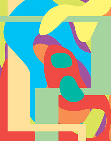
I like these; very smart, abstract pictures. I like the sort of milky palette, and also the way the artist uses a limited vocabulary of color theory to create pleasing spatial depth.
You're right about the milkiness--I hadn't really thought about it. Corey's subsequent work is more and more dense and complex, and I like that, but I had been meaning to come back to these early images--they do a lot with simple shapes/outlines, like Matisse cutouts but more convoluted and psychobiographical. Depth and flatness are fighting each other, as are the organic blobs and the architectural spaces, and these conflicts read as angst, which in turn conflicts with the seductive color...
These images pleases my eyes. They look so sharp.
what a nice surprise to come across this today Tom. I haven't thought about this work in some time.
|
Claire Corey, ink on watercolor paper (Iris), 1995-1996:
- tom moody 7-06-2007 10:09 pm
I like these; very smart, abstract pictures. I like the sort of milky palette, and also the way the artist uses a limited vocabulary of color theory to create pleasing spatial depth.
- bxk (guest) 7-07-2007 5:24 am
You're right about the milkiness--I hadn't really thought about it. Corey's subsequent work is more and more dense and complex, and I like that, but I had been meaning to come back to these early images--they do a lot with simple shapes/outlines, like Matisse cutouts but more convoluted and psychobiographical. Depth and flatness are fighting each other, as are the organic blobs and the architectural spaces, and these conflicts read as angst, which in turn conflicts with the seductive color...
- tom moody 7-08-2007 7:38 am
These images pleases my eyes. They look so sharp.
- Todd (guest) 7-11-2007 11:14 am
what a nice surprise to come across this today Tom. I haven't thought about this work in some time.
- cc (guest) 9-22-2007 12:43 am