The Shitty Design Award
by Von Bark
 |
The shitty design award for this issue is the new look of THE BEER STORE. Other award winners include the TTC Spadina Streetcar Route, the proposed TTC St. Clair Streetcar Route, and Microsoft's Windows 98 Operating System.
more...
|
The Shitty Design Award continued...
That unique Ontarian cultural entity, known as THE BEER STORE tm, formerly known as Brewers Retail tm, is not technically a monopoly, although it exhibits many of the characteristics of a monopoly. It is not, as one might assume, administrated by the provincial government like the LLBO is. THE BEER STORE is a purely commercial fiefdom which had been soley owned by Ontario's two major breweries, Labatt's and Molson's, for many years (until Sleeman's managed to squeeze their way onto the table a few years ago). Foreign brands and micro breweries have their products available at the kind indulgence of the major players, at their discretion, as per demand.
This was explained to me by a friend many years ago as we were arrayed in a long snaking lineup at the Parkdale, Brock Street Brewers Retail. A gentleman of somewhat charismatic flavour in the line up ahead of us, overhearing my friend's remarks, was moved to correct us: "Are ya fuggin nuts, the beer store is run by the fuggin gub-mint!" He swayed as though ready to continue this discussion towards a pugilistic plane, but the passion of his sentiments may have been subdued by the uniformed and armed presence of an officer of public order wisely stationed at this private distributor of goodly ale at this peak demand hour.
Our local rituals of purchasing beer are distinctly arcane and quaint. A few years ago my charming American cousin dropped by for a visit and a narrated explanation of these protocols was one scene in her video documentary of our unique province.
However, times change, and while there are never any changes I have not opposed, the newfangled high-tech ludicrous "new look" of THE BEER STORE is only functional as an example of why Western society is doomed.
Just imagine a clutch of yuppie wanker media design visionaries in a boardroom pulling a classic snowjob: "Yes, you people who control the distribution of beer in this province have a virtual monopoly on how the poor slobs are virtually forced to go to you to buy your product ... and we can make it better!"
So what do they do? They embark on a theoretically perfect design excercise in anti-ergonomics. No longer is the cute lineup of cans and bottles on view, now a big board of vague listings of millilitres in fine print. A shelf of featured products is ready to grab off the shelves (and run away with if one is so desperate). Instead of one polite queue to buy your beer, a vague of thicket of understaffed registers.
In the interests of scientific exactitude we requested the input of a dedicated team of researchers, die-hard alcoholics, actually, veterans of many intriguing lineups at Brewers Retail, including some of whom were even present at the epic "Mensa-Day" at the Brewers Retail on Dundas Street when a gentleman of immense imagination changed his order with a complexity refletive of advanced string theory.
That was the day, but now we live in the real world. The result of this new system, of course, is pure chaos. There is no longer an orderly queue, instead an amorphous hurly burly of agitated clients fumbling through the mob towards an ambivalently available cash register. The only factor containing this barely controlled fury is the exemplary talent of the mostly young polite presumambly motivated staff, whose heroic efforts prevent this retail/consumer industrial-design travesty from collapsing into an utter retail-chernobyl. I presume that the staff is reasonably paid but dealing with this crap stimulation deserves them another raise.
By chance, we (our research team) stumbled upon one of the last outposts of the old-style Brewers Retail single line queue in a tiny outlet on the outskirts of Scarborough last month. By chance, it was a quiet afternoon so we had a rare opportunity to briefly interview the staff without preventing other worthy souls behind us in the queue from access to their desires. Asked for their opinions about the new design, they replied candidly, innocently not thinking that their comments would be recorded: "This old store is the best. The news ones are a disaster. We dread when the changeover comes here."
The beerstore.ca has a website, vaguely proud of their new look, but not like they have any choice. We note that they do not proudly display the name of the design team responsible for this new look. There is a perfect place for the individuals behind this design team: in hell: there, they get to actually live in a universe of their own design.
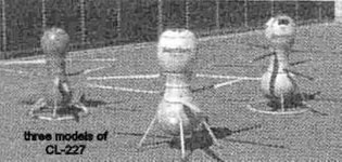
Sidebar: CL-227 An exampe of groovy Canadian design from Jane's Book of Things that Fly Fast and Can Kill You
another groovy image here
The CL-227 Sentinel is a remote-controlled unmanned aerial vehicle made by Canadair.It displays a distinctively unusual bulbous hourglass profile. Lift is provided by a paired set of helicopter rotors emanating from the waist of the system. The prototype of the CL-227 was developed in 1977. While designed purely for intelligence gathering, it's strange and menacing physical appearance inspired Science Fiction writer Bruce Sterling to portray it as an assassination device in the novel Islands in the Net.
(Please note that while the CL-227 technically does not really fly very fast, nor kill you, it is one spooky-looking hunk of hardware. Acknowledgements to Daffyd J.)
|
The Shitty Design Award
by Von Bark
- sally mckay 5-25-2006 7:15 pm
The Shitty Design Award continued...
That unique Ontarian cultural entity, known as THE BEER STORE tm, formerly known as Brewers Retail tm, is not technically a monopoly, although it exhibits many of the characteristics of a monopoly. It is not, as one might assume, administrated by the provincial government like the LLBO is. THE BEER STORE is a purely commercial fiefdom which had been soley owned by Ontario's two major breweries, Labatt's and Molson's, for many years (until Sleeman's managed to squeeze their way onto the table a few years ago). Foreign brands and micro breweries have their products available at the kind indulgence of the major players, at their discretion, as per demand.
This was explained to me by a friend many years ago as we were arrayed in a long snaking lineup at the Parkdale, Brock Street Brewers Retail. A gentleman of somewhat charismatic flavour in the line up ahead of us, overhearing my friend's remarks, was moved to correct us: "Are ya fuggin nuts, the beer store is run by the fuggin gub-mint!" He swayed as though ready to continue this discussion towards a pugilistic plane, but the passion of his sentiments may have been subdued by the uniformed and armed presence of an officer of public order wisely stationed at this private distributor of goodly ale at this peak demand hour.
Our local rituals of purchasing beer are distinctly arcane and quaint. A few years ago my charming American cousin dropped by for a visit and a narrated explanation of these protocols was one scene in her video documentary of our unique province.
However, times change, and while there are never any changes I have not opposed, the newfangled high-tech ludicrous "new look" of THE BEER STORE is only functional as an example of why Western society is doomed.
Just imagine a clutch of yuppie wanker media design visionaries in a boardroom pulling a classic snowjob: "Yes, you people who control the distribution of beer in this province have a virtual monopoly on how the poor slobs are virtually forced to go to you to buy your product ... and we can make it better!"
So what do they do? They embark on a theoretically perfect design excercise in anti-ergonomics. No longer is the cute lineup of cans and bottles on view, now a big board of vague listings of millilitres in fine print. A shelf of featured products is ready to grab off the shelves (and run away with if one is so desperate). Instead of one polite queue to buy your beer, a vague of thicket of understaffed registers.
In the interests of scientific exactitude we requested the input of a dedicated team of researchers, die-hard alcoholics, actually, veterans of many intriguing lineups at Brewers Retail, including some of whom were even present at the epic "Mensa-Day" at the Brewers Retail on Dundas Street when a gentleman of immense imagination changed his order with a complexity refletive of advanced string theory.
That was the day, but now we live in the real world. The result of this new system, of course, is pure chaos. There is no longer an orderly queue, instead an amorphous hurly burly of agitated clients fumbling through the mob towards an ambivalently available cash register. The only factor containing this barely controlled fury is the exemplary talent of the mostly young polite presumambly motivated staff, whose heroic efforts prevent this retail/consumer industrial-design travesty from collapsing into an utter retail-chernobyl. I presume that the staff is reasonably paid but dealing with this crap stimulation deserves them another raise.
By chance, we (our research team) stumbled upon one of the last outposts of the old-style Brewers Retail single line queue in a tiny outlet on the outskirts of Scarborough last month. By chance, it was a quiet afternoon so we had a rare opportunity to briefly interview the staff without preventing other worthy souls behind us in the queue from access to their desires. Asked for their opinions about the new design, they replied candidly, innocently not thinking that their comments would be recorded: "This old store is the best. The news ones are a disaster. We dread when the changeover comes here."
The beerstore.ca has a website, vaguely proud of their new look, but not like they have any choice. We note that they do not proudly display the name of the design team responsible for this new look. There is a perfect place for the individuals behind this design team: in hell: there, they get to actually live in a universe of their own design.
Sidebar: CL-227 An exampe of groovy Canadian design from Jane's Book of Things that Fly Fast and Can Kill You
another groovy image here
The CL-227 Sentinel is a remote-controlled unmanned aerial vehicle made by Canadair.It displays a distinctively unusual bulbous hourglass profile. Lift is provided by a paired set of helicopter rotors emanating from the waist of the system. The prototype of the CL-227 was developed in 1977. While designed purely for intelligence gathering, it's strange and menacing physical appearance inspired Science Fiction writer Bruce Sterling to portray it as an assassination device in the novel Islands in the Net.
(Please note that while the CL-227 technically does not really fly very fast, nor kill you, it is one spooky-looking hunk of hardware. Acknowledgements to Daffyd J.)
- sally mckay 5-25-2006 10:33 pm