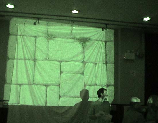
This image above is part of a great digital slide show from the launch of Spacing, the new magazine pubished by the Toronto Pubic Space Committee. The images were by Kevin Steele, and comprised of extraordinarily familiar, unglamourized shots of downtown Toronto. I liked the gratuitious hanging-sheet-backdrop very much indeed, as well as the fake telephone-poles-with-posters made out of cardboard tubes.
The TPSC is opposed to billboards and corporate ads, much in favour of postering and under-the-official-radar public art. The pole full of staples is a recurring theme, and makes a nice visual metaphor for public interaction. Unfortunately the articles in this first issue tend toward the overly-ernest-and-slightly-boring end of the urban activism scale. But there's a lot of talent on the Spacing team, and I suspect these problems will get worked out over time.
I liked the first issue of spacing. A bit serious but it's a real
serious subject too. As Ursual Franklin said recently, "People, commons are under attack. The enemy is us." (para-phrasing here) Public space is an example of this. Also, the visual components of the issue were very strong for a first issue.
Nice sideways design, too!
Toronto Pubic Space is not Toronto Public Space but I like the tension in that possibility.
|
The TPSC is opposed to billboards and corporate ads, much in favour of postering and under-the-official-radar public art. The pole full of staples is a recurring theme, and makes a nice visual metaphor for public interaction. Unfortunately the articles in this first issue tend toward the overly-ernest-and-slightly-boring end of the urban activism scale. But there's a lot of talent on the Spacing team, and I suspect these problems will get worked out over time.
- sally mckay 12-06-2003 9:05 pm
I liked the first issue of spacing. A bit serious but it's a real
serious subject too. As Ursual Franklin said recently, "People, commons are under attack. The enemy is us." (para-phrasing here) Public space is an example of this. Also, the visual components of the issue were very strong for a first issue.
- Tino 12-11-2003 7:37 pm
Nice sideways design, too!
- kissmachine 12-15-2003 2:24 am
Toronto Pubic Space is not Toronto Public Space but I like the tension in that possibility.
- paola (guest) 12-19-2003 11:09 pm