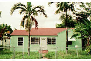
miami house no. 15
These are nice. That Jersey City pic is pretty big and is throwing off the page spacing on my browser (requires a serious right to left scroll). Next time you're over I'll show you. For people with big screens or higher screen resolution, I'm sure it looks fine, though.
I have my screen set at 800 x 600 pixels; type is more comfortable to read at that res. At 1024 X 768 pixels your page looks fine. I'm seeing more weblogs and web pages that say "best viewed at 1024 X 768"--makes it easier for the designer to cram more stuff in. I'd rather design with amateur surfers and seniors in mind and assume small viewing window/big type. That's just me, though.
I was designing with the assumtion no one was reading or looking. The original premis was that this is one big collection of personal notes and bookmarks from recent investigations. the JC pic was another realstate pic grab and happened to fit well on my meager 15" powerbook. im sticking with the (economic) unreformatted image for the time being. thanks for the tech help though. every little bit helps.
Your powerbook isn't meager. That's a sharp image that allows a lot of information on the screen.
|
miami house no. 15
- bill 11-28-2003 7:50 pm
These are nice. That Jersey City pic is pretty big and is throwing off the page spacing on my browser (requires a serious right to left scroll). Next time you're over I'll show you. For people with big screens or higher screen resolution, I'm sure it looks fine, though.
- tom moody 11-28-2003 7:59 pm [add a comment]
I have my screen set at 800 x 600 pixels; type is more comfortable to read at that res. At 1024 X 768 pixels your page looks fine. I'm seeing more weblogs and web pages that say "best viewed at 1024 X 768"--makes it easier for the designer to cram more stuff in. I'd rather design with amateur surfers and seniors in mind and assume small viewing window/big type. That's just me, though.
- tom moody 11-28-2003 8:07 pm [add a comment]
I was designing with the assumtion no one was reading or looking. The original premis was that this is one big collection of personal notes and bookmarks from recent investigations. the JC pic was another realstate pic grab and happened to fit well on my meager 15" powerbook. im sticking with the (economic) unreformatted image for the time being. thanks for the tech help though. every little bit helps.
- bill 11-28-2003 8:32 pm [add a comment]
Your powerbook isn't meager. That's a sharp image that allows a lot of information on the screen.
- tom moody 11-28-2003 9:25 pm [add a comment]