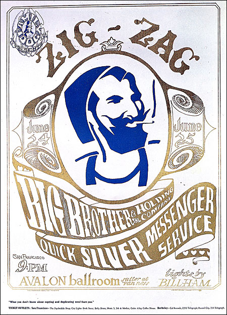
The Zig-Zag man was brewing for a long time. We kept saying: "Should we do the Zig-Zag man or not?" Finally, we decided to do it. We had a good concert for Big Brother, so we did the poster, then we went and cleaned our studio out. We cleaned out any kind of seeds or pot. It was squeaky clean. We almost left town after we did the poster, but nothing happened. The police didn't say anything. Zig-Zag didn't say anything. We thought we were going to get a lawsuit, but we didn't. I read an article that said it was like a million-dollar ad campaign for Zig-Zag. They couldn't advertise to the potheads. But they got a million-dollar campaign for nothing from me and Kelley.
buy a hand bill at wolfgans vault
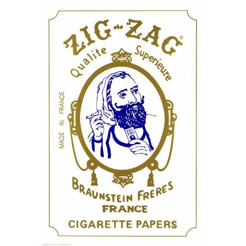 
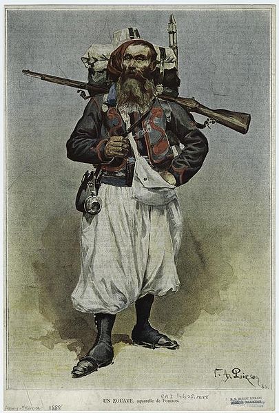
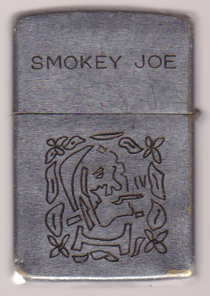
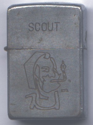
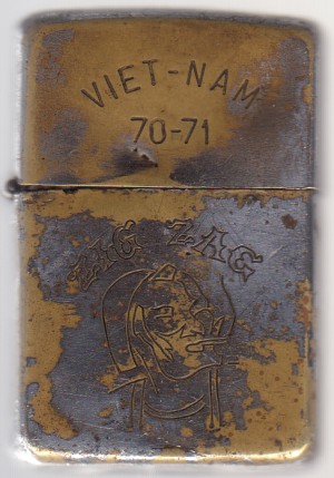
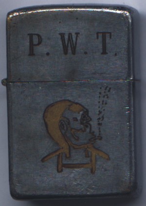
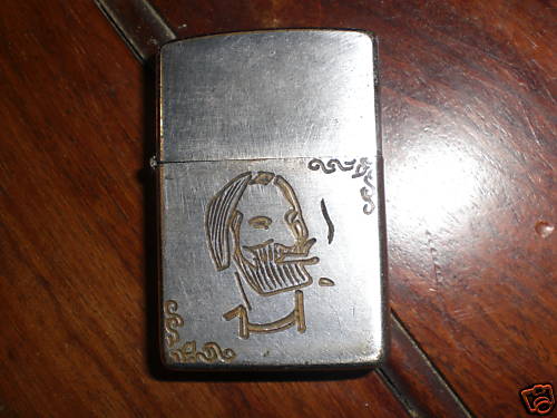
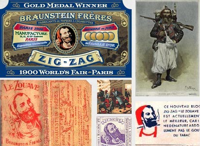
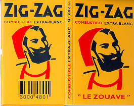
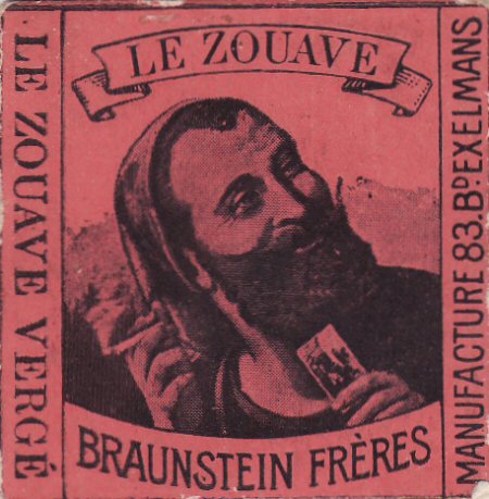
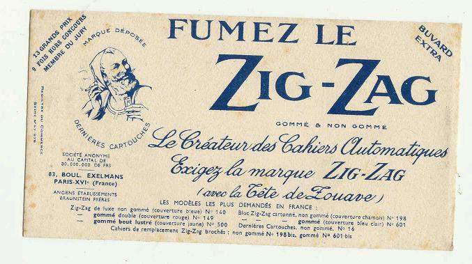
The character portrayed on the front of Zig-Zag products, colloquially known as the "Zig-Zag man", originates from a folk story about a Zouave in the battle of Sevastopol. When the soldier's clay pipe was destroyed by a bullet, he attempted to roll his tobacco into a cigarette using a piece of paper torn from his bag of gunpowder.[1]
joint show (broken) / joint show
The psychedelic poster artists of the late '60s and early '70s would have to be given a fair amount of play, beginning with the most important poster event of the '60s, a show of Jugendstil posters at the University of California Art Museum, organized and curated by Herschel Chipp. Unfortunately, I can't quite remember the exact date; it was in 1965 or 1966, but the information would not be too hard to come by. This exhibition was seen by all of the people in San Francisco who were doing posters for the rock 'n' roll events of the time, and the very next posters were all but direct imitations of those of the Jugendstil, particularly reflecting the lettering of Ferdinand Andrei (President of the Vienna Secession 1905), and Leopold Forstner of the Wiener Werkstätte, which you will recall as letters all made to fit into a square, or some other shape, and almost illegible. [See the Photoshop file "Das Plakat January 1921"]
This period of American poster design is well documented in a book The Great Poster Trip, Art Eureka published by Coyne & Blanchard, Inc. in 1968. Most of these posters were printed by the San Francisco printer Tea Lautrec Litho, owned by Levon Mosgofian. I printed some of them at the Berkeley Free Press, but I don't have copies of anything. Some of the poster producers were: Berkeley Buonaparte, The Print Mint, The Family Dog, The Food, and Bill Graham. Important designers of that time were: Stanley Mouse and Kelly, of Mouse Studios, Wes Wilson, Victor Moscoso, David Singer, Rick Griffin and Bob Fried. Some of these artists and others whose names I can't recall were represented by the gallery, The Poster (now Thackrey & Robertson). Sean Thackrey or Sally Robertson could give you lots of important information. We should not forget Peter Max, who was quite a figure at the time, although a little tiresome in retrospect.
|
The Zig-Zag man was brewing for a long time. We kept saying: "Should we do the Zig-Zag man or not?" Finally, we decided to do it. We had a good concert for Big Brother, so we did the poster, then we went and cleaned our studio out. We cleaned out any kind of seeds or pot. It was squeaky clean. We almost left town after we did the poster, but nothing happened. The police didn't say anything. Zig-Zag didn't say anything. We thought we were going to get a lawsuit, but we didn't. I read an article that said it was like a million-dollar ad campaign for Zig-Zag. They couldn't advertise to the potheads. But they got a million-dollar campaign for nothing from me and Kelley.
buy a hand bill at wolfgans vault
- bill 1-24-2010 2:09 pm
The character portrayed on the front of Zig-Zag products, colloquially known as the "Zig-Zag man", originates from a folk story about a Zouave in the battle of Sevastopol. When the soldier's clay pipe was destroyed by a bullet, he attempted to roll his tobacco into a cigarette using a piece of paper torn from his bag of gunpowder.[1]
- bill 1-24-2010 2:14 pm [add a comment]
joint show (broken) / joint show
- bill 1-24-2010 2:34 pm [add a comment]
- bill 1-24-2010 2:52 pm [add a comment]
- bill 1-24-2010 8:22 pm [add a comment]
- bill 3-19-2010 4:26 pm [add a comment]