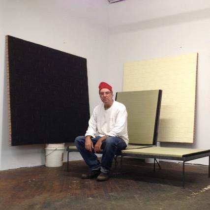
Schwarz
View current page
...more recent posts
For five weeks, until May 17, Storefront for Art and Architecture will operate this satellite space in a backroom of Paperchase Printing, a print shop in Hollywood with some room to spare because its digital printers take up less space than the ones they replaced.
On display will be "CCCP: Cosmic Communist Constructions Photographed," an exhibition of French photographer Frédéric Chaubin's images of Eastern Bloc buildings that went up in the 1970s and '80s -- the last two decades of the Cold War and the final years of the Soviet Union.
The two stories about threats to Bertrand Goldberg's architecture in today's Tribune reveal that Goldberg's architecture still speaks to us today. The question is: Why?
In the 1960s, Goldberg, once an acolyte of Mies van der Rohe, revolted against the master of steel and glass, as well as his devotion to the right angle. Goldberg shifted instead to curves and concrete, and the result was Marina City, including the corncob-shaped apartment towers along the Chicago River that are icons of the Chicago skyline.
on fucking up 2CC
The wraps are starting to come off 2 Columbus Circle, which will be reborn this fall as the Museum of Art and Design. Although it remains within the dimensions and footprint of the original, the structure, formerly home to the Huntington Hartford Museum, has been fundamentally changed inside and out and the city is much the poorer for that.
Since its inauguration in 1964, this beleaguered building has been one of the most enduringly divisive structures in the city, if not the world. No sooner had it opened than the architecture critic Ada Louise Huxtable dubbed it the "Venetian lollipop" building, because of the peculiar arcade at its base. And in the nearly half-century since, that label has stuck, like obscene graffiti smeared across its entrance to be distinguished, naturally, from the actual graffiti smeared across its entrance. For the longest time, simply to mention "the lollipop building" passed for taste and discernment in matters of architecture and design.
Why did "everyone" hate this building, the loving labor of Edward Durrell Stone, one of America's most eminent Modernist architects? Back in 1964, its tentative embrace of historicism, contextualism, and even irony qualities later embraced by the Postmodernists seemed heretical and appalling. It felt like decades since anyone had had the gall and poor judgment to attempt something other than a glass and steel curtain wall.
Often overlooked, however, is that even back then there were people [me] who quite liked the building. Even if its embrace of Venetian and Byzantine motifs was halfhearted at best, still there was a positive enchantment to the place, a sense and here I draw upon memories from my own childhood that architecture could open up whole new worlds to the receptive soul. Unlike most buildings in Manhattan, 2 Columbus Circle presented a smooth, windowless expanse of gleaming white marble, qualified by adorable round portholes along the sides and ruddy granite accents. Imagine a Modernist re-enactment of a Venetian palazzo dropped into one of the busiest intersections in the busiest city in the world and encircled, like an island, by the ceaseless flow of traffic rather than the green waters of the Grand Canal!
sputnic lights at vintage oasis
aint it....!
via zoller
justin snags another good shipping container cabin find
"art is either plagiarism or revolution."
-paul gauguin
now can someone get me a job at one of those stupid net surfing art clubs. i can spell fuked up on purpose too.
our friend linda found tables made from reclaimed bowling lanes at the BKLN flea market
porch board
via vz
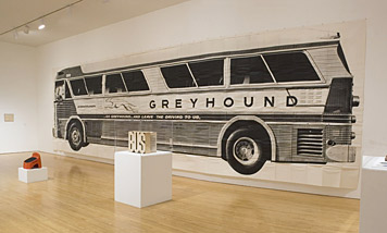
this is quite a grand discovery for me. at age 13 i visited some cousins in evanston Ill. on the first opportunity i took the train into chicago and headed straight to the old town district. there in a prospering bi-level head shop, hung high on the wall i spotted a life sized poster of a greyhound bus. its stuck with me ever since. epic (!) looking generically warholian (screened americana) and 100% pop (think rosenquist and oldenburg BIG). since the age of the internet ive searched off and on but not until this moment have i found the "A"uthor. turns out, it was mason williams.
i try not to be seduced by the fetish aspects of nakashima furniture. really, they are just straight up trestle tables. free edges? just short cuts to a completed work station. butterfly keys? you need them for mending slabs of wood which might not make the grade otherwise. but this table in rosewood, well it did me in. me and someone with 210k.
In 1954 the artist Asger Jorn wrote to Max Bill, Bauhaus is the name of an artistic inspiration. Bill, a former Bauhaus student and the founding director of the newly opened Hochschule für Gestaltung in Ulm, West Germany, a self-anointed successor to the Bauhaus, replied, Bauhaus is not the name of an artistic inspiration, but the meaning of a movement that represents a well-defined doctrine. To which Jorn shot back, If Bauhaus is not the name of an artistic inspiration, it is the name of a doctrine without inspiration that is to say, dead.1from the spring/summer '08 HDM online
This exchange between the orthodox Bill, who would run his school like a monastery, and Jorn, who as a provocation would create something called the International Movement for an Imaginist Bauhaus before going on to cofound the Situationist International a couple years later, was more than just an epistolary joust. Virtually since its founding in 1919, throughout its fourteen-year existence in Weimar, Dessau, and Berlin under three successive directors, and in the three quarters of a century since it closed its doors in advance of the Nazis, the Bauhaus has been the object of veneration, hostility, controversy, and myth. It has been variously portrayed as a seminal experiment in pedagogy, a hotbed of radicalism, the standard-bearer of the ethos of functionalism and industrial technology, an aesthetic style, and most broadly, an idea synonymous with the spirit of early 20th-century modernity itself. In a new collection of essays thoughtfully edited by Kathleen James-Chakraborty, it is a cultural manifestation closely linked to the political and economic vicissitudes of its times.
Authorship in design is a sticky question, and always has been. There are a few considerations: collaboration, control, voice, and limits. The questions that follow from these considerations are simple enough. Iflike architects or filmmakers, but unlike bookwriters or oil painterswe collaborate on our projects with a huge array of people, including paying clients, regulatory and legal institutions, fellow design staff and subcontractors, printers and fabricators, merchants and mailing houses, are we even able to author a work? To aid us in this discussion on collaborations impact on authorship, some designers (in particular Michael Rock) have pointed out Andrew Sarriss auteur model, developed for the analysis of filmmaking.
rago has two modern design auctions a year. last fall we saw a frail but spirited Philip Lloyd Powell in the auction room looking very elfin. sadly he has passed on since then. here are some shots of my brothers small PLP side table that came from a little east village thrift shop called "garage sale" which was located on 1st avenue and second street back in the 80's.
back from the rago auction showroom with (up-skirt) images of george nakashima splayed and tapered table legs.
Toward an Architecture is the most influential book on architecture of the modern era. Perhaps only Vitruvius can match it for influence from any age. So let's make that the most influential book on architecture for about 2,000 years.
Emerging from the era of manifestos, it is a radical, hectoring, brilliant book. It blends the eye-catching absurdity of Dada, the strange juxtapositions of surrealism and the technophilic cutaway drawings of a boys' magazine with text that is incisive, sometimes funny and occasionally wholly convincing.
Written in 1923, when Le Corbusier, a Swiss-born architect living in France, had built only a couple of houses, it has survived as the manifesto of modern architecture. It is a paean to the unselfconscious, functional beauty of engineering - an appeal to architects and patrons to abandon outmoded traditional modes of construction and look to the power and clarity of industrial buildings, aeroplanes and machines. And that is how the book is largely remembered, along with its call for the house to be ''a machine for living in'', perhaps the most quoted phrase in architecture. It is also an ode to architectural ambition - grandeur, proportion, elegance and meaning.
nyc canon
square america
by way of reference library
To the north and south of my plebeian ranch-style home here, my neighbors are transforming their pads into midcentury modern showplaces. At one time all you needed to accomplish this was some orange paint and concrete blocks; nowadays the makeover involves a lot of chopping.
One neighbor ripped out the fig and lemon trees planted there 40 years before by the original owner. To the north, modernistas tore out a jungle of honeysuckle vines and asparagus ferns weaving in and out of an old fence.
All around my neighborhood, new owners are hacking off the blond skirts of the Washingtonia filifera palms and amputating tendrils of black dates. In the latest development, they are even shaving the rough bark of the palms, leaving a shiny blood-like surface.
The skinned palm look is very sleek, very atomic -- it goes back to the early days of modernism in the '40s. But it leaves nowhere for a collared lizard, roadrunner, orange oriole or barn owl to hide. It's not even good for the tree.
As I walk around the neighborhood, it's beginning to look like some modernists are intent on annihilating habitat and banishing nature. More yards -- some had resembled gardens in Pasadena with a loose, shady ambience and alcoves of privacy -- sport a minimalist look, with soldierly rows of tufted grasses, or lone agave spikes in seas of gravel or lawn.
the unisim of wadyslaw strzeminski and katarzyna korbo
abandoned roller coaster
via vz
Plans to save a unique section of Eero Saarinen's TWA terminal at John F. Kennedy International Airport have stalled on the runway.