tom moody
View current page...more recent posts
To sum up an
earlier post about James Elkins' book
What Happened to Art Criticism? Asking that question is a bit like fussing over the drapes while a rhinoceros crashes about your living room (or whatever metaphor gets this across). Like it or not, artists keep making art; you can either describe it, using whatever tools and venues are available, until a theory becomes clear, or worry about less important "writerly" concerns, like classifying different types of criticism and asking whether they're up to the job.
Coincidences is a blog of photo criticism that refreshingly doesn't distinguish too much between "client" and non-commercial work (yes, I've griped here about ads but mainly when they're ruining my favorite songs; that's not to say interesting things can't be found in them).
This post rounds up links on Southern shutterbug William Eggleston; a
later post adds my
reply to a Slate article where Jim Lewis proclaimed Eggleston's 1976 MOMA show "an annunciation of the coming of color." In a reply to my reply (in the comments to the Coincidences post), Stan Banos says:
Eggleston did "validate" color photography as an art form back in the day ('76). I remember it quite clearly. Here was this middle aged Southern guy hitting the photo scene like visual punk. Prior to him when color and "art" photography were mentioned, the usual work summoned forth was the droll, color pictorials of Ernst Haas. But just as the "English Invasion" was not just the Beatles, there was also the work of Sternfield and Shore (not a law firm). Goldin and Meisalis also pioneered and validated the use of color for photojournalism. And Meyerowitz was probably the most popular of the lot, and his lesser known color street work was every bit as mindboggling (if not as revolutionary) as Eggleston's.
I don't doubt what Lewis called the "coming of color" was revelatory when so-called art photography was a grey, carefully controlled arena. My argument is that events outside the photo scene made that coming more inevitable than did the work of one man. But I wasn't there, as Banos obviously was, in the sense of being so involved with the scene as to be hit by a punk rock moment. I'd trust that gut impression more than Lewis's arguments, which just weren't very convincing (though I'm not sure Nan Goldin thinks of herself as a photojournalist). I still think the issue of the "validity" of color (i.e., whether it was important for photo departments to collect) diminishes in importance when you pull the lens back to view the entire visual (commercial art, conceptual art) picture.
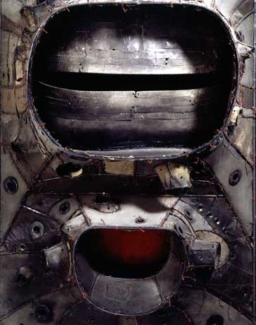 | | Saw Lee Bontecou's semi-retrospective at MOMA-Q(uee)NS on Thursday. The work to the left is typical (if a bit over-metallic in the reproduction)--don't remember if it's in the show; the image came off the web. |
|
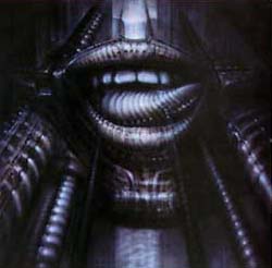
| Bontecou--Progenitor or Symptom? (right: H. R. Giger, the "Alien" guy) |
|  |
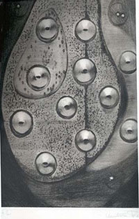 | | Using perspective depth and modeling in shallow space is a way to "do abstraction" without sacrificing the pleasure of drawing. Left: Augustin Fernandez. |
|
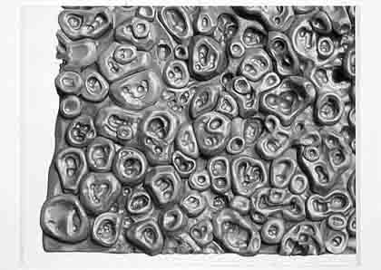
| Alexander Ross (right) also does this. |
|  |
Donald Judd gave Bontecou an early critical nod, as practically every article about her reminds us, but her work is completely at odds with his minimal aesthetic. She started out in the
assemblage camp, just as he did, but while he gradually shed more "stuff" from his art, she kept working with materials from the scrap heap, and worse to minimalist sensibilities, used it to make a kind of sculptural abstract expressionism. One oohs and ahs at her craftsmanship but the work comes off strangely inert in person; the Giger-esque vaginas dentata are overwrought and corny. In the early 70s she made vacuformed plastic objects somewhat reminiscent of the forms in Judy Chicago's biomorphic airbrush art--those were actually kind of good.
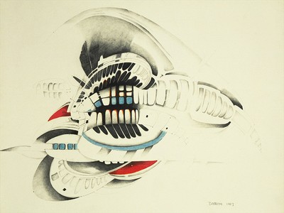
(The story is she "turned away from the art world" at this time, but it's possible her career as a crypto-feminist surrealist abstractionist was going to jump the shark when she started making plastic fish suspended from the ceiling with monofilament--maybe the turning away was pre-emptive?) Lately she's looking more like Roger Dean of Yes LP cover fame, making
Metal Hurlant/Hobbit Rock spaceship thingies that hang from the ceiling and resemble hypertrophied sea urchins. Some of this is good (and slightly off-topic, I happen to know the above-mentioned Alex Ross is a Dean fan, though more rigorously abstract overall--Dean's is still the cult that dare not speak its name in the fanboy-averse art world, regardless of the fact that his architecture is now getting some acclaim). The tepid copper, teal and, alabaster color schemes of Bontecou's "spaceships" are a turnoff, though. The bolder colors in her drawing above--or no color--would have been more satisfying.