View current page
26 matchs for infinite+fill:
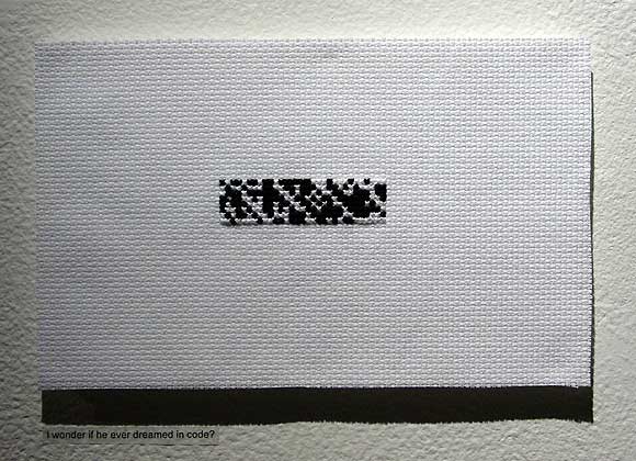
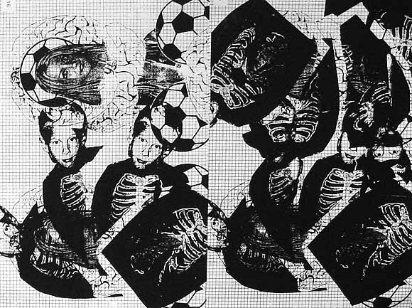
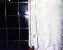
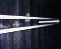
Some photos I took at Cody Trepte's show (for Alan Turing), at NYU/Tisch School of the Arts' Gulf & Western Gallery, 721 Broadway. More about the show is here. At the top is a "binary cross stitch" similar to the one Trepte had in the Infinite Fill Show a while back. The middle image is an essay by pioneering computer scientist and codebreaker Turing with everything but the 1s and 0s removed (detail of a 33 page installation). The bottom image, another detail, is the negative space (spaces between words) in another Turing essay. The show is a non-standard take on "computer art" in the gallery context. The formal vocabulary is reductive (or accumulative) minimalism a la Yayoi Kusama's airmail stamp paintings, and while the subject matter is the language of both the computer and the computer scientist, it's treated not in a literal way but rather as an absence, or anti-content. As the press release explains, Turing was gay and accused in the not so swinging '50s of "acts of gross indecency." His "sentence" was an "experimental hormone therapy" consisting of estrogen injections to "reduce the libido." He died a couple of years later, apparently a suicide, but with questions lingering. Trepte's work is thus not the typical Buzz Lightyear computer-fetish celebration but rather an examination of the repressed, fragile, elegiac back story to the "machine that's changed our lives."
The exhibition's up through Saturday, Jan. 6. Gallery hours are 10am through 7pm weekdays, and noon to 5pm on Saturdays.
dude gets whupped - artist unknown
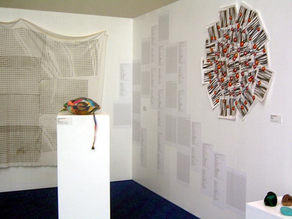
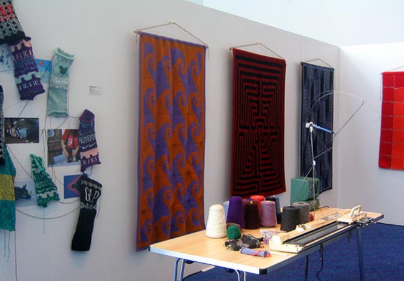
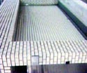
Finally got some pics of the "Fuzzy Logic" show from summer 2005, in Manchester, UK, curated by Jackie Passmore and Michael Connor. A million thanks to Cat Mazza for these photos. The show was discussed a bit here (scroll way down). The top photo depicts Cory Arcangel's Infinite Fill Blanket, Peter Coffin's "wall-based prints bridging ASCII art and knitting patterns," a LoVid soft sound sculpture on the pedestal, my Fuzzyball paper piece upper right, and Claire Irving's mathematical knitting in the foreground. The bottom photo shows Cat Mazza's logoknit pieces and her knitting machine, and Woolly Thoughts' Mathematical Afghans.
current blog page / main site
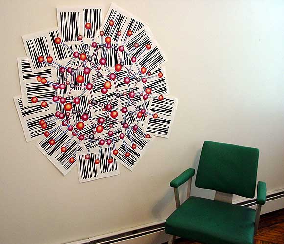
The above piece, Fuzzyball, has been shipped over to Manchester, UK, for the Futuresonic festival. It's in an exhibit called "Fuzzy Logic," which is a subset of another exhibition called "Low Grade" that is part of the larger festival. The curators are Jackie Passmore and Michael Connor. By the way, the molecule above really is called a "fuzzyball" (a buckyball variant); I didn't title it just for the show. Here's the rundown on "Fuzzy Logic":
"Low Grade" argues that the roots of computing technology are linked to Britain's 19th Century cotton trade, with weaving looms providing inspiration for the design of the first computer. In a city famous for both its textile history - Manchester was once known as "Cottonopolis" - and as the birthplace of the modern computer, "Fuzzy Logic" demonstrates how new media artists are turning back to the loom, combining technology with the knitting needle to create a new wave of fabric-based media arts, mathematical knitting and textile activism.My piece doesn't involve knitting but I have always described this type of work as a paper quilt or mosaic. When I started doing these pieces in the mid-90s I was very interested in cyberfeminist Sadie Plant, who is speaking at the festival, and I was somewhat chagrined to discover no one in the NY art world was following this dialogue, or giving any particular thought to bridging the computational and the crafted. Things have gotten better in the last few years with the arrival on the scene of many of the above artists, so I'm not feeling quite as lonely as I did in 1997, when the gallery I was showing with mostly just apologized for the work, as in "Sorry it's not made with a brush or pencil and fabricated of fine, durable art materials, we know how important that is to you, Mrs. Drysdale." As late as 2001, a dealer I was working with was still asking me questions like "Do you ever think of painting these?"
Artists and works include:
Claire Irving (UK): Mathematical Knitting
Woolly Thoughts (UK): Mathematical Afghans
Cat Mazza (US): KnitPro Software, the LogoKnit knitting machine and examples of knitted work
Mandy McIntosh (UK): Knitting patterns for Atlanta and other cities, plus Radiant Circle
LoVid (US): Soft sound sculpture, sculpting psychedelic soundsssssssssssz
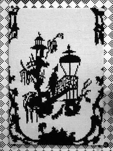
Peter Coffin (US): Wall-based prints bridging ASCII art and knitting patterns
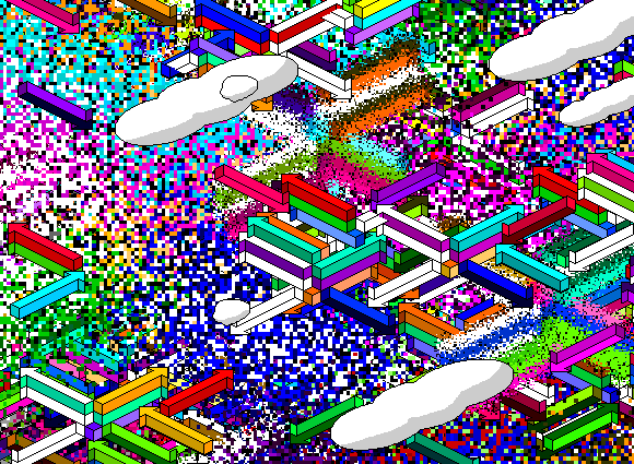
Cory Arcangel (US): Security blanket based on the "infinite fill" patterns used in place of colour on early drawing software Mac Paint
Rebecca Vaughan (US): Conceptual knitted cosies for uncosy environments
Tom Moody (US): Psychedelic and abject works riding the guardrails between the handmade and the digital
Details from Michael Bell-Smith's video, Top of the World, at Foxy Production, in the group exhibition "GEO," which runs through February 8, 2005.
The video begins with an aerial perspective looking down on a videogame landscape (sort of reminiscent of the old Intellivision tank battle terrain, but it could be a lot of things from that era). Directional arrows invade the middle ground and...
...after passing over, under, and around each other they begin to dissolve into painterly sprays of pure pixelation--a gorgeous effect, but not too gorgeous. It looks like a specific set of commands to "break down" as opposed to a one-click Photoshop filter; don't know if any, or how much, custom programming was required and don't care particularly. Eventually the screen fills with a succulent allover abstraction that could be Monet's Water Lilies a la Bit-Rot.
This detail showing the initial breakdown into pixels probably looks fuzzy in Safari--another browser is recommended to see this scaled up image super-sharp.
In the gallery, the video is displayed on an LCD screen directly from the computer. My only quibble is I miss seeing this type of imagery on the big clunky CRT picture tube, as a similar work of Bell-Smith's was displayed last summer in the Infinite Fill Group Show. Ideally when he has a solo exhibit we can see his work with a variety of formats and hardware. Also recommended is a music piece on Bell-Smith's blog that is a kind of marathon sequencer ditty--curious to see what happens with that if it reaches the projected 74 minutes.
TOM MOODY WEBLOG TOP TEN 2004
1. Site Specific Art is Dead; Long Live.... According to this text from the year 2035, the dinosaur finally died when artists ran amok in the Saarinen airport terminal; meanwhile, the small mammals of wireless and GPS-based art stirred at Spectropolis 2004 and the psy.geo.CONFLUX.
2. Diana Kingsley at Leo Castelli. This artist's subtle humor has been evading the New York art world for years. The New Yorker is the latest not to get it.
3. Ross Knight at the Sculpture Center. More art too subtle for Saltz and the pros.
4. The Infinite Fill Show at Foxy Production. Disclosure: yrs truly was in this show (along with 92 other artists).
5. Four-way tie: Banks Violette at Team, John Parker at Front Room, Joe McKay at vertexList, Paper Rad at Foxy Production (and online).
6. Loretta Lux. Powerful images of ideal children combine painting, photography and digi-manipulation, made even more meme-worthy by resizing at a web-friendly 300 x 300 pixels.
7. Chris Ashley, Jan - December 2004. Abstract painter moves to web, uses your browser to make paintings, blows away competition.
8. SCREENFULL, July - December 2004. If Sigmar Polke were in his 20s today and/or Richard Prince surfed the net instead of painting, this is what they'd be doing. If only it could be commodified...
9. Michelle Handelman in Bryant Park. The performances were memorably quirky, the summer day was beautiful, Bryant Park was beautiful...
10. Duncan Hannah at JG Contemporary/James Graham & Sons. Weirdly affectless Hopperesque work by one of New York's best painters, whose work has long been too subtle for...oh never mind.
Honorable Mention: The art world's efforts to end the Iraq War and throw the current bums out of office, even though both have so far failed.
In a comment to the previous post, Brent questions whether Chris Ashley's stationary HTML drawing and jimpunk's moving .GIF are comparable or compatible on the same page. My usual quip about showing video next to paintings in a gallery setting is that it's like bringing a baby to a wedding, but the browser is the great equalizer. A few more line breaks were added to the post so the pieces aren't quite so close together, but otherwise, yeah, I think they have more in common than not as art non-objects. Although neither artist is an Op artist in the old '60s sense, the pieces exploit optical tricks over and above their plain formal appeal: illusory depth in the Ashley and quite literal vibration in the jp. Moreover, they are fresh takes on the grid and opticality, which the New York Times and the Village Voice love to dismiss as the concerns of a bygone generation, in spite of all evidence to the contrary (e.g., the Infinite Fill show.)
The "Infinite Fill Show" is now officially down, and the gallery, Foxy Production, suggested a way to pull up the somewhat obsessive posting on the subject here, which I hadn't thought of (duh): just click http://www.digitalmediatree.com/tommoody/?search=infinite+fill. That brings up 20 posts, including this one. Comments aren't included in the search, so you have to click on those separately. If you click http://www.digitalmediatree.com/tommoody/?search=infinite, you get 7 extra off-topic (but really good!) posts.
By the way, for anyone who wants to cite this page in a bio, press release or angry spam email, "Tom Moody" is preferred, or secondarily, "Tom Moody's Weblog." While "Digital Media Tree" sometimes appears as a cite for this log, that's not really correct; the Tree is a weblog collective and each of us has our own independent, wholly unedited content.
Ryan Compton, Mathematics of Composition (Brains and Grid), silkscreen, 2004, 17.5 X 22.5 inches, from "The Infinite Fill Show." "Compton invests what Leo Steinberg called the 'flatbed picture plane' of Rauschenberg and Warhol with the almost perceptible audial tint of a feeding-back electric guitar dropped from a considerable height." --October magazine (just kidding, I made that up). I believe that's Britney Spears posed like the Virgin Mary over the soccer ball and the brains.
 |
|
UPDATE: A large-ish image (750 x 1000) of Joe McKay's piece has been added and linked to in the post where it's discussed.
 To the left is Time Out NY's "Infinite Fill Show" review; on the whole it's better than the NY Times'. Below is the accompanying photo. My notes on the review: To the left is Time Out NY's "Infinite Fill Show" review; on the whole it's better than the NY Times'. Below is the accompanying photo. My notes on the review:At least this writer got Jamie Arcangel's sex right, but it's Foxy Production, singular. "[F]ew of the artworks reveal the influence of the computer age..." This is to calm regular readers of the Time Out art page, who might be freaked out by too much computer art in a gallery. "Several of the artists display Op Art grids made from media as disparate as a latch hook and cassette tapes, including a vinyl piece by the curators' mother." That is how that sentence should read: I suspect editorial garbling in the published text. Props to Joe McKay for undulations catching the critic's eye. His piece is good, a sort of moving Suprematist abstraction gliding in and out of a permanent dark band on a broken PowerBook. Broken consumer tech=very good. [J]ust as computers generate complexity using a binary system of 1s and 0s, the Arcangels' two simple criteria [black & white + repeating patterns] have yielded a superabundance of pattern--not to mention artwork..." Yes! Bemoaners of the "crisis of criticism," you get your theory where you find it in the art world; this is a variant of Sally McKay's here on this blog (scroll down to comments). Roberta Smith only got the second half of this thought. |
 |
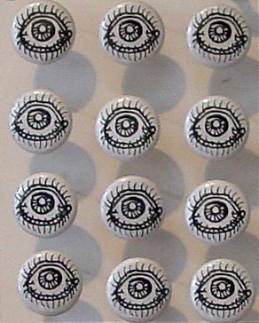
Two by Noah Lyon, from "The Infinite Fill Show." Above: "Paper Rodeo Head," ink and whiteout on Bristol, 2004; below: "12 Eyes," mixed media, 2004. Paper Rodeo is a Providence zine crammed with imagery such as Lyon's cartoon homage to Arcimboldo. (The grey smears to the left are shadows from the buttons, which are adjacent to the drawing in the show.) The explosion of psychotropic-influenced graphics coming out of Providence is duly noted; still waiting for a critic to stop complaining about the state of criticism and get down to the hard work of defining how this particular graphic revolution differs from the Zap comix '60s and the Raw magazine '80s (it does differ). These days my taste leans more towards the cartoon minimalism of the "eye buttons," though it's so damn easy to provoke a response with eyes.
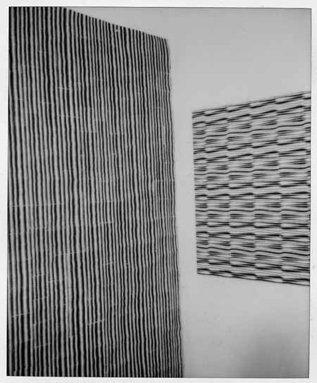
My 54th Street (Hell's Kitchen) studio, ca. 1998. Left hand image(s): Pipes 2, 1998, laser prints and linen tape, 88" X 78", previously exhibited here. The work on the right is untitled, same media. Each piece is essentially a giant paper quilt made of approx. three by five inch rectangles of xerox-printed paper taped together on the back (the linen tape is starchy and moistened when applied; when it dries it forms a "kite frame" of plaster-like strips that give the piece a sense of volume perceptible from the front). The big one hangs loosely on the wall, the small one is folded around a stretcher. Perhaps you can see where a group exhibition of black and white, repeating, Op art-like patterns, computer-made, with a kind of "jenky" outsider craft focus, would interest me. The "pipes" were originally intended to be cut out and used as struts or sticks for the molecules I was making, but I discovered that when placed side by side, they created intense, fairly painful optical vibration (not visible in these polaroid scans). These, and the allover patterns of spheres I was doing simultaneously, are what lead to my investigation and reworking of Op art rhetoric and ultimately my involvement in the "post-hypnotic" exhibition.
"p-h" traveled around the U.S. but never made it to NY. It would have been a hard sell here. I knew the idea of a (multiply-recontextualized) Op pseudo-revival was doomed when I read Roberta Smith's review of the Bridget Riley show at Dia. I'm paraphrasing here, but Smith basically said that Riley was tainted by her association with artists who would be forever on the margins, "especially in anti-Op New York." Wow, opposition to Op art is institutionalized here! Or was that another way of saying "anti-Op Roberta"? Considering the predominance of Op-like patterns in "The Infinite Fill Show," I guess it took the "teen bedroom angle" to override Roberta's dislike of the form and/or perception that it was discredited. Or, less cynically, maybe it was just the overwhelming evidence that artists find it more interesting than she does. [reposted from a few days ago with modifications.]
 |
 |
 |
 |
 |
 |
 |
 |
 |
 |
 |
 |
 |
 |
 |
 |
 |
 |
 |
 |
 |
|
 |
 |
Aya T. Kanai, "Polaroids Tokyo/NYC," 2004, spectra polaroid photos, from "The Infinite Fill Show." Web layout (rephotography, slight cropping of installation views) by Tom Moody.
Still more thoughts on Infinite Fill. The so-called Bedroom shows Roberta Smith talks about in her review--she mentions Dearraindrop but Scott Hug's and Daniel Reich's shows also come to mind1--are mainly of sociological interest (collectives arise to challenge the hegemony of the individual genius, only to eventually be beaten down by the art world's need to market solo work--my cynical prediction), and backward-looking to the extent that they stand for some "rejuvenation of painting" discourse. The Providence collectives didn't invent the "colorful room full of manic cartoon imagery"--arguably that was Kenny Scharf's contribution to art...20 years ago. Whereas there is something larger at stake in IF, which is the merger of so-called new media art with traditional gallery exhibition practice. If art is to avoid shriveling into some finicky "cult of the hand," it's going to have to reconcile itself to technology, and eventually something interesting will emerge from what they used to call the "dialectic" between the two arenas. In Infinite Fill, the monochrome grid is the level playing field where the two opposed forces meet, intuitively connecting Sol LeWitt, needlepoint, and video games in an easy to read, "anyone can play" matrix. Also, as Sally McKay suggests in the comments to a previous post, "Infinite Fill" is a pun--it's about a computer filling up space and artists filling up a room with work. So far, none of the Bedroom Gang has come up with anything that elegant or concise, theory-wise.
1. I would exclude Paper Rad here, since their Foxy Production show was fairly tightly organized, with different walls devoted to different themes. I missed the Dearraindrop extravaganza at Deitch but friends said it wasn't so good--too much wall space to fill with manic creative activity. I did see their previous floor to ceiling effort at John Connelly, and like most people thought Billy Grant's video was the best part. You don't need a Soho barn for that, though--just a TV!
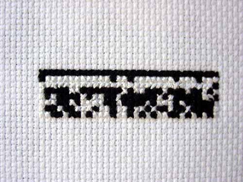
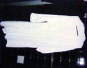
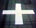
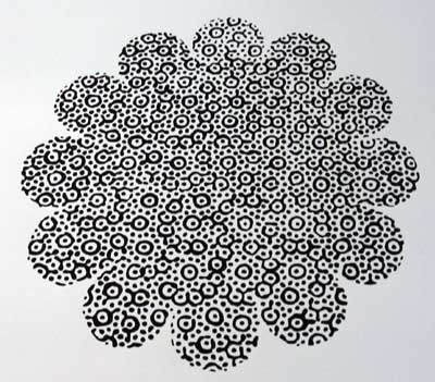
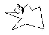
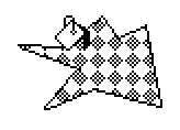
Cody Trepte, Why Are Numbers So Comfortable? (detail), cross stitch binary, 2004, from "The Infinite Fill Show".
Belatedly noticed that this image should be rotated 90 degrees counterclockwise. I don't know if it's the installation or my photo that got it wrong.
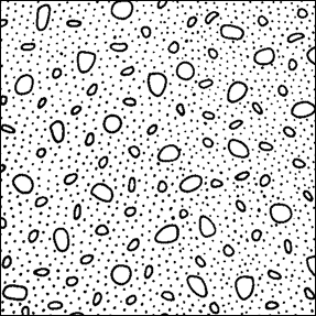
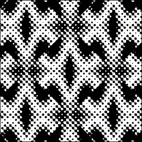
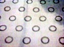
Before MacPaint incorporated black & white, so-called infinite fill patterns into home computer graphics, most already existed and were used by design firms, newspaper paste-up departments, and cartoonists for shading camera-ready art. Manufactured as adhesive sheets, they were (and still are by some) cut out with X-acto knives and mounted on illustration board. Zipatone was the company cartoonists swore by; it's now defunct but Letraset has a mind-boggling array of fill patterns viewable (and/or downloadable) online.
Transfer Graphics - Letratone (physical media - comes printed on sheets of adhesive film)
Dot TintsPhototone Imagery - Textures & Tones - Single Downloads
Geographical & Architectural
Dots & Grids
Mezzotints
Miscellaneous
There's been quite a bit of ruminating on various artblogs about "the role of criticism" recently, but the topic remains frustratingly vague since specific examples are avoided. As a case study--surprise, surprise--let's look at the critical reasoning behind the "Infinite Fill Show" (which we've been discussing here lately), as articulated in the exhibition materials and the New York Times review of the show.
Press release/call for entries theory: "The only rule is that [work submitted] has to somehow use black and white repeating patterns" (from the call for entries). "The curatorial concept was inspired by [MacPaint], the 1984 software application with varied 16-bit monochrome patterning that could be picked and dropped into areas of the screen to denote color and depth. For Cory and Jamie Arcangel, this rudimentary precursor to Photoshop's draw and paint functions provides a creative tool to explore multiple perspectives within a unifying aesthetic." (from the press release)
The "nostalgia factor" associated with old programs I addressed in an earlier post. Still worth considering are (a) how did pattern substitute for color and depth in MacPaint, exactly? are "bricks" a color? who came up with those patterns? how well did/do they work in actual practice? to what extent were artistic prerogatives usurped by engineering prerogatives? (b) MacPaint is a precursor to Photoshop, which is pixel-based, but how does it relate to vector programs such as Illustrator, which use defined curves rather than rectangular blocks? If the show is a form of ancestor-worship, whose family is being feted? are pixel-based programs more "important" because they've been subsumed into html and web design? (c) to what extent was MacPaint old news, incorporating pre-1984 print conventions such as Ben Day dot patterns (also frequently alluded to in "Infinite Fill"), zipatone, or letratone?
New York Times theory (i.e., everything but the purely descriptive parts of the review): (1) "How many different ways can a work of art combine black, white and repetition? An answer is essayed by 'The Infinite Fill Group Show...'" (2) "The show is intended as a homage to [MacPaint], an early computer application (released in 1984) that enabled the user to click and drag a range of black-and-white patterns into images of any kind." (3) "[T]he show resembles a photo-negative of the floor-to-ceiling, color-saturated conventions of the so-called 'bedroom shows,' those showcases for collaboratively minded young artists that reached an apotheosis of sorts in Dearraindrop's extravaganza at Deitch Projects in SoHo..."
The "youth culture" and "psychedelia/color saturation" issues were raised here earlier. Perhaps "Infinite Fill" was also a "photo-negative" (inversion) of the teenager's bedroom shows because if included artists of all ages? What was the kid-to-geezer ratio? Does it matter? Item (1) slightly restates the show's premise (as a way of saying how diverse it is): but did each work in the show in fact use B&W and repetition? (No.) Black & white schemes are sometimes used by curators (not naming any names) to unify group shows of quite disparate work but disguise the lack of a thesis. Is that the case here? (No!--but why?) Does the fact that MacPaint was monochrome and used fill patterns justify the inclusion of works such as needlepoints, enlarged newsprint images, and zebra rugs? How is the political work in the show justified by a formal premise? Is the premise "merely formal"? The Times doesn't answer these questions with specitic examples (and neither have I in this short post); unless or until someone does so, a gap between theory and description remains unfilled.
Returning to the point raised in my first sentence, I submit that the "role of the critic" is to answer questions and plug gaps such as the above. (Not holding my breath, though.) As long as there is work to be done you don't sit around bemoaning what you're supposed to do.
UPDATE: This post has been reworked a bit to take into account the wording of the Arcangels' call for entries. I also added the links about historic fill patterns (zipatone, letratone).
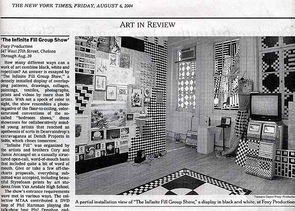
The "Infinite Fill Show" gets the lead review in the New York Times today (page E32 of the print edition). Critic Roberta Smith says the exhibit, with its all-black and white color scheme, resembles a "photo-negative of the so-called 'bedroom shows,' those [floor-to-ceiling, color saturated] showcases for collaboratively minded young artists that reached an apotheosis of sorts in Dearraindrop's extravaganza at Deitch Projects..." After that, the review is pretty descriptive; she concludes by noting the show is an homage to "Mac Paint (sic)." It's a glowing write-up (for this non-effusive critic), and congratulations all around, but Smith really ought to read blogs more. If she did, she'd know that Jamie Arcangel is female. Pretty funny--she describes "Infinite Fill"'s organizers as "the artists and brothers Cory and Jamie Arcangel."
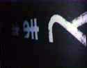
More work from the "Infinite Fill Show." Above: Kevin McGarry, NIN.gif (detail). In the lower part of this image, not shown here, the ninja is carrying a scythe like the Grim Reaper--is this some game character I don't know about?
Louisa Minkin, Blindspot (detail of watercolor).
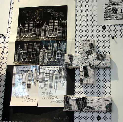
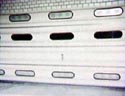
Jamie Arcangel did the New York City collage (in high school) and LoVid the patchwork plus and minus.
Jim Hamlyn, original .GIF, printed out for the "Infinite Fill Show." This image has been resized, the full image is here.
More about the show: Walter Robinson mistakenly describes the content in his Weekend Update column as "psychedelia and goth." Maybe he pasted in a paragraph from an old Whitney Biennial 2004 review by mistake? You have to stretch to find anything goth in the show, and psychedelia kind of implies color to most people these days, doesn't it? The keywords here are "Op Art" and "geek." Also, it's hard for me to imagine the phrase "eternal youth culture" coming out of the Foxy Production gallerists' mouth: who talks about shows that way? Besides, it's redundant, as I've argued on this page repeatedly: all of American culture is "eternal youth culture."
"Infinite Fill Show" installation view of collaboration: jimpunk (www.jimpunk.com) vs. tom moody, 2004, running on Netscape (slower than here, but it's fine that way, too). The gallery listed my and jimpunk's animated .GIFs as "URLs, not for sale" because I was too big a dork to burn them on a CD and demand several hundred thousand bucks for them. The small circles taped on the powerbook are checklist numbers.
Looks like there's going to be some national press for the show; I plan to keep posting about it, with more pictures coming, etc. This will be diary-style reportage, not criticism per se, since I'm obviously not detached.
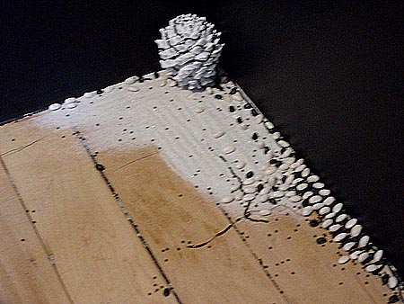
I went back to look at the "Infinite Fill Show" today and took some more pictures; I'll be putting them up gradually. This one came out blurry and I feel in all good conscience I should reshoot it, but I'm posting it anyway. It's an installation by Leif Ritchey, very easy to overlook down at your feet, in a corner. Yes, it's a zen rock garden with a black and white pine cone, beans, and raked sand, an elegant (but still somewhat lowbrow) counterpoint to all the digital brut up at eye-level. Ritchey's an analog guy, and I've been playing his video "Flatbush Windows" over and over and showing it to friends. I found it on the Nautical Almanac-related compilation Eyes of the Mind (which I've been meaning to write about--it's awesome). The video is as understated as this piece--grainy bits of one-step-removed footage shot off an awkwardly framed TV screen, depicting trees blowing in the wind, people walking up and down the sidewalk, clunky jump cuts of a pair of women's shoes (decorated with beads? I have to watch it again), with a soundtrack of jazz and quiet techno that's somewhat tinny, like it's wafting in from another room. The best kind of Cagean work, strangely gripping for being so ephemeral.
"The Infinite Fill Show" installation photos - thumbnails.
Press release (incl. artist list).
Critical pontification / more/ still more.
New York Times review (text) / (scan)
Time Out NY review
The exhibition opening was crowded but not too crowded and hot but not too hot. The work fell into two broad categories: things made with actual digital fill patterns (printouts, videos) and hand-crafted objects that mimicked fill patterns (paintings, drawings, needlepoints). Variations and exceptions abounded in this 90-some artist show. A nice touch was the silkscreen-printed dot matrix check pattern tacked up as background wallpaper--that (and the black and white color scheme) helped to unify everything. Overall, an amusing mix of lumpen craft and tech, politics and non-politics, the timeless and the topical (e.g., a tabloid cover of Martha in prison stripes). Paper Rad played a song in the hall and blew a fuse, which killed the gallery overhead lights but not the plugged-in laptops, TVs, or the strobe light. Enough daylight still came in to see the show. Kudos to Cory and Jamie Arcangel for packing the small gallery with nice stuff to look at.
UPDATE: More photos, showing the stunned and bemused opening night crowd (as opposed to my more severe photographic "statement") are at James Wagner's site.
WHY INFINITE FILL? WHY NOW? (SOME THEORIES)
Speaking of Infinite Fill patterns, an artist saw the image of mine below printed out in the studio and said something like "It's so old it's new again." That's actually kind of a bad reason to be working with these patterns and programs: what might be called the fleeting buzz of historicization. Two generational moments connected with an emerging technology are when you experience it in all its newness (especially in pimply adolescence), and when you encounter it nostalgically as a kind of "future past." The rubbing together of those two instants can throw off some sparks, but they're pretty meager to power a body of work, or a career. Better reasons for using old programs might be: (1) to access good effects that have been superseded or "improved" in newer programs, (2) as a way of clearly revealing the futuristic assumptions, mass production values, or plain bad aesthetics of existing programs (most of which are just tricked-up, bloated versions of the old ones), and (3) because less is more, as Kate Moss once said.
Below is the press release for the "Infinite Fill Show," opening Thurs., July 22 at Foxy Production in New York. The call for entries describing the project is here. I submitted three animated .GIFs, which I'm told will be shown on a laptop. The .GIFs themselves (including two of mine & a collaboration with jimpunk) are here; the html display page
Curated by Cory + Jamie Arcangel
Opening reception: Thursday, July 22, 6.00 - 8.30 pm
Dates: July 22 to August 19, 2004
Summer hours: Tuesday to Friday, 11.00 am - 6.00 pm
Foxy Production (547 WEST 27 ST. FL 6, NYC 10001 - TEL 212 239 2758) announces The Infinite Fill Show, a group exhibition of dazzling black and white patterns, curated by brother and sister team Cory and Jamie Arcangel. The exhibition includes new and historical, readymade and handcrafted works in a range of media.
The curators sent out an open call to artists for found or made objects which had to adhere to two basic rules: they must be black and white, and they must contain repeating patterns. The curatorial concept was inspired by MAC Paint, the 1984 software application with varied 16-bit monochrome patterning that could be picked and dropped into areas of the screen to denote color and depth. For Cory and Jamie Arcangel, this rudimentary precursor to Photoshop's draw and paint functions provides a creative tool to explore multiple perspectives within a unifying aesthetic.
The Infinite Fill Show, features over fifty artists, from high school students to internationally renowned artists, including: Lucas Ajemian + LLFS, Elyse Allen, Cory Arcangel, Jamie Arcangel, Maureen Arcangel, Steve Austin, Jimmy Baker + Matt Coors, Michael Bell-Smith, Marc LeBlanc, Orit Ben-Shitrit, Chris Bors, Sascha Braunig, Jonah Brucker-Cohen, James Buckhouse, Anthony Campuzano, Henry Chamberlain, Peter Coffin, Ryan Compton, Elisabeth Condon, Devon Costello, Jim Drain, Sarah Dunbar, Dragan Espenschied (with Sofia Aleinikova), Devin Flynn, Nello Gacuda, Joy Garnett, Tamara Gayer, Paul Gigolotti, Benjamin Godsill, Katherine Grayson, Sabrina Gschwandtner, Jim Hamlyn, Tamara Henderson (with Brent Wadden), Honeygun Labs, G.H. Hovagimyan, Akiko Ichikawa, Ketta Ioannidou, jimpunk + Tom Moody, Aya T. Kanai, Chris Kasper, Ori Kleiner, Paul Laster, LoVid, Noah Lyon, Kevin McGarry, Joe McKay, Erica Magrey, Frankie Martin, Jonte Martin, Jillian Mcdonald, Louisa Minkin, Justin Mitchell, Kyle Mock, Mombert, Tom Moody, MTAA, Josh Nimoy, David Noonan, Marisa Olsen, PAPER RAD, Marcin Ramocki, Scott Reeder, Tyson Reeder, Douglas Repetto, Leif Ritchey, RSG, Sterling Ruby, Justin Samson, Gregory J Scranton, Daniel Shiffman, Sistaz 4Ever, Paul Slocum, Renee So, Erika Somogyi, Nancy Smith, Oriane Stender, Kirsten Stoltmann, Jennifer Sullivan, Joshua W.F. Thomson, Cody Trepte, Van Arsdale High School Art Students, Andrew M.K. Warren, Ben Warwas, Andrew Jeffrey Wright.
UPDATES: A short report on the opening (with installation photos) is here (also links to other posts, criticism, etc.) The artist list above has been edited to conform to the exhibition checklist.