View current page
...more recent posts
From MTAA: PS1s website redesign sucks
How does PS1s web site bite? Let me count the ways rudely.Originally from MTAA Reference Resource, ReBlogged by francis on Mar 12, 2005 at 04:02 PM, Apologetic disclaimer removed by tom.
1. Splash page (need I say more?)
2. Cheese ball flash animation announcing GNY2005 [Greater New York is a kind of Whitney Biennial for New York artists, held at PS1 in Queens, the Museum of Modern Art's "alternative space." This is the second; the first, a perceived "career launcher," took place in 2000. --tm]
3. Evil pop-up from cheese ball flash animation announcing GNY2005
4. The artist list in the stupid pop-up from the cheese ball flash animation doesnt do anything! Yes you can rollover an artists name and it lights up, but a click does nothing!
5. The exhibition section just has the stinking press release? How about some friendly copy (and larger text). PLUS, the navigation of stinking press release is too small and too confusing (the page youre on should be highlighted not the page youre not on, duh!).
6. Why is there a press section when the exhibition section already has the press release? Oh, I see, so you could put a really big dumb graphic that says Press, Greater New York 2005, which clicks off to MOMAs site.
7. At least make the friggin top-left logo clickable back to the homepage for chrissakes! This has been web-site navigation convention from before the turn of the century!
8. It dont validate. (snigger, snigger) And its so fd up, it would be hard to figure out where to start.
9. Change your meta-tags now! NOW! NOW! NOW! (Its a shame to see the free and open-source Mambo put to such wicked uses.)
Ahhhh. That felt good.
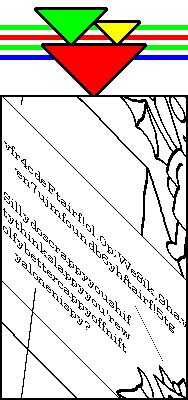
More imagery lifted (or re-lifted) from http://castlezzt.net, which Michael Bell-Smith found and which Paul Slocum describes as an "amazing mile long webzine thing" with the caveat that it's "probably not good for weak of computer or slow of internet." Go experience it yourself, it definitely poses a challenge to Abe Linkoln's complex net art diagram in the browser-busting department and is chockablock with interesting found (?) and concocted (?) imagery. (And did I mention that it's also juvenile and incoherent?) Rather than trying to recreate the experience here, I've just plucked out a couple of nuggets from the original maximalist context. Some nice new animations have recently been posted.