View current page
...more recent posts
Coincidences is a blog of photo criticism that refreshingly doesn't distinguish too much between "client" and non-commercial work (yes, I've griped here about ads but mainly when they're ruining my favorite songs; that's not to say interesting things can't be found in them). This post rounds up links on Southern shutterbug William Eggleston; a later post adds my reply to a Slate article where Jim Lewis proclaimed Eggleston's 1976 MOMA show "an annunciation of the coming of color." In a reply to my reply (in the comments to the Coincidences post), Stan Banos says:
Eggleston did "validate" color photography as an art form back in the day ('76). I remember it quite clearly. Here was this middle aged Southern guy hitting the photo scene like visual punk. Prior to him when color and "art" photography were mentioned, the usual work summoned forth was the droll, color pictorials of Ernst Haas. But just as the "English Invasion" was not just the Beatles, there was also the work of Sternfield and Shore (not a law firm). Goldin and Meisalis also pioneered and validated the use of color for photojournalism. And Meyerowitz was probably the most popular of the lot, and his lesser known color street work was every bit as mindboggling (if not as revolutionary) as Eggleston's.I don't doubt what Lewis called the "coming of color" was revelatory when so-called art photography was a grey, carefully controlled arena. My argument is that events outside the photo scene made that coming more inevitable than did the work of one man. But I wasn't there, as Banos obviously was, in the sense of being so involved with the scene as to be hit by a punk rock moment. I'd trust that gut impression more than Lewis's arguments, which just weren't very convincing (though I'm not sure Nan Goldin thinks of herself as a photojournalist). I still think the issue of the "validity" of color (i.e., whether it was important for photo departments to collect) diminishes in importance when you pull the lens back to view the entire visual (commercial art, conceptual art) picture.
 |
|
|  |
 |
|
|  |
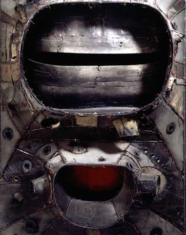
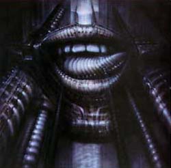
Donald Judd gave Bontecou an early critical nod, as practically every article about her reminds us, but her work is completely at odds with his minimal aesthetic. She started out in the assemblage camp, just as he did, but while he gradually shed more "stuff" from his art, she kept working with materials from the scrap heap, and worse to minimalist sensibilities, used it to make a kind of sculptural abstract expressionism. One oohs and ahs at her craftsmanship but the work comes off strangely inert in person; the Giger-esque vaginas dentata are overwrought and corny. In the early 70s she made vacuformed plastic objects somewhat reminiscent of the forms in Judy Chicago's biomorphic airbrush art--those were actually kind of good.
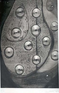
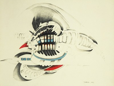 (The story is she "turned away from the art world" at this time, but it's possible her career as a crypto-feminist surrealist abstractionist was going to jump the shark when she started making plastic fish suspended from the ceiling with monofilament--maybe the turning away was pre-emptive?) Lately she's looking more like Roger Dean of Yes LP cover fame, making Metal Hurlant/Hobbit Rock spaceship thingies that hang from the ceiling and resemble hypertrophied sea urchins. Some of this is good (and slightly off-topic, I happen to know the above-mentioned Alex Ross is a Dean fan, though more rigorously abstract overall--Dean's is still the cult that dare not speak its name in the fanboy-averse art world, regardless of the fact that his architecture is now getting some acclaim). The tepid copper, teal and, alabaster color schemes of Bontecou's "spaceships" are a turnoff, though. The bolder colors in her drawing above--or no color--would have been more satisfying.
Dan at Iconoduel recently summarized a book by James Elkins titled "What Happened to Art Criticism?" While it is mostly fair in assessing the sources and limitations of criticism, Elkins gives short shrift to artists as originators of art world concepts, vocabularies, and judgments; in fact he gives them no shrift. He compares scholars who dispassionately critique critiques (in the field known as "reception history") to entomologists observing ant battles, with no stake at all in the outcome. And that's pretty much how he deals with artists--as people to write about but rarely read. So to Elkins' laundry list of critical sources (cultural history, philosophy, academic treatises, poetic criticism, etc.) I propose adding another: artist polemics.
Reviews, manifestos, transcribed panel discussions, artist's statements, press releases, interviews, studio talk, letters, emails, blog entries, slides, jpegs, Quicktime movies, chat room dialogue by artists: those are the engines that drive theory and judgment in the art world (electronic media being new components, obviously). Art writers who aren't also artists do participate, internalize concepts, write them up in a more dignified or cohesive or exciting way, maybe even put a new, brilliant spin on them, but their efforts will always be secondary to the main enterprise of artist-generated discourse, which necessarily includes criticism.
I think it was philosopher and former printmaker Arthur Danto who said artists don't make good critics because they're too focused, tunnel-vision-like, on their own practice (Elkins doesn't even give them that). Spoken like a true ex-artist! Donald Judd, Robert Smithson, Barnett Newman, Adrian Piper, Robert Motherwell, Art & Language, Joseph Kosuth, Barbara Kruger, Peter Halley (I could keep going) may not be the best writers or talkers in the world, but indisputably they catalyze, they content-provide, they know their history, and they judge. Clement Greenberg learned about flatness, color, push and pull and the rest of it from hanging out with artists, notably Hans Hoffman in the early days. Elkins writes as if Clem invented all his terminology himself.
Elkins devotes much ink to a weird distinction between Michael Fried and Jerry Saltz on the subject of whether critics should "take a position" when criticizing. Back in the day, the actual dialogue between Fried and an artist, Robert Smithson, on an actual position, Minimalism, was far more interesting. The only artist I can recall Elkins quoting at length is Andrea Fraser, and she is amazingly articulate. Possibly Elkins has a bone to pick with uppity artists, complaining early on that one changed what he wrote about her in a catalog essay. Deleting his word ("sad") without telling him was indisputably bad manners, but Elkins should have been more humble about his role as a catalog scribe, which is to help nail down the artist's vision as a kind of first draft of art history.
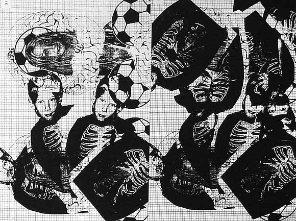
Ryan Compton, Mathematics of Composition (Brains and Grid), silkscreen, 2004, 17.5 X 22.5 inches, from "The Infinite Fill Show." "Compton invests what Leo Steinberg called the 'flatbed picture plane' of Rauschenberg and Warhol with the almost perceptible audial tint of a feeding-back electric guitar dropped from a considerable height." --October magazine (just kidding, I made that up). I believe that's Britney Spears posed like the Virgin Mary over the soccer ball and the brains.
Simon Reynolds on Beats as Fonts
The analogy that struck me was fonts. If your classic rock drum sound is something like Baskerville or Times New Roman, then the drums in the Belgian stuff or early Eurohouse or The KLF is perhaps equivalent to Arial or Lucida Console or something of that ilk: streamlined, almost-naturalistic, with a hint of futurity and this-is-the-modern-world. But like your classic rock drum sound, the beat/font doesnt really draw attention to itself, its functional--rhythm as division of time. Pure information. Of course rock drum sound hasnt always been like that--think of psychedelias effects-laden beats: the billowing, phased drum-rolls on The Small Faces "Itchycoo Park" being equivalent perhaps to the trippy typography on all those Fillmore Ballroom posters for bands like Sopwith Camel and Jefferson Airplane, woogly and pendulous to the point of illegibility.
Looksmart's FindArticles is putting old art magazine articles online; from the blowing my own horn department, I offer the following links:
Frances Colpitt's Art in America piece on abstract painting in Texas, which discusses an interesting scene we had going there in '94-'95 (continuing to this day even though several painters moved to NY). Also discussed besides yours truly are John Pomara, Aaron Parazette, David Szafranski, Jeff Elrod, Giovanni Garcia-Fenech, and others. It's amusing to read her description of Elrod's (then) slacker paintings of Atari game imagery, since he eventually became a somewhat stylish reifier of vector flotsam. (Boy, there's an article; I wonder who will write it?)
My Artforum review of the French (Corsican) artist Ange Leccia's solo at the Contemporary Arts Museum (CAM) in Houston. I described this big-scale Fluxo-conceptualist's entire show based on how it compared to various strains of abstract painting, using commodity art as a straw man. The show was good, but in retrospect I'd say it was a meditative climb-down from the work that got him known--the curious conceit of doing ephemeral Yoko Ono gestures with massive heavy-industry-produced technology.
From my first year of New York Artforum reviews, a piece on Barbara Gallucci: a 1996 show that Roberta Refused to Touch. Well, I remember she did a big roundup of hot new Soho galleries that month and managed not to mention Lauren Wittels' space, which was definitely hot at the time. There was some personal back story associated with the exhibit that I was definitely aware of, but I chose to review it with a "cold" interpretation.
 |
|
UPDATE: A large-ish image (750 x 1000) of Joe McKay's piece has been added and linked to in the post where it's discussed.