View current page
31 matchs for uee:
A few posts back a "wandering POV of a wandering POV" was discussed--a shaky, panning YouTube video documenting Linda Post's shaky, panning video perambulation through a cornfield. Here's another variation (thx AFC): John Michael Boling's YouTube of a video panning along a block of strip malls. The standard YouTube screen framing the action scrolls slowly from right to left using the "marquee" browser command, making its position on your screen in constant "slow and go" tension with the position of the camera's viewfinder. The video's continuous "tracking shot" is roughly panoramic, whereas the YT starts over at your screen's right as soon as it reaches the left side, creating what feels at times like an impossible folded space.
In both scenarios (James Kalm's Linda Post video isn't a piece per se but an inevitable meta extension of the Post), recursiveness is the watchword, in form (a picture within a picture) and in content: Post's video references cornfield tracking shots (from North by Northwest to Children of the Corn) and Boling's obliquely channels Ed Ruscha's Every Building on the Sunset Strip.
If we had an Adorno he might say such dual recursiveness is a distinguishing feature of 21st Century art, or at the very least Web 2.0 art.
YouTube of Ryuichi Sakamoto and his wife Akiko Yano playing an old YMO standard together at the piano. Back in the day I couldn't get my sophisticated record collecting friends interested in YMO or Sakamoto. They just couldn't go there. I'm glad to see that people are still discovering them/him through the Net or what have you. [/self pitying reminiscence]
What I'm listening to now: Barbara Morgenstern. The Grass Is Always Greener, Nichts Muss, Fjorden are the ones I've heard. Kind of Slapp Happy-era Dagmar Krause meets To Rococo Rot but an original songwriter as interested in texture as tonality. The "transposition queen"--you never know where her key and chord changes within a song are going to take you, but it's not meandering, it's completely focused and intentional. Lyrics in English and German, alternating.
Reenacting the Unenacted?
About The MusterA friend attended this event and said it was ridiculous. Semi-diverse clumps of artists standing around looking clueless, waiting for some leadership or an idea to emerge, with no common purpose except the need to be "seen" and the vague desire to "help out." Reenaction is an interesting social phenomenon--so what? "What are you fighting for?" is a "When did you stop beating your wife?"-style question, in that it assumes you are fighting and the questioner doesn't know why, and one should have the good sense not to answer it, thus saving yourself becoming fodder for a coffee table book. Perhaps one purpose the mustering served was to parody the Iraq war protest marches of '03, where every leftist "cause" under the sun was represented and the participants were so busy working on their funny signs and costumes they forgot what was needed--a grim unified front, hundreds of thousands strong, to stop the coming senseless slaughter. Somehow parody doesn't seem like the idea behind "The Muster," though.
On May the 14th, 2005, artist Allison Smith transformed Governors Island the former U.S. military base located only minutes by ferry from the southern shore of Manhattan into a stage for an unforgettable work of public art, commissioned by the Public Art Fund. Inspired by American Civil War battle reenactments, The Muster was a "polyphonic marshalling of voices" in which Smith invited artists and non-artists alike to declare a cause and create a campsite-installation in response to her question: "What are you fighting for?" Combining celebration, art, craft, history and activism, this earnest and jubilant event embodied the complexities of its political, aesthetic, and cultural moment.
Allison Smith is a New York-based artist, whose diverse practice investigates the cultural phenomenon of historical reenactment, or living history, using it as a means of addressing the relationship between American history, social activism, craft, and queer identity. Her work has recently been seen in exhibitions at Artpace San Antonio; Palais de Tokyo, Paris; Andy Warhol Museum, Pittsburgh; P.S. 1 Contemporary Art Center, New York; and elsewhere.
Produced with the inimitable flair of the ever-talented graphic designer Jorge Colombo, this book documents the Muster and places it within broader contexts. Included are more than 140 photographs, a foreword by Susan K. Freedman, President of the Public Art Fund, and essays by Tom Eccles, curator of the project and director of the Bard Center for Curatorial Studies, James Trainor, US editor for Frieze, Anne Wehr, Communications Director for the Public Art Fund, and "Mustering Officer" Allison Smith.
Baby Sloth [YouTube]
Unrelated to baby sloths: I was recently invited by another blog to do some critical writing for it. I was flattered by the request but replied that I was mainly focused on my own art and music and wasn't really doing reviewing outside my own domain. (My FAQ page sort of explains why--art world damage.) I said I was happy to have anything on this page reblogged, so it wasn't really a no. The person who emailed definitely took it as a "no," though. There is much good writing about art on the Net (as well as crap) that's yours for the asking--I don't know why it should have to "originate" on the site that publishes it. What's wrong with a collage of writing? Kathy Acker-like. Some blog items don't get picked up because they're too "controversial" (woo, scary). I appreciate someone "having my back" occasionally, as they say in the Army, when I go out on a limb and...express an opinion. Paddy Johnson could probably use a pat for daring to... have guts. (She called Queen Roberta a bad writer! No one in the New York art world ever stands up to the Queen and Jer.)
2001 [counter-directional arrows] 2006
Jason Kottke: "Nasty Nets used CSS positioning to 'embed' one YouTube video into another. 'Be sure to hit "play" on both YouTubes.' Reminds me of the animated GIF mashups (link)."
Hello, content? Who cares about CSS positioning?
As Theodor Adorno described the work: "An exquisite and in some ways exquisitely awful play of symmetries. The 1968 'state of the art' trip sequence from 2001: A Space Odyssey, its widescreen magnificence reduced to YouTube size, serves as a continuously running background to a smaller YouTube nested within its boundaries. The foreground film consists of a simple but somewhat relentless montage of photos made by teenagers playing with basic iPhoto effects, while Queen chugs along on the soundtrack.
"The split screen, mirror image appears in both foreground and background: one limns a cleavage in space-time, expansive, landscape-embracing, the other barrages the viewer with portrait grotesqueries, cartoonish Francis Bacon-like horrors caused by flipping selected facial features. Yet there are 'crossover points' where the faces widen and flatten into topographic arrays and the Kubrick film jumps to contorted portrait closeups of Keir Dullea's agonized face.
"The background clip has pretentions to high culture with its doom-laden Ligeti score and references to Modernist abstraction yet it is ultimately still a mass market popcorn movie. The teens' use of iPhoto exploits the most readily available computer imaging gimmicks such as 'spherizing' but is actually superior in its quick, intuitive sense of play to the ponderous 'high art' uses of the exact same tools by artists such as Lucas Samaras. As above so below, art mirrors the street and vice versa."
Update: I changed the title of this post because it was fuX0ring my RSS feed. I really, really, really hate the inflexibility of RSS and wish people would just bookmark me like in the old days.
The following exchange appeared in Houston's online magazine GlassTire back in 2001:
Tire Iron #6 3/15/2001
Inman Gallery
by Bill Davenport
I confess: I myself show at Inman Gallery, so if you feel that this invalidates my opinion of other work shown there, you can stop reading now.
John Pomara's glossy enameled panels are competent, affectless, impersonal. In the past I have used the phrase "toxic pond sludge" (I meant that in a good way) to describe Pomara's abstractions, but these new works at Inman gallery are cleaner. The panels are either black or white; the black ones suggesting nighttime landscapes, time-lapse photographs of headlights on a rain-slick city street. The proportions of the white panels suggest sheets of milky paper, squeegeed into horizontal zips like writing.
In both cases, the vertical orientation of the panel counteracts the horizontal stretch of the painting. Compare these works to Barnet Newman's: if Newman's vertical zips are the figure reduced to its essential gravity-defying assertion of existence, Pomara's horizontal streaks are the equivalent distillation of landscape, stretching flat and sliding sideways at high speed.
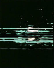
John Pomara, Pipeline, 2000
oil enamel on aluminum, 30 x 24 inches
Although they are emphatically about the glossy deliciousness of industrial paint, Pomara's works don't feel like paintings. Their exposed edges show that each is a thin sheet of aluminum laminated to birch plywood. The panels seem manufactured, not painted: the result of the impersonal operation of chance and technique.
The odd, syncopated hanging of the show does a lot for the work; irregular intervals between the panels make them into a sort of Morse code: intermittent, static-laden signals on the information superhighway. In the entranceway, a large black panel is hung next to a similar small one, upsetting one's expectations of typical gallery-style installation. The two panels have an odd relationship: a large and small version of the same thing, or possibly one close-up and one far away.
A discussion of Pomara's work is incomplete without referencing the very similar works of Houston artist Tad Griffin, Pomara's former student. Their co-existence is an opportunity to make subtle comparisons that highlight nuances of both artists' works, which are usually submerged. Here we are comparing, not pears and oranges, but Bosc vs. Bartlett. Both Griffin and Pomara swipe intermittent stripes of black and white paint across aluminum panels. Pomara's recent works are more pictorial: his streaks condense at the middle of the panel to imply depth, demarcating foreground, middle, and background; Griffin's all-over patterns are a depthless skin stretched across the surface of his paintings. Griffin's intervals are regular, but not mechanical; he is a man imitating a machine. Pomara's irregular compositions of stripes and gaps are the opposite: a painter using mechanical techniques to depersonalize his pictures. If we can collect one or two more Texas squeegee painters we'd have a school!
Response to Tire Iron #6 3/15/2001 [Update: this comment has gone missing from Glasstire but I saved it here]
Bill Davenport makes some good points about John Pomara's work. I have a couple of quibbles, and a thing or two to add. First, when I read that something is "competent, affectless, and impersonal," my first question is, why? I wish Davenport had gone more into the reasons a painter might deliberately work that way. My own theory is that many painters are still drawn to "the gesture," an unplanned, frequently exhilirating way of generating visual information, but are sick of the romantic action-painter myth left over from the '50s. The use of squeegees — or in Pomara's case, customized painter's shields — to blur and scrape away paint is a way of literally eradicating the gesture, but also adding another exciting, randomizing variable in the creation of a picture.
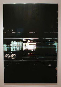
John Pomara, On Line, 2000
oil enamel on aluminum, 72 x 48 inches
This new variable suggests fresh content: the "impersonality" and "affectlessness" of the times, yes, but also a reference to the new visual landscape given to us by technology — "intermittent, static-laden signals on the information superhighway," as Davenport nicely puts it. There are plenty of interesting artists working in this territory: Stephen Ellis, John Zinsser, Bill Komoski, Shirley Kaneda, Mark Sheinkman, William Wood, Carl Fudge, Rochelle Feinstein, to name a few. Instead of the somewhat belittling "squeegee school," a better term would be mediated abstraction, referring to media in both the material and communications sense. This is an international tendency among painters, which both Pomara and Griffin are aware of and plugged into. And which, I might add, Pomara continues to work and evolve in. If we must compare Pomara and Griffin, a better job could be done. "Griffin is a man imitating a machine," Davenport says, while Pomara is "a painter using mechanical techniques to depersonalize his pictures." Isn't that a distinction without a difference? I'd say Pomara, with his succulent surfaces and all-too-human imperfections, is a man imitating a machine, while Griffin, with his high-polished control of every millimeter of a picture, is more like a machine imitating a man. (And I mean that in a good way.) - Tom Moody, New York
My reply has been edited slightly for punctuation and syntax. Some newer work by Pomara is referenced here. Earlier posts on him are here and here. With five and a half years' hindsight, I'd say that almost none of the painters mentioned in my reply represents much of a viable school any longer, except Pomara, who is busy morphing it into something else. Those *were* artists imitating machines, or a machine look, and little besides--that was probably not a good phrase to apply to him, because he's actually thinking below the surface of the computer, using processes of creative decomposition with imaging software to develop a new "pixelesque" iconography. His work belongs in the new media dialogue--painting is just a part of it.
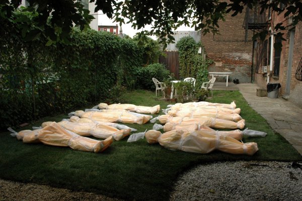
Above: Susan C. Dessel, Our Backyard, A Cautionary Tale, photo by James Wagner, from the exhibition "Dangling Between the Real Thing and the Sign in the Window" at Dam Stuhltrager, Brooklyn, NY, through November 13, curated by Wagner and Barry Hoggard.
Acknowledging that the Iraq war "may not be popular with the public," Dick Cheney says that it "doesn't matter in the sense that we have to continue the mission and do what we think is right." He speaks clinically because so far, only the families of soldiers have been affected and the majority of Americans aren't "feeling the war" except through fleeting, carefully controlled images on TV. The work above is a protest piece, icy in its own way as Cheney's statements. The bodies, or lumps shaped like bodies, are wrapped in plastic as if tagged for the morgue, and arranged in neat rows. Their placement in this verdant courtyard is doubly incongruous, since the courtyard itself is fairly out of place in a gritty Williamsburg block near the Brooklyn-Queens Expressway (the yard sits behind the gallery, out of view of the street). What might be a fairly common sight in Baghdad these days looks beamed down from space in Brooklyn--for now. The photo is good but you need to see the work in person. It really hits you. Goddamit, we didn't do enough to stop the meaningless retaliatory slaughter by this, our supposed democracy.
Inside the gallery, the mood swings back and forth between the dire and the ebullient. A little Joy Garnett painting of a fireman's ladder surrounded by an uncontrolled blaze captures a random, but sadly all-too-familiar moment of urban chaos with flailing gestures of orange. Jacques Louis Vidal's pixelated digital photocollage on Duratrans depicts a pyrotechnic insanitarium in both senses of that term: the actual archaic nickname for Coney Island and a Mark Dery-esque, meth-shooting evangelical quasi-culture gone berserk. (I wish my camera's "memory stick" hadn't chosen today to break--I had a good photo.) I also liked Ina Diane Archer's Jazz Age, Deco film credits excerpted from her video "The Lincoln Film Conspiracy," conjuring an alternate-universe African American Hollywood studio with its slick production Black Ants in Your Pants 1926, starring the artist herself in various guises as well as Sun Ra as "Dr. Cosmos." And Nicolas Garait brings us back to the Middle East with his video installation "28 Months," an abstract montage of 8mm film and found sound evoking Algeria during the 1954-1962 War of Independence, as if seen through a haze of smoke and imperialist propaganda. Lots to like (and worry about) in this show.
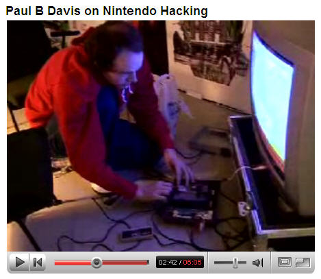
YouTube: "Produced by Hit 'n' Run [for Dutch television], this interview took place with Paul B. Davis from the BEIGE collective at the 35th International Film Festival Rotterdam. Paul exhibited a piece at the exhibition 'Satellite of Love' produced by Exploding Television. Here he talks about his Nintendo Cartridge Hacking."
Davis' delivery is very dry and funny in this video, and he has some great things to say. He and fellow artist Cory Arcangel, through their work with the BEIGE collective, have both been active proponents of busting open game cartridges and reprogramming the chips (though perhaps in a less aggressively activist way today than a few years ago--but that's another post). While gaygamer.net calls Mary Flanagan the "secret heart" of the movie 8 BIT, I don't really agree with that. (As mentioned earlier, Kristin Lucas's work would have been a catchier example in the film to show the psychological effects of life in a high-speed technological world--her late '90s videos incorporating game and sci-fi tropes are at once disturbing, aesthetically engaging, "lo fi," and presaged many themes of what might now be called the 8 BIT movement.)
No, if the movie has a secret heart, it's why Arcangel and Davis, who used the phrase "8 Bit" in an LP title five years ago and are sort of the poster children for the current scene, started hacking Nintendo cartridges in the first place. Davis was always the more political of the pair in how he speaks about it, but he makes an interesting point in this YouTube vid: that untapped aesthetic potential exists in everyday gear that is meant to be inaccessible to us. As he describes it, the "cheapest, highest quality audio and video generation system you could get" is locked up in a proprietary system that mostly sits in your closet. Although its hardware and software constitute a complete or "general purpose" computer, it only does one thing, which is play this one particular brand of game.
This is what I would call the "ecological" argument--a wry complaint addressed to the consumerist waste that is the bedrock of our capitalist system and represents a condition that simply will not go on forever, as resources dry up and the planet turns into a sewer. To some extent the 8-bit scene gives a glimpse of artists we will have after the Fall: patterned on archetypes like Gilligan's Island's Professor or Escape from New York's Brain, they will squeeze "energy dependent culture" out of a diminishing stock of manufactured products. Yet the BEIGE crew is doing it now, while we're still awash in plentiful, working consumer electronics. Their suggestion that "anyone can hack cartridges" also recalls Robert Pirsig's '70s self help book Zen and the Art of Motorcycle Maintenance, which argued for people taking back some control in their technologically dependent lives. Of course, the BEIGE work is goofy and fun, too--it's not as Earth First!-y or New Age as I'm making it sound. Here is an excerpt from an early manifesto, written by Davis; it would have been nice to hear more of this in 8 BIT:
Bereft of a veneer, interaction with such complicated machinery requires a significant amount of technological knowledge and awareness. In this spirit, "Fat Bits" represents a step towards what Cory and I describe as "Post-Data". We create computer art which is aesthetically aware of both its own identity and the underlying process which supports it - that is to say it recognizes the fundamental prototype of the "computer", and not the "software", as the tool and medium. The content for "Fat Bits", video of a NHL hockey fight, was chosen because the close-up nature of its imagery makes for convenient replication on low-resolution systems such as the Nintendo Entertainment System. The use of the Nintendo Entertainment System is itself important because it, firstly, signifies an artistic "re-licensing" of proprietary corporate technology and, secondly, refutes Nintendo's forced obsolescence profit structure which defines it as "outdated" (the Nintendo Entertainment System was introduced to the US home video game market in 1986). Our primary foundation of Post Data is then this: the conscious corruption of data, the releasing of bits from their imprisonment within the restrictive, limiting boundaries of corporate software applications, and the exploitation of the extreme complexity of computer systems paired with the extreme intentionality of artist(s) who seek to engage the computing process at a fundamental level.
Every couple of weeks the art and technology website Eyebeam reBlog invites a guest reBlogger to act as a combination curator, editor, and DJ, surfing and reposting noteworthy material from blog feeds. Paddy Johnson criticizes the tendency of the reBloggers of late to rely too much on known "tech news" sites (Make, Boingboing, et al) for recycled material. I agree with her, but then I would, because the practice violates my own self-declared "rules for reBlogging," posted at the end of my gig there in '04.
Generally speaking, there are entirely too many stories in the category Michael Bell-Smith calls Talking Refrigerators.
These are whimsical items about some engineering marvel, usually from a college robotics department or venture capital startup, that are at best consumerist PR and at worst the kind of ridiculous '50s gee whiz utopianism that we all should know by now has a down side and a dark side (just thinking of that nightvision video clip of the helicopter gunner blasting a wounded Iraqi soldier to hamburger--"squeeze the joystick, instant no soldier!").
Case in point: a recently reBlogged item offers a clip from a local news station about an alarm clock that rolls off your nightstand, forcing you to chase it across the floor until you wake up. Hey, that same fuzzy gear could be repurposed to make "rolling landmines" that follow you around till they blow your legs off! Less fluff, more stories about the world we live in I guess is what I'm hoping for.
And from the not-biting-the-hand-too-hard-that-feeds-me department, thanks to L.N.R., George Hotelling, Angus Galloway, Perry Lowe, Huong Ngo, Evan Roth, and David Jacobs for reBlogging me this year--you guys rule!
I have been wanting to eat at wd~50 for a while now, since the chef is a friend of friends and I've been hearing so much about the place. This past Thursday, as a sort of belated birthday present to myself, I went, and wow. The chef, Wylie Dufresne, is celebrated for adventurous and artistic cuisine: I missed his appearance on Iron Chef America but as a sometime watcher of the show I know the culinary experts who get invited don't screw around.
His restaurant, at 50 Clinton Street on the Lower East Side, is spacious and comfortable. I went with a party of six and we did the ten-course tasting menu. The staff brings a succession of very small, elegant dishes to the table, and Wylie's father Dewey drops by to discourse knowledgeably on the different wines you're drinking. The experience is folksy and unpretentious even though the food and drink is so ultra-refined it could be caricatured, say, in a Cohn brothers movie. (For some reason I'm thinking of Maude Lebowsky.)
Just a few examples from the tasting. The first dish out is a fig in a perfect cube shape with a slice of anchovy balancing on top. Awesome to look at and a mind-bending combo of flavors. More geometry came in the form of a smooth cylinder of foie gras (yeah I know, tortured ducks--I don't feel good about it), which breaks open to reveal a liquid center with some kind of oozy beet concoction. The taste resided somewhere between Satori and Nirvana. A bowl of fishy consomme with a hint of chocolate (!) came with a tiny squeeze bottle, complete with orange cap like Elmer's. You squeeze thin ropes of yogurt, thickened with some kind of space age enzymes into the broth. A little weird, and the fish and cocoa combo I found discordant, but a lot of great art is offputting. Many of the dishes come on beds of shavings the waiter described as "soil," as in "pea soil" or "chocolate soil," and the small dabs and smears of sauces on the plates jazz up the views and tastes.
Not a place for starving artists, but every artist should save up some money for a once in a lifetime trip. Simply amazing on every level.
In case you haven't seen the love letter Scooter ("Biff") Libby wrote to Judith ("Queen of All Iraq") Miller, here's the last paragraph. The typographical equivalent of vomiting will follow. Here's what one mass killler (and published novelist) says to another mass killer (with a book deal):
You went to jail in the summer. It is fall now. You have stories to cover--Iraqi elections and suicide bombers, biological threats and the Iranian nuclear program. Out West, where you vacation, the aspens will be turning. They turn in clusters, because their roots connect them. Come back to work--and life. Until then, you will remain in my thoughts and prayers. With admiration, Scooter Libby.This is childish, but bleeeeaaaaagggghhhhh. Wasn't Saddam Hussein also supposed to be some kind of novelist? Here's hoping Biff goes to the Big House, just for writing that paragraph. Jane Hamsher, posting on Digby's blog, has more on what sort of coded info was being communicated in the non-mash-note part of the letter. Haven't been following the Plamegate minutiae to this extent, but it's pretty clear that navigating the twists and turns of the investigation is how we're processing the terrible crime of the Iraq war, because the Democrats are too complicit to have a real debate about it. The aspens can't turn soon enough for me.
Art in America-recommended blogger James Wagner recently discovered that the Museum of Modern Art subsidiary PS1, a so-called alternate space in Queens, doesn't allow photo-taking of the "Greater New York 2005" exhibit! Man, considering the critical hatred-shading-to-indifference that show received, you'd think they'd want all the publicity they could get. A "no photo" policy benefits MOMA because its art is high-dollar intellectual property that pays dividends in the gift shop--can't have folks thinking this work belongs to everyone with the unfortunate consequence that Jay Bob sells Starry Night T-shirts in Springfield MO based on his digital camera pictures of same.
But an "alternate space" has a different mission, which is to introduce new, difficult, and/or undiscovered talent to the world. Or in this case, new, difficult, and/or undiscovered talent repped by major Chelsea galleries. One way you do this is by encouraging photographers and citizen-journalists to spread the word far and wide with as many visual aids as they can possibly publish.
Anyway, Wagner has a great idea, which is to post artists' sketches on his blog of works in the show. So far he's only gotten one, and it's not loading in my browser at the moment, but I think I'll mosey over to PS1 and do a drawing, as an act of protest of the image blackout and because the editorial thought-process of deciding what to draw appeals. My prediction is most artists won't want to do this, because so many are, let's be frank, geniuses, who have been told they must patiently wait their turn for institutional recognition: "playas" don't sketch other playas' work. * Fine, be a good vassal, I'm gonna go have me some fun.
*Also 'cause it's hard to use that internet thingie.
I got to see some of Paul McCarthy's early work--which I've always been mildly curious about--at the Haus Der Kunst in Munich this week. Unlike US art institutions, which filter art for the delicate sensibilities of small children, Victorian grandmothers, and Newt Gingrich, European museums don't protect viewers from the sight of icky penises and soiled butt cheeks. Like Charles Ray, who we mostly think of now as a conceptual sculptor, McCarthy comes from the late 60s/early 70s performance art-meets-black and white documentary photo tradition, which famously produced Chris Burden, Vito Acconci, et al. The earliest McCarthy works on view were Earth art-style pieces such as "Rolling a Bowling Ball Down a Mountain" and "Flying From Salt Lake City to LA," documented with rigorous photo grids. Later, McCarthy entered the body art canon with the performances "Painting Lines on the Wall Using My Face and One Shoulder" and "Plastering My Head and One Arm into the Wall." (All titles are approximate.)
By the mid 70s, he had snapped and begun producing his signature work, which could be succinctly described as "Writhing Around Half Naked in Meat and Assorted Condiments." The actual title of his breakthrough video is Sailor's Meat/Sailor's Delight, 1974, which Paper Magazine describes thusly:
...McCarthy donned a pair of woman's see-through panties, blue eye shadow and a blonde wig and proceeded to straddle a queen-sized bed smothered in raw hamburger meat and catsup. From there he went on to rub raw flesh across his chest and penis, mimic sexual intercourse with a jar of mayonnaise and a makeshift phallus, and urinate on a piece of sausage before shoving it down his throat. If that weren't enough, he ended the piece by smashing a bottle on the floor and walking barefoot on the shards of glass.I watched most of this vid at the Haus Der Kunst, sitting on a seat in the main gallery with all this kinky sexual imagery right out there in plain view. There were no furtive darkened rooms for creepy behavior as in the US, but headphones did protect the other museumgoers from McCarthy's disturbing grunts and Deliverance-like squeals. Damn, the early 70s were an interestingly depraved time, partly owing to the end of the sexual revolution that conservatives are always complaining about, partly because the median age of the US population was about 22 and cranky oldsters were not allowed to run the show, as they do now. John Waters had the jump on McCarthy by several years for the filming of antisocial, antipodean behavior--check out the "rosary job" in Multiple Maniacs (1970) to see how far courageous filmmakers won't go now. The main difference was Waters hadn't entered the art world yet--McCarthy's work came out of a fairly disciplined, non-theatrical tradition of testing visual boundaries. Lack of pacing and production values were built into this type of video. Not sure what my point is here, except to say that to the extent LA wants to claim McCarthy as some kind of art world response to the film industry, there were far more maverick filmmakers anticipating what he did.
The Haus Der Kunst featured recent video and sculpture by McCarthy, much of it centered around a lunatic inversion of Disney's "Pirates of the Caribbean" theme park ride. The screaming, pissing, and rolling in Hershey's syrup is a group romp these days, with larger budgets and casts. I like the artist's later work OK, probably more so in a public context, in Europe, than at Luhring Augustine, where the faux-tony exclusiveness of the Chelsea gallery environment tends to suck all life out of art. Stlll, it's fascinating to see how artists got where they got--to experience the original jarring moments that made their reputations, as opposed to the professional, institutionally-supported continuation of those moments.
Currently reading a short story collection called The Ultimate Cyberpunk (2002); evidently it's part of a The Ultimate... series, hence the horrible name. It has fallen to the hapless Pat Cadigan ("Queen of Cyberpunk") to assemble this material and despite a bland introduction in which she does nothing to explain the history of the movement or compare her choices, the stories are pretty good (so far--I'm about halfway through).
Alfred Bester's "Fondly Fahrenheit" is a natural prototype, using the now-familiar Hollywood trope of a serial killer moving from city to city (probably a lot more shocking in '54), the twist(s) being that the killer(s) are an android and his human master who have become so psychically entwined that the reader is never entirely sure who's doing the butchering. Whenever the artificial human starts to go funny he sings a tune from the turn of the last century ("Oh it's no feat to beat the heat. All reet! All reet! So jeet your seat/Be fleet be fleet/Cool and discreet/Honey...") Very creepy, but definitely all reet.
Cordwainer Smith's "The Game of Rat and Dragon" initially surprises as a choice with its space opera setting, but damned if more foundations aren't being laid: in order for ships to traverse the stars, humans merge minds to combat murderous dragons lurking in the depths of planoformed spacetime, using an electronic device called a pin-set. The story hook is that the pinlighters also partner telepathically with domestic cats, who see the dragons as rats and are much more effective than humans alone at annihilating them back. I like this tale but blanch that it's basically an extended love letter from a writer to his kitty, and wish Cadigan had included Smith's "Scanners Live in Vain," one of the greatest cyborg stories ever written, instead.
Philip K. Dick's "We Can Remember It For You Wholesale" served as the bare bones of the Gropenfuhrer vehicle Total Recall, and I mean bare bones. Typical Hollywood move, Douglas Quaid was originally Quail--so much less manly except the character is supposed to be a dweeb. James Tiptree, Jr.'s "The Girl Who Was Plugged In" is unreadable, marred by the breezily hip, drunk-on-the-elixir-that-was-the-60s style so prevalent in New Wave sf around '72-'73 (see also Norman Spinrad, John Brunner, RA Lafferty). Having not read Tiptree I wanted to like the story since we now know "he" is a woman, Alice Sheldon, and many were pissed off back in the day by her "deception," which is cool, but had to skip this after a page or two. By pure contrast, Wm Gibson's "Burning Chrome" hasn't aged a day since '82 and is lit'rary but much more sparingly written. Also looking forward to re-reading his "Dogfight," written with Michael Swanwick, another story about cybercowboys and the women they neglect...
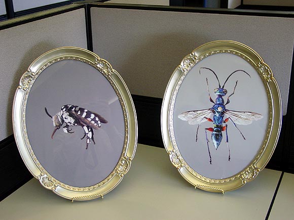
A few more installation shots from the ART@><*WORK (cubicle) show, in addition to my earlier ones and the ones Chris Ashley took. Top to bottom: Tony Luib's tribute to latex office supplies, including an abundance of what I call thumb condoms (used for flipping pages); an assortment of Michelle Rosenberg's "office supplies converted to bellows" (squeeze them and weird game calls inside squawk and chirp); Irene Moon's entomology thesis photos (excuse my lame reflection in the shot).


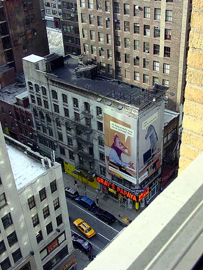
And lastly, a view out the window of 520 8th Avenue, Suite 1602.
Announcing the "Thomas Gradgrind Award"
This week's Gradgrind goes to Michael Kimmelman of the New York Times, for the last paragraph of his "Greater New York 2005" review:
It's good, in this context, to find a selection of Steve Mumford's painted dispatches from Iraq, plainspoken journalistic pictures of a throwback kind. They announce a mature artist looking closely at what is urgently unfolding around him. Their traditional sobriety stands out in a show that, like the burbling young art world now, seems gladly co-opted and almost too able to please.Top hole, Mr. Kimmelman. Top hole. Our lady Queen Victoria would be most impressed, Indeed, one wishes to see young artists be mature and perspicacious in their craft and not susceptible to influences of the fleeting and trivial sort. And all the better if the illustration in question is in the illustrious service of the Empire, what ho? (Tip of the top hat to bill for finding this most stout and exemplary paragraph.)
"Greater New York 2005" to Revisit Previous Group of Artists
The Museum of Modern Art's alternative space, PS1 in Queens, announced today that "Greater New York 2005" will consist entirely of artists from the 2000 exhibition "Greater New York." "We wanted to see what all our artists were doing five years later," said PS1 director Alanna Heiss, "and frankly we're sick of this 'fresh young talent' paradigm." She says she fears that New York is "becoming like LA, where the scene is centered around artists still in grad school" and protested the "increasing infantilization trend" of the rival 2004 Whitney Biennial. At an impromptu press conference, she read the following quote from a 1987 Dan Graham essay as further justification for the Museum's somewhat unexpected and daring project:
According to [Walter] Benjamin, "progress," the 19th-century scientific and ultimately capitalist myth, is expressed in commodities, fashion goods which "produce a sense of eternal newness." This makes progress a mythical goal, never to be reached, for there is always the new and it is always superseded by the next new. For Benjamin, then, progress is actually a state of stasis. And yet it is this very stasis that makes the recovery of the just-past potentially subversive.Below, images by "Greater New York" artist Michael Phelan, then and now:
Michael Phelan, from the "Driftwood and Dried Arrangements" series shown in "Greater New York" (2000)

Michael Phelan, from the "Bears" series, to be shown in "Greater New York" (2005)
From MTAA: PS1s website redesign sucks
How does PS1s web site bite? Let me count the ways rudely.Originally from MTAA Reference Resource, ReBlogged by francis on Mar 12, 2005 at 04:02 PM, Apologetic disclaimer removed by tom.
1. Splash page (need I say more?)
2. Cheese ball flash animation announcing GNY2005 [Greater New York is a kind of Whitney Biennial for New York artists, held at PS1 in Queens, the Museum of Modern Art's "alternative space." This is the second; the first, a perceived "career launcher," took place in 2000. --tm]
3. Evil pop-up from cheese ball flash animation announcing GNY2005
4. The artist list in the stupid pop-up from the cheese ball flash animation doesnt do anything! Yes you can rollover an artists name and it lights up, but a click does nothing!
5. The exhibition section just has the stinking press release? How about some friendly copy (and larger text). PLUS, the navigation of stinking press release is too small and too confusing (the page youre on should be highlighted not the page youre not on, duh!).
6. Why is there a press section when the exhibition section already has the press release? Oh, I see, so you could put a really big dumb graphic that says Press, Greater New York 2005, which clicks off to MOMAs site.
7. At least make the friggin top-left logo clickable back to the homepage for chrissakes! This has been web-site navigation convention from before the turn of the century!
8. It dont validate. (snigger, snigger) And its so fd up, it would be hard to figure out where to start.
9. Change your meta-tags now! NOW! NOW! NOW! (Its a shame to see the free and open-source Mambo put to such wicked uses.)
Ahhhh. That felt good.
Leif Ritchey, ATM Gallery, 170 Avenue B, NYC, through Feb. 13. This work is probably the antithesis of what this page is into--it's in the vein of assemblage, expressionism, Rauschenberg, Cornell & combing through trashbins and thriftstores, as opposed to Minimalism, pop, artificiality, and the questionably sincere. Nevertheless one can't help but respond to many of the elegant, intimate aspects of Ritchey's installations and sculptures, which were described earlier here and which can be found lurking in crevices or down near the baseboards of this ATM show--abstract tangles of ripped and resewn bricabrac, accumulations of costume jewelry as intricate as Peter Greenaway place settings, a strip of fabric painted with a skunk stripe of plaster and curled inside a striped plastic box. The show could have been edited drastically, but again, that might be missing the point. A running theme of dresses hanging on hangars and wadded female apparel stuffed in boxes added a kink factor, or at the very least a Miss Havisham factor of faded, disappointed sexuality.* Dense accumulations of fetishistic found and altered objects invoke Michael Tracy, an ur-Catholic artist from the Texas border briefly in vogue in the 80s, and at worst, Arman's stuffing of detritus into Plexi cubes.
Insider detail: one might recognize the black and white photo in the piece above as the Felix Gonzales-Torres edition offered as a takeaway at the MOMA-Q(uee)NS opening a couple of years ago, still bearing traces of being rolled up and flattened, as most were.** The soul of Chelsea minimalism meets the essence of East Village maximalism, with the shrine of plaster-smeared objects providing an elegiac link.
Ritchey's video and music may actually be his most successful form of urban collage: the "Flatbush Windows" VHS described in the earlier post still haunts, and this track [mp3 removed] from a recent 4-song CD-R takes the noise jam into the realm of strolling big city cool. Think detuned portable radio, where every station plays house or funk.
*UPDATE: Learned on a return visit that Ritchey makes the clothing himself, and the show somewhat indiscriminately mingles his fashion work (which is quite good) with his assemblage work, hence my confusion. More on my second visit soon.
**UPDATE 2: A Major Art Personage visiting the gallery today didn't recognize the Gonzales-Torres until I dweebily pointed it out.
More pics, commentary, and discussion here and here.
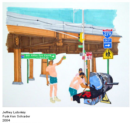
I have an animated .GIF in the online exhibition "Sunday Afternoon," curated by MatCh-Art (Matthew Fisher and Christina Vassallo). The show of approximately 25 artists, described as "an interdisciplinary exploration of leisure, love and obligations," showcases, among other things, what Jerry Saltz has called "puberty escapism" and what I would call The New Dumb Little Painting, a style sweeping New York, if not the world. I don't mean the term disparagingly at all: antecedents would be Laura Owens and Karen Kilimnick and the reigning queen, I suppose, would be Dana Schutz (even though her paintings aren't very little). The style is marked by faux naive paint handling, disguising sharp, emotionally punchy, and/or socially-tinged observations; MatCh-Art and its earlier incarnations specialize in fairly intimate and ambiguous twists on the genre. Here's a great example, from the "Sunday Afternoon" show, Jeffrey Lutonsky's Fuck Ken Schrader, 2004, ink and pencil on paper, 14 X 17 inches:
The American Dream

This is my downstairs neighbor standing on what used to be his patio deck. The property owner next door decided to squeeze a few more rental dollars out of his 3-story building by lowering the level of his back yard ten feet and adding a fourth apartment in the basement. Construction has been slow: he did the digging a year ago and never shored up the excavated pit with concrete, as the city required him to do. Consequently my neighbor's yard is slowly sliding into the hole.

Here's another view: you can see the lake of water from a recent rain through the gap under the fence. It's amazing the fence is still standing.

And here's the view of the fence on the other side of the pit, two doors over from our building. Isn't America great? It's a place where you're free to be a business failure and there are always others to take up the slack--that's how much we value entrepreneurship. It wasn't always thus: in days of yore a posse of strong men from the neighborhood would have paid a visit on Mr. Budding Capitalist and stood there with arms folded till he filled in the hole with his own labor. But that would be fascistic, so we rely on the court system to do...nothing.
Normally Robert Christgau's writing is so unclear, but he really nails the the new Ramones documentary in the Voice. The movie's great, the only thing I still wonder is where in the world their sound came from. The film explains how intense it was for the bland mid-70s, but not why they made the particular choices they did: short, hard uncomplicated loud songs with "morbid" themes. Performance art is mentioned in the film (and by Christgau) as an analogy, but we still don't know why 4 guys from Queens who liked the Stooges and the Dolls invented this form of high-energy minimalism. They weren't from the arty set like the Talking Heads; in fact the most fascinating person in the film is Johnny, who is a Bush and Nixon-loving Republican (and who, we also learn, kept the band honed, driven, and together as a unit for 20 years). Where did his sense of style and the vision of the group come from, given that he's so non-reflective? This is not to slight the other members' contributions, but they all seem to agree at the end of the day that Johnny was the Nazi behind the Bop.
 |
|
|  |
 |
|
| 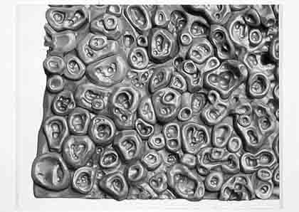 |
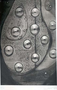
Donald Judd gave Bontecou an early critical nod, as practically every article about her reminds us, but her work is completely at odds with his minimal aesthetic. She started out in the assemblage camp, just as he did, but while he gradually shed more "stuff" from his art, she kept working with materials from the scrap heap, and worse to minimalist sensibilities, used it to make a kind of sculptural abstract expressionism. One oohs and ahs at her craftsmanship but the work comes off strangely inert in person; the Giger-esque vaginas dentata are overwrought and corny. In the early 70s she made vacuformed plastic objects somewhat reminiscent of the forms in Judy Chicago's biomorphic airbrush art--those were actually kind of good.
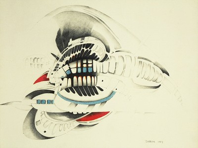 (The story is she "turned away from the art world" at this time, but it's possible her career as a crypto-feminist surrealist abstractionist was going to jump the shark when she started making plastic fish suspended from the ceiling with monofilament--maybe the turning away was pre-emptive?) Lately she's looking more like Roger Dean of Yes LP cover fame, making Metal Hurlant/Hobbit Rock spaceship thingies that hang from the ceiling and resemble hypertrophied sea urchins. Some of this is good (and slightly off-topic, I happen to know the above-mentioned Alex Ross is a Dean fan, though more rigorously abstract overall--Dean's is still the cult that dare not speak its name in the fanboy-averse art world, regardless of the fact that his architecture is now getting some acclaim). The tepid copper, teal and, alabaster color schemes of Bontecou's "spaceships" are a turnoff, though. The bolder colors in her drawing above--or no color--would have been more satisfying.
Jason Little, the cartoonist who created the great strip "Bee," has organized a kind of walk-in, multi-artist, multilayered, po-mo graphic-novel installation piece that one reads panel by panel while moving through a labyrinthine exhibition space. It's called Cartünnel: a comix fluxture:
Visitors are invited to walk through the maze and experience a Choose Your Own Adventure story, with side-plots, dead-ends, and parallel narrative universes, created in a collaborative atmosphere. Depending on which directions visitors choose at various junctures along the way, the course of the story will be altered accordingly. A visitor would be able to walk through the maze several times and see different versions and permutations of the narrative each time they do.I haven't seen the installation yet (at Flux Factory in Queens, Saturdays and Sundays 2-8 pm through August 7) but I enjoyed paging through Little's panels online (go to the thumbnail grid, or even better, follow them sequentially here by clicking the right arrows above each panel). Not all of the show looks this strong (and the mounting of drawings appears awfully crude) but I'll say more after I...um, see it. All the artists are doing variations on a mutually agreed-upon story and characters: a cute Cambodian girl loses her leg to a landmine, moves to America with her parents, then discovers a magic goose in Central Park. The bird is the familiar of a witch lady, a naked hag in a wolf skin cursed to live forever in the park, who periodically morphs into a curvaceous babe and seduces joggers. Just as he did with Bee (whose adventures are assembled in the book Shutterbug Follies), Little makes creeped-out subject matter seem beguiling and "normal" through his clean, lucid, and enormously sympathetic drawing style. His panels are for sale, and a portion goes to the not-for-profit space--I acquired two (including the winsome one above), in a shameless display of Greenbergesque blogospheric power-broking.
Above: Ross Knight at the Sculpture Center, 44-19 Purves St., Long Island City (Queens), NY. On one level, Knight's work takes us back to a moment of not-so-ancient art history when the aesthetic purity of say, Anthony Caro smacked up against the obdurate factualness of Minimalist slabs and cubes. What makes it "now," as opposed to some '60s throwback, is the rickety, slightly forlorn look of the sculptures (yes, that's intentional, and very wry), masking a kind of stealth investigation not just of found materials but found design--in 80s-speak, a "play of real world signifiers" that would have been anathema to all those '60s guys. To plagiarize myself from an earlier article:
Using a limited but highly versatile repertoire of materialsaluminum pipes, corrugated vinyl sheeting, Velcro, paintKnight erects flimsy, portable structures that are essentially abstract (like classic Minimalist works, they unfold and change as the viewer moves in and around them) but invoke influences ranging across the socio-economic spectrum, from high-tech trade show architecture to point-of-sale advertising displays to the jury-rigged shelters of the homeless. Highly sensitive to context, these constructions change with their placement and angle of view.Several things have happened with the work since that was written. Knight no longer paints the structures but relies instead on the straight-from-the-factory pigmentation of the cut plastic sheets (and it's tinted Plex now, in lieu of the lighter weight corrugated signboard). Also, he's making forays into outdoor sculpture, so the pieces now tread a delicate line between the light, provisional look that's essential on a content level and the practical realities of withstanding the elements. Thus, he buries concrete to anchor the aluminum tubes, uses bolts rather than velcro, and adds tightly stretched guy wires, incorporating these as new elements to his vocabulary, while still keeping that carefully controlled slapped-together feel. One imagines an enthusiastic (or deranged) carnival barker standing within the black & chartreuse enclosure above, exhorting the viewer to enter the gateway and experience more of that particular exquisite blue. Unlike the egomaniacal Richard Serra, Knight doesn't rudely block ingress and egress to a public building, though. You just walk right on through.
In November I visited Robert Boyd at Schroeder Romero gallery in Williamsburg, Brooklyn, to talk about his exhibition "The Virgin Collection" (as in "Like a..."), a high-concept conflation of Madonna, Gap kids, Spanish penitents, leftist agitprop, and fine crystal. The centerpiece of the show was a tall, freestanding effigy in bridal attire, holding a bouquet, with what looked like a KKK hood covering the head. The headgear is actually the official garb of the Nazarenos (the aforementioned penitents), originally meant to debase the wearer, like a dunce cap. During the opening, Boyd stood immobile inside this getup while people boozed & schmoozed (but still gave him a lot of space). In a true test of self-discipline, he held his pose even when a random drunk knocked over a delicate sculpture right in front of him. Sprinkled on plinths or hanging throughout the gallery were wedding trappings straight out of Modern Bride--stemware, cake-cutting knife, bridal portraits--emblazoned with Virgin Collection logos or otherwise tweaked, but all very elegantly presented. Boyd is taking a subtly askance, queer-theory look at both wedding mores and what Walter Benjamin calls the "aestheticization of power" with the show, but he also had some anecdotes suggesting an emotional undercurrent. We talked about the experience of certain gay couples being politely but perceptibly shunned at straight weddings, as if the whole rutting hetero thing caused even BoBos (bourgeois bohemians) to close ranks at Ritual Time. And if you think the Klan hood has lost any transgressive potential through pop culture repetition (in Cohn Brothers movies and the like), he related how the first lab he took the "bridal photos" to refused to print the pictures. Such symbols do still have power, as attested to by Supreme Court Justice Clarence Thomas's recent outburst during oral arguments in the cross burning case. (I had a couple of sentences here where I mimicked an offended Klansman threatening Boyd for his various transgressions against Southern honor and matrimonial rites, but I deleted them because people didn't know I was joking.)
The 19th Century romantics used to talk about art "aspiring to the condition of music"; certainly this urge still existed by the time Kandinsky and his circle came along. By the 1970s, though, art had acquired a heavy additional burden that I suppose could be called "signification." The representational art of yesteryear (history painting, say) has been replaced by an underlying, not always obvious narrative about some social or political condition that bothers the artist. I've written about this before. The job of the writer or the curator then becomes decoding the artist's exact political meaning and passing this narrative on to others. The "Tempo" show, which opened a couple of weeks ago at MOMA's new Queens facility, is a good example. The galleries are filled with objects, more or less interesting, on the theme of "Time," and in the exhibition brochure, the curator gives a line or two to what each object means. In all likelihood, if the curator hadn't been able to come up with that soundbite, the piece wouldn't have been in the show.
How is it that music continues to escape this requirement of signification? If Simon Reynolds writes about a house track, he doesn't judge it a failure it if doesn't contain a sped-up sample of, say, George Bush uttering the words "axis of evil." If it did contain that sample, he might note it, but the track is going to stand or fall on the basis of other criteria. For certain he's not going to say, as many curators do about art pieces, that it's "merely formal" if it doesn't have the sample. These days, I'm more and more interested in work that critics would condemn as merely formal. At least I can be reasonably sure that it won't contain some puerile, easily decodable political sentiment.
Another example: a few years ago I took a pair of German dealers on a tour of some New York studios. All of the work was dumb, in-your-face, latter day Op art, but with some material or perceptual hook that made it not so dumb. The dealers looked at the floor most of the time and seemed really embarrassed. Later, on the subway, they showed me pictures of art they'd exhibited in their gallery. I remember one piece consisted of pharmaceutical boxes that had been stuck to cylindrical columns in the gallery with green stripes wrapping the columns at the exact level of the boxes. The piece had a nice postminimal vibe and wasn't far off the things I'd been showing them, but for them the pharm packaging was the absolutely necessary "axis of evil" sample. All it took was one "political" element to validate the work (though they never explained why those particular drug boxes were "political"). I couldn't resist saying: "I think these pieces would be great without the drug packaging," which got me surly looks.
Gerhard Richter, painter of emotionally-distanced images and even-more-emotionally-distanced abstraction, is currently being rehabilitated as Gerhard Richter, warm and fuzzy lover of children, pets, and beautiful women. First came the portrait of his infant son, clutching a spoon and cutely smeared with baby food, on the cover of the January 2002 Artforum. Then came the Museum of Modern Art's retrospective (which opened last week), emphasizing portraits over abstractions and quality over quantity. Then came Michael Kimmelman's gooey New York Times review, comparing Richter to Vermeer and waxing sentimental over the painter's family pictures. (Postscript: Strangely, none of the skepticism in Kimmelman's contemporaneous New York Times Magazine profile--which made Richter out to be a freak on the family level--found its way into his review.)
MOMA curator Robert Storr has chosen to focus the viewer's attention on individual "masterpieces" rather than highlight Richter's relentless, factory-like production. In an interview in the same Artforum, Storr expresses a preference for "the many things that can be said about individual works," rather than "the few things that could be said about large groups of paintings." This contradicts Richter's own view of his work, which can be divined from various early catalogs, the artist's self-produced catalog raisonne, and most importantly the Atlas--an encyclopedic, gridded compendium of photos, abstract brushstrokes, and studio experiments, which filled an entire floor at the Dia Foundation a few years back. In the latter work, as interviewer Tom Holert describes it, the "single picture vanishes in the ordering system; the grid, the context of the images, reclaims the individual work."
Atlas: Panel 8, 1962-66
This more radical--and accurate--view of Richter could have been conveyed by including more works in the retrospective, and by hanging them less respectfully: by using the Atlas as a model, in other words. In the past, Richter has shown his 48 Portraits, grisaille images of mathematicians, writers, and other dead white dudes, in an imposing grid; at MOMA they wrap spaciously, in two rows of 24, around the inside of a stairwell, exactly as they might be seen in a institution that meant to celebrate them. Richter did scores of "color chip" paintings in the '70s, elegant enlargements of the gridded colors you find in paint stores, and it would be hard to find better icons of ambiguity towards the work of modernists such as Mondrian and Kelly. Presenting, or interspersing, a profusion of these paintings (or more abstractions in general) among the other works would have given the show the clinical, confused feel that it is the paradoxical essence of Richter: the artist as lab technician, studying image overload and seeking its underlying "rules." Instead, MOMA showed only two color chip paintings (one big and one small), presumably those the curator thought were "best."
Storr's hanging led directly to Kimmelman's treacly review, which fawns over Richter's "tender" brushwork, traditional subjects (landscapes, portraits), and eye for the beauty "that's still out there" after one "strips away the cliches and false rhetoric" of mass culture. Not a word is said about Richter's compulsive use of the squeegee to smear and eradicate imagery--one gets the impression that it is used only as a tool to make abstractions. Kimmelman ascribes to one work, Richter's painting of his father Horst holding a dog on his lap, the quality of being "under water," like a memory "surfacing but being sucked back down." But couldn't one could also say that Richter attacked the image, by dragging the half-dried paint across the canvas, as if trying to scrape away that same "memory"? Or perhaps that his father was just one more smeary image in the overcrowded mass media darkroom?
Richter's 70, and a big gun in the art world, so late-career flattery and hagiography is inevitable. Thus, it was extremely refreshing to read Donald Kuspit's artnet piece criticizing the show. Of course, Kuspit's a grouch who lately judges all art on the basis of whether it has "healing power," but he's also knowledgeable about contemporary German painting, and after Kimmelman it's exhilirating to hear the Great God Richter described as "the dregs of the German Wave, the last ripple in what once seemed a riptide." Discussing Richter's East German-ness, and the presumption of authenticity it gives the artist in rich Western art circles, Kuspit reminds us that the East was also a zone where state-sponsored "Socialist Realism" thrived. This leads to a discussion that raises far more interesting questions than the Storr/Kimmelman attempt to reinvent Richter as a humanist:
Kuspit omits to mention that Richter, early on in his career, attempted an ironic reinvention of Socialist Realism for the West, calling it "capitalist realism." Whether this was an ultra-serious form of Pop or "Socialist Realism in Modernist drag" is a question still worth debating. It may be, as Storr says, one of the "few things that can be [discussed] about large groups of paintings," but surely it's more interesting than talking about Richter's search for beauty in the face of his own pessimism.Richter's work takes Socialist Realism as its point of departure and continues to be Socialist Realist in modernist drag. Socialist Realism is peoples art. It uses the styles of the acceptable past, cutting them down to the reproductive terms that are comprehensible to the people. Their vision is cancelled in the name of the Great Cause--the People--and they are banalized into instruments of ideology and propaganda. Richter does the same thing with abstraction and representation. They are reduced to dumb shows of art--a kind of visual mummery--or, to put this another way, a visual sound and fury signifying nothing, whatever its subject matter. They are reduced to people's art, simplified and trivialized. All one has to do is to look at his mock Mondrian to get the point. It is peoples abstraction, just as Richter's Abstract Expressionist paintings are the people's platitudinous idea of Abstract Expressionism--a Socialist Realist scam on Abstract Expressionism.
Here's the Artforum.com blurb on Rodney Graham's show at 303 Gallery: "The primary work in this show, Phonokinetoscope, 2001, recreates a bicycle ride taken by Dr. Albert Hofmann through Berlin's Tiergarten on April 19, 1943. Before hopping on his bike, Hofmann, a chemist researching ergot alkaloids, swallowed a quarter milligram of the then new compound LSD-25. Later he would write that it dramatically altered his 'acoustic and optical perceptions.' Graham's film, complete with bike ride, LSD (which he washes down with coffee from a vintage thermos), and music composed and sung by the artist, mercifully avoids any overt psychedelia. Instead, it focuses on subtle interconnections and slippages between visual and aural perception, offering instances where sight and sound merge, as when the wheeze of the film projector matches the visual rhythm of a playing card hitting the spokes of a spinning bicycle wheel."
Actually none of the above is precisely true. The 16 mm film loop is synchronized with an LP recording of a song by Graham, a kind of folk-metal ballad in the John Cale/Nick Drake/Syd Barrett mold. As the song begins, Graham is already on his bike. He pedals through the park, stops to stare fixedly at a statue, and rides across a bridge in reverse-motion--an homage to Butch Cassidy and the Sundance Kid, the press release reminds us. The playing card in the spokes of his bike, anchored with a wood clothespin, suggests he's regressed to a childlike (or dork-like) state. The lyrics to the song are as dumb as they are poignant:
Who is it that does not love a tree?
I planted one, I planted three.
Two for you and one for me.
Botanical anomaly...
You're the kind of girl that fits into my world...
You're the kind of girl that fits into my world...
Finally, at the end of the song, he sits down, and with power chords climaxing on the soundtrack, eats a square of blotter and stares entranced at the clothespin and the playing card, a Queen of Diamonds (as in Lucy in the Sky with...?). Of course, since the piece is a loop, you could interpret the end as the beginning, and imagine the film as a trip that lasts an eternity. EXCEPT Graham has deliberately made it possible for any idiot to walk into the gallery and lift the the tone arm off the LP, which stops the song and disconnects the "looper," bringing the film--which people are watching in a different room from the one with the turntable--to a sudden, jarring halt. The woman at the desk said many viewers have gotten angry when this happens.
An online column by Scott Speh called "Hot Commodities" deserves a look. Unusual for an art scene where everyone has an opinions about shows they don't see, Speh actually gets off his ass, goes to exhibits, and then writes frank, funny reports about them. Unlike the art mags, there's no commercial agenda or behind-the-scenes string-pulling, just honest, off-the-cuff opinionmongering. His review of Dennis Hollingsworth's show at Nicole Klagsbrun excellently captures the nuances of this abstract painter's hard-to-nail work:
The Voice said [it] looked like cheesy hotel art at first - this is part of the appeal. Like [Laura] Owens he toes that bad/good line. Plus he can paint in the old romantic sense of pushing colored mud around a canvas. But it's not all intuition and action painting - he does have a strategy, a formula if you will, that gives the work a sort of steely logic keeps me from yawning. In addition to the historical technique, alla prima, a wet into wet impasto type application, he uses a number of signature techniques - he calls some of them monads, bulldozers, flings and pillows - that sees him pulling starburst-like strings from globs of paint, squeezing pigment straight from the tube - then carving a flat edge off the top of these ribbons, and trowelling and excising geometric shapes. I'm a sucker for straight from the tube pure color and juxtaposing high key and putrid, ugly color.Here's another tidbit, from his review of Wolfgang Tillmans' last show at Andrea Rosen:
Artforum describes [Tillmans'] installation techniques as similar to the way teenagers decorate their bedrooms, "scattering unframed photos across the wall, mixing huge and tiny" etc. Oh, I don't think so. Has this writer ever seen a teenager's room? Perhaps he'd like to go home to Ohio with me and check out my 16-year-old sister's floor to ceiling collage - not an inch of free wall space.and last, this quip about Rita McBride at Alexander & Bonin:
Shiny greenish-grey minimalist sculptures cast from video games or ATMs. I told the desk jockey "that one ATM isn't working." She didn't think I was funny.
Days 4-5 Paris
THURSDAY
Visited "un art populaire" exhibit at the Fondation Cartier. This lavish building (financed by the famous jeweler) featured one of those "we are the world" exhibits frequently cobbled together by Western curators as a kind of mea culpa for First World imperialism. Here the only unifying link appeared to be the word "popular," allowing the exhibit to bring together Western kitsch-quoters (Mike Kelley, Robert Arneson), their Eastern counterparts (Takashi Murakami, the Luo Brothers), and oodles of Third World folk artists. There were nice pieces in the show even if the premise was lazy and uninformative.
"Sinceres Felicitations" at Ecole Nationale Superieure des Beaux-Arts. The graduating class of 2001, as juried by Fabrice Hybert, Sylvia Fanchon, and Dominique Gauthier. Lots of future video artists and Biennale-circuit-conceptualists-in-training. Very little painting, but I liked Gaël Davrinche's large canvases convincingly channeling children's art, and a couple of digital photosurrealist images by Vincent Mauger, using Toy Story-like modeling, texturing, and lighting. The confused state of current art was best reflected in Pierre Olivier Balu's installation: a row of not-half-bad paintings along the top of the wall, a row of performance-documentation photographs underneath, and the obligatory video monitor on the floor. All bases covered, all curators satisfied.
"Rodin en 1900" at Musee Luxembourg. This exhibition recreated the "Rodin Pavilion" at the 1900 World's Fair. The artist appeared to have moved everything en masse from his studio--bronzes, plasters, unfinished works, drawings, documentary photos--to the pavilion. The recreation, with its temporary wood floor, inner-lit canvas walls and salon style groupings of drawings and photos, was pleasantly po-mo.
FRIDAY
Trip to Versailles to visit the State Apartments, Hall of Mirrors, Gardens, and ticket-taker-attended toilet. It was fascinating to be here after seeing the Mad King Ludwig's digs in Bavaria. Ludwig worshipped Louis XIV, and his castle is in many ways a miniature of Versailles. Interesting that Bavaria's most famous unacknowledged gay modeled his huge, floor to ceiling bed canopy on the Queen's bed at Versailles rather than the King's.