View current page
...more recent posts
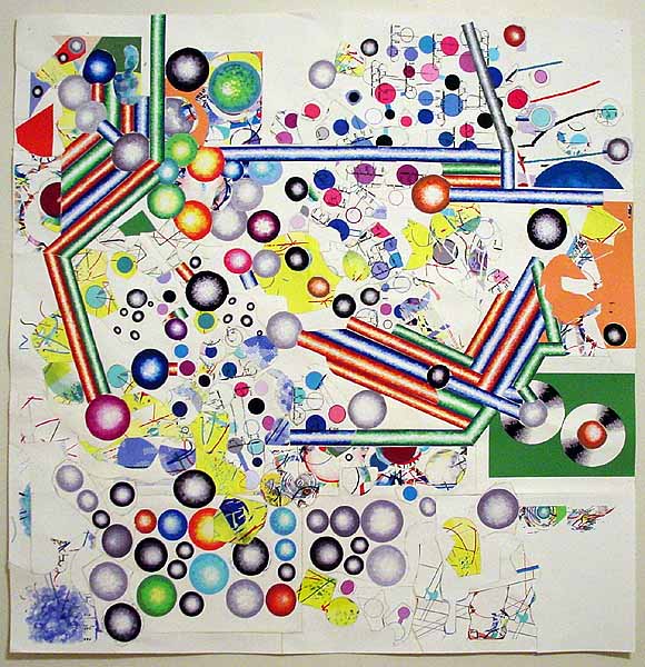
Expanded version of a piece I did last year; I added about 8 inches to the what used to be the top and turned the format from a rectangle to a square. I'm calling it Van Der Graaf Flux; the whole thing is meandering conceptually and may not be finished (meandering being, I think, the subject matter). It has some Russian constructivist elements. Those spinning disc things over on the right are a design I saw years ago in a Popova (?) painting depicting rolls of silk in a silk mill, seen end-on; I've recycled it quite a bit. All the imagery is drawn in MSPaintbrush and MSPaint; the paper is repeatedly run through the printer, cut apart with scissors, and taped back together; the back of the piece is a dense network of linen tape holding the whole thing together. See? Kind of ugly, but here it is (flipped).
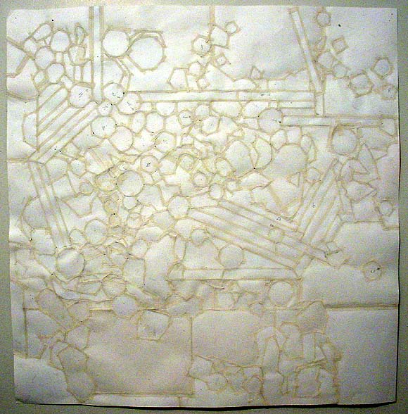
Here's a macro detail, which should banish any remaining illusions that this piece is "computer-slick":
Towers of Light vs The Birds
James Wagner asks about the flecks in the light beams in this photo he took of yesterday's Tribute in Light 9/11 memorial. Via alex (scroll down): "This is what birders were afraid of: this year's Tribute in Light display coincided with a big migrant flight. Too bad for the birds. Here's a report received from bird advocate Rebekah Creshkoff (a non-birder friend who saw the display thought that there was "glitter" in the light beams; that was birds.)"
I was at the Tribute in Light briefly tonight, from about 10:30 to 11. I didn't see our volunteer Brooke, but I sure hope she or Eileen or Denise had/have a camera. I didn't, but what's going on down there should be documented.Just wait till they fire up those big wind turbines in the Freedom Tower.THOUSANDS of birds were behaviorally trapped in the columns of light. The beams were visibly filled with birds for their entire height, looking like clouds of bugs. Their twittering was audible.
Their brightly illuminated bodies were reflected in the windows of nearby buildings -- 3 World Financial Center and the movie theatre. The light was so bright, some birds looked as though they were on fire.
There were so many birds, it was impossible to track any one individual for any length of time. I did see one bird that circled in and out of the uptown beam six times before I lost track. Each time, the bird stayed in the light for from 3 to 9 seconds.
The lowest 30 feet or so of light had moths instead of birds. Fantastic numbers of moths were attracted to surface of the big lamps. Assistants (wearing sunglasses) frequently wiped the surface of the lights with a cloth; even so, there would be smoke from all the moth bodies just moments later. I saw one bird lower down (apparently) escape the beams.
The birds were visible to the naked eye as sparkling motes floating in the light from Barrow St., about a mile or so uptown.
I found all this extremely disturbing. It takes a songbird about a week to lay down a gram of fat -- fuel for its long-distance migration. That fat will carry it about 120 miles. How much fat are they wasting flying around in those beams, only to have to (best case) spend the next several days refueling in food- and habitat-poor lower Manhattan?
The beams put me in mind of the old-time ceilometers -- beams of light formerly used at airports to measure the height of the cloud cover. Many significant birds kills were documented at ceilometers. I am attaching a paper I wrote for the organizers of the first Tribute in Light, which references ceilometer data.
The good news is, the lights will be off tomorrow. But is the human value of the Tribute in Light really worth imperiling thousands of birds -- and incinerating God knows how many moths?
Rebekah
I posted this diptych a while back, and attempted to explain what was going on in the piece when someone asked what the hell it was. Apropos of a more recent discussion, I realize now that mere blabbery words are no substitute for a revealing, demystifying, letting it all hang out, kinda looks like shit back of the piece shot. I didn't want to do this before because it destroys the elegant aura I worked so hard to give this cheaply executed work. I don't know why I'm doing it now--you wouldn't see this in a gallery unless you took it down off the wall, why show it online? (By the way, the times I've shown these pieces publicly I've stretched a rectangle of silk behind the paper so no one can poke a finger through it--but I don't believe in glueing it down or pouring resin all over it to "collector-ify" it, a la Fred Tomaselli.)
Another recycled reBlog post:
Matt Pyke recently left tDR [The Designers Republic --TM] to join Transistor Studios - the most excellent demo reel of his is here, and his latest project, a music video for Nuno Felipe, can be seen here. Good stuff!The Designers Republic was the vanguard of the graphics revolution (or what might be called the "vector revolution" for its use of Illustrator, Flash, and the like), most conspicuous in electronic dance music packaging but also embraced by Globo Youth Marketing Capitalism. It's nice to put a name to a product, even if tDR was supposed to be about anonymity and collectivity. I didn't watch the music video but the demo reel is pretty mind-blowing. Sorry to always keep harping on Jeremy Blake, but this is better, innit? I liked Blake during his Morris Louis phase (which PT Anderson picked up on and then Blake abruptly dropped) but for a full-service digital collage artist, Pike is doing more tricky and I would say paradigmatic stuff. It's just that one is "high art" and was in the Whitney three times in as many years and the other is "low art" that is probably making the producer oodles of money--as clear an argument as I've seen for the need to rethink the distinction, at least where digital media are concerned.
via KALIBER1000
jimpunk did a nice animated .GIF of my "logo" morphing into the wiring diagram from my reBlog post "How to make a Nintendo controller into a PC joystick."
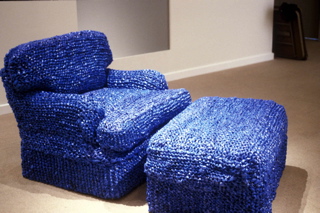
Sarah Hollis Perry, At Home (blue chair), chair upholstered with New York Times bags
Opening Friday, Sept 10th, 8pm, at Flux Factory, Long Island City, NY, running from September 10 - 25, 2004:
REFUSE: functional art objects and music made from waste.
Project statement
There is an alchemical process that takes place when waste is converted into something useful. REFUSE is a collection of work by artists who apply this process to castaway raw materials reshaped into functional art objects and sound sculptures. The exhibit will include pieces whose emphasis is on form and function, making scavenged material an integral, possibly unapparent element of the work through skilled transmutation. An apparent dwelling space within the gallery will be assembled with pieces ranging from dresses woven from cassette tape ribbon (Alyce Santoro), a chair reupholstered with woven blue new york times bags (Sarah Hollis Perry), chairs fashioned from recycled road signs (Boris Bally) and tables crafted from scrap wood (Scrapile). Several Interactive sound sculptures and musical instruments made from waste will be placed throughout the gallery providing a sonic backdrop for the space.
Featuring works by Boris Bally (borisbally.com), Lea Bogdan, Ken Butler, Peggy Diggs, Joy Halsted, Nikolai Moderbacher (nikolaim.com), Cynthia Norton, John Parker (eyekhan.com), Sarah Hollis Perry, Philadelphia Dumpster Divers Neil Benson and Steve Thompson, Alyce Santoro (alycesantoro.com), SCRAPILE (bettencourtwood.com), Colleen Smiley, Meghan Trainor, Crispin Webb (crispinwebb.com), Peter Whitehead (healthyarts.com), Isac Zal (isaczal.com), and more.
[Just a few thoughts, based on surfing around some of the websites: working with landfill material is tricky; it can be politically edgy but it can also get bogged down in the sentimentality of "old stuff." There are a million undistinguished artists all over the world making assemblage type works with discarded junk; what separates them from a Yayoi Kusama or a Robert Rauschenberg is a question curators should be asking. Sarah Hollis Perry, maker of the blue chair above, appears to have swallowed Kusama whole but the cheekiness of using Times bags--the discarded wrapper or "invisible brand" of the "intellectual paper"--makes the work seem up to date. (I say seem because I'm only looking at the jpeg.) Other participants in the show might be veering dangerously close to the sentimental school, and there appears to be at least one designer making a straight commercial product out of post-consumer materials. Nothing wrong with that as long as the curation takes these distinctions into account. Yeah, I know, no one asked me to criticize the show, I'm just covering my ass because I haven't seen it. --TM)
The American Dream
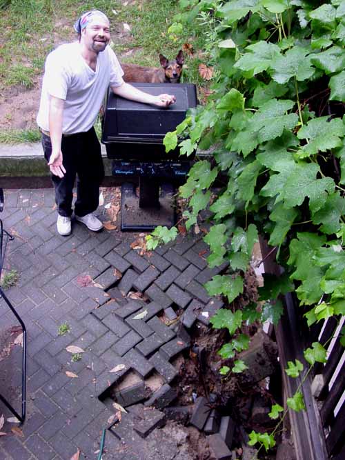
This is my downstairs neighbor standing on what used to be his patio deck. The property owner next door decided to squeeze a few more rental dollars out of his 3-story building by lowering the level of his back yard ten feet and adding a fourth apartment in the basement. Construction has been slow: he did the digging a year ago and never shored up the excavated pit with concrete, as the city required him to do. Consequently my neighbor's yard is slowly sliding into the hole.
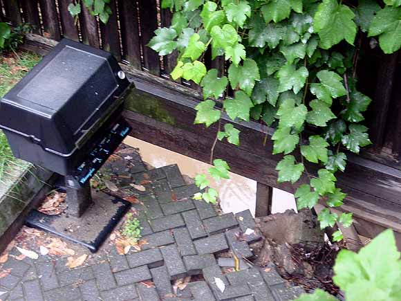
Here's another view: you can see the lake of water from a recent rain through the gap under the fence. It's amazing the fence is still standing.
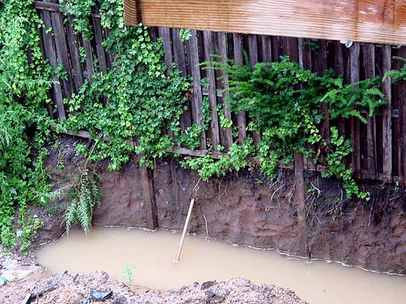
And here's the view of the fence on the other side of the pit, two doors over from our building. Isn't America great? It's a place where you're free to be a business failure and there are always others to take up the slack--that's how much we value entrepreneurship. It wasn't always thus: in days of yore a posse of strong men from the neighborhood would have paid a visit on Mr. Budding Capitalist and stood there with arms folded till he filled in the hole with his own labor. But that would be fascistic, so we rely on the court system to do...nothing.
What is an art blog? 3
Chris Ashley has some questions/comments addressing the previous post. Taking them in order (now it reads like an interview):
Is it just me or did you rewrite th[e] post, and include more quotes?
I did a slight rewrite (I often tinker with posts after they're up; if it's substantive I put an UPDATE notice at the bottom).
Now that I look closer, it's funny to notice that the staples [in your piece] aren't big heavy staplegun-type staples used for stretching canvas; they look thin, like from an office stapler. Am I wrong? If I'm right, it's a sign, along with the office-standard colored copy paper, telling me that this "painting" has white collar origins. Did you photocopy this on the job? [...]
When I showed this body of work in the late 90s I used the phrase "corporate tramp art" in the press release but none of the writing picked up on that. Let's just say the work was an attempt to make lemonade, psychologically, out of an astringently toxic permatemp gig that has since mercifully ended. I'm doing similar work elsewhere (which is more enjoyable), so I feel I must add, "Of course no company supplies or materials were used." (The staples are actually light duty staples from an old Swingline gun.)
I'm interested in this quote from [yester]day: "...I do value the physical work (too)..." You've said in the past (Nov. 30, 03), "I like painting OK but I'm sick of the 'romance of paint.'" I'm curious, then, about this comment from a few days ago,"The only reason I'm pulling this out now is I reached a point with the computer-painting where I want to see more real world grit, and this older work is all about grit." I guess I'm wondering about what is the difference between the grit and romance, is paint always romantic, and what would paint add or detract from your recent work?
By "real world grit" I was referring to the legal pad, office paper, product boxes and such that I've incorporated into the work. For a while I've been working solely with computer-printed inkjet imagery and started thinking I needed to mix it up more with found stuff. The older work did a lot of layering between found and not-found.
[A]s I get back into painting after a hiatus (a long story), I am (and yes, I'm a "he") trying to figure out what I'm doing, what I want, where I'm going, and what I'm doing in the HTML drawings that is generalizable to other work. What I'm taking first from the HTML work is an approach to subject matter, a serial or a series approach, intentional transparency and overlay, a kind of gesture, and the notion of figure vs. field. And in my trying to figure this out I'm finding that it's really useful to post the drawings that I'm doing, to put them out for me to see, and for others, too. My weblog is, for me, a studio, a wall on which to post the work and reflect on it, a place for feedback, if I'm lucky, as well as a place to archive the work, write about art, link to interesting things, build arguments and interests over time.
This is the same thing I value in [your] weblog. I've also been paying attention to Dennis Hollingsworth's weblog, which I first found out about here, as well. I'm surprised that more artists don't use their weblogs as real workspaces for their art; most that I've seen are in the classic mold of a place to write, link, and gossip- journal-like spaces. What I don't see often enough are webloggers who mine their past posts, reflect on where they've been and where they are now, connect dots, and build a corpus of work. Am I missing others who are doing this?
As for painting, I have no plans to do it--I'm more interested in the problem-solving of how to make interesting, resonant, stand-alone objects with the computer, printers, photocopiers, etc., and intertwining that practice with purely online things like animated GIFs. There's more than enough there for a career. And for what it's worth, I much prefer your HTML drawings to the scanned sketches: the latter are "one step removed," but even more than that, having to work within the rigid cyber-parameters really toughens up and enlivens your output, for me. The online drawings seem very "now," whereas the sketches seem like a step back, even when I like the imagery. (Just so you know, I'm as bad as an ex-smoker about trying to talk people out of painting.)
As for art blogging, we discussed this issue a while back but I didn't address your comments specifically. I'll give my thoughts and then I'll post someone's slightly cynical (but thought-provoking) formulation from the previous round. First, the web is strewn with the carcasses of dead weblogs; it takes a particular kind of personality to keep posting, artist or no. Secondly, the web will mirror life: some artists will treat the contents of their studios like precious trade secrets and won't let anyone in while others will be very open.
In the previous round, artist and blogger twhid sent around a batch of questions about artists' blogging from someone researching the issue in Europe. In an email sent around to the group of initial respondents (which I'm publishing without permission and will remove if asked), Dyske Suematsu wrote:
There are probably many reasons contributing to the lack of interest in blogs in the art world. Here are some I can think of.I agree with some parts of this and disagree with others. It sounds a bit bitter, but there's a lot of truth there, there are definitely class things about the art world worth despising. I'm amused by the collectors who made piles in the tech sector seeking refuge in the art world as "the place of the sacred handmade."
1. Blog is a product of popular culture, and fine art is a product of high culture. Using blogs would devalue or take away this mystique of fine arts.
2. Many fine artists are not so computer savvy, and many among them are deliberately that way in order to distinguish themselves from the ordinary people who have to sit in front of computers all day at work. Artists need to keep the facade of being special and exceptional. They can't be doing what everyone else is doing.
3. Blatant self-promotion is looked down on in fine arts. Although the success in fine arts is largely defined by your skills for self-promotion, you must do so covertly. The Web in general is now seen as a marketing tool, and because of this, many artists, especially famous ones, do not bother building websites, much less Weblogs.
4. Artists could devalue their own work by speaking or verbalizing. Good artists are not necessarily good critical thinkers. If they were good at writing, and if writing is conducive to what they want to say, they probably would just write, instead of making something visual.
5. Fine art mainly caters to the taste of the upper class. The people of the upper class do not read weblogs. They are not so computer savvy either, because they can afford not to learn anything about computers; they just hire people to take care of computer-related tasks. In their homes, they often hide computers using elaborate pieces of furniture. They find them distasteful.
Later he added:
6. Fine arts is an interest of the privileged upper class. The rich and powerful do not like anything in which money cannot give them an advantage. Even for something as common as movies, they can arrange private, advanced screenings. For music, they can get prime seats at live concerts. Purchasing fine arts is the ultimate exercise of their privileges. For web-based art, however, they have no advantage. Absolutely anyone can view Net art from any computers. Digital art does not allow them to feel special and privileged, which is the main reason why they buy art in the first place. So, if you want to be a successful gallery-based artist, you need to address these upper-class concerns, and stay away from the interests of Philistines.