tom moody

tom moody's weblog
(2001 - 2007)

tommoody.us (2004 - )

2001-2007 archive

main site

faq

digital media tree (or "home" below)


RSS / validator


BLOG in gallery / AFC / artCal / furtherfield on BLOG

room sized animated GIFs / pics

geeks in the gallery / 2 / 3

fuzzy logic

and/or gallery / pics / 2

rhizome interview / illustrated

ny arts interview / illustrated

visit my cubicle

blogging & the arts panel

my dorkbot talk / notes

infinite fill show


music

video


Links:

coalition casualties

civilian casualties

iraq today / older

mccain defends bush's iraq strategy

eyebeam reBlog

hullabaloo

tyndall report

aron namenwirth

bloggy / artCal

james wagner

what really happened

stinkoman

antiwar.com

cory arcangel / at del.icio.us

juan cole

a a attanasio

rhizome.org

three rivers online

unknown news

eschaton

prereview

edward b. rackley

travelers diagram at del.icio.us

atomic cinema

lovid

cpb::softinfo :: blog

vertexList

paper rad / info

nastynets now

the memory hole

de palma a la mod

aaron in japan

NEWSgrist

chris ashley

comiclopedia

discogs

counterpunch

9/11 timeline

tedg on film

art is for the people

x-eleven

jim woodring

stephen hendee

steve gilliard

mellon writes again

eyekhan

adrien75 / 757

disco-nnect

WFMU's Beware of the Blog

travis hallenbeck

paul slocum

guthrie lonergan / at del.icio.us

tom moody


View current page
...more recent posts
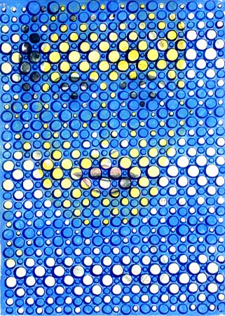


David Moreno

DAVID MORENO
Untitled, 2002; ink on paper; 12.75 x 9.25"
#6 of a suite of 6 (image from Feature Gallery website)

Never seen this piece in person. It might well work better as a web graphic than an object. "Graphic" meaning art, it should be added, but having a particular punch or "read" in the concise, compressed format of a web page. "Accidental enhancement" or "second-level improvement" should be added to the criteria art historians consider in evaluating work.

A breakthrough moment on this score occurred a few years ago when the Museum of Modern Art collected several of Van Gogh's "postman of Arles" paintings for a small group show. The museum couldn't get loans for all of them, so one was represented by a digital reproduction, mounted on a panel so it read like a painting. With its bright, saturated colors, crisp "sharpened" resolution, and excellent lighting, it stole the show--making the others appear dingy, old, and fussed-over.

- tom moody 3-05-2007 9:16 pm [link] [2 comments]