View current page
...more recent posts
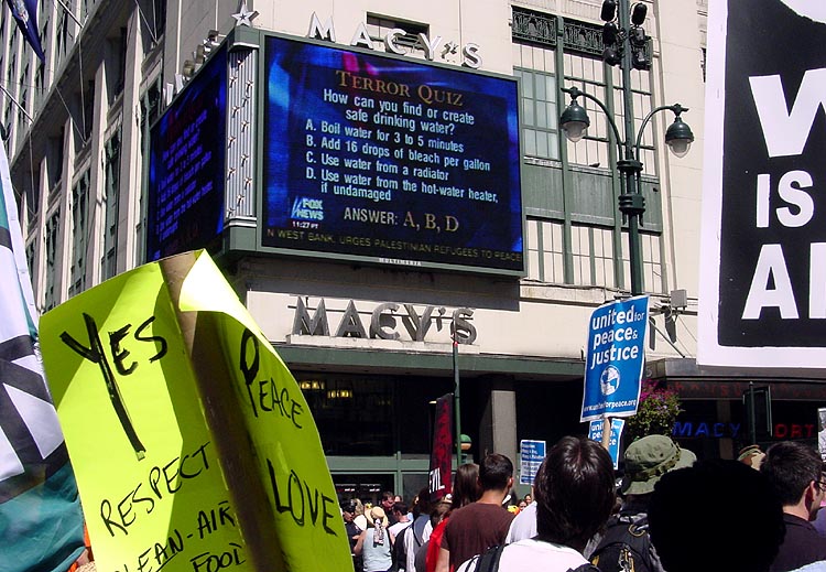
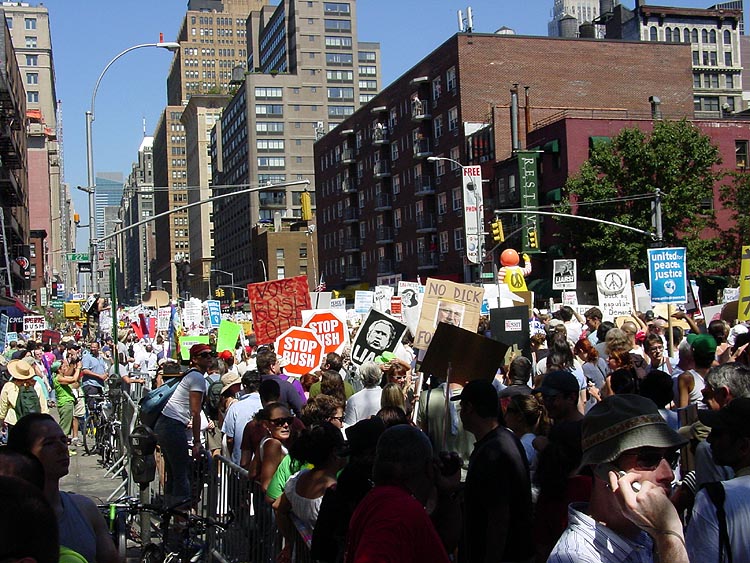
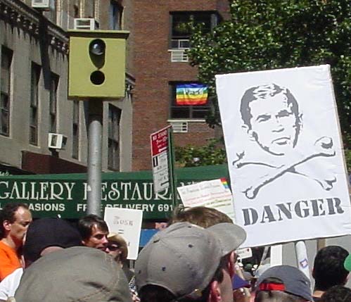
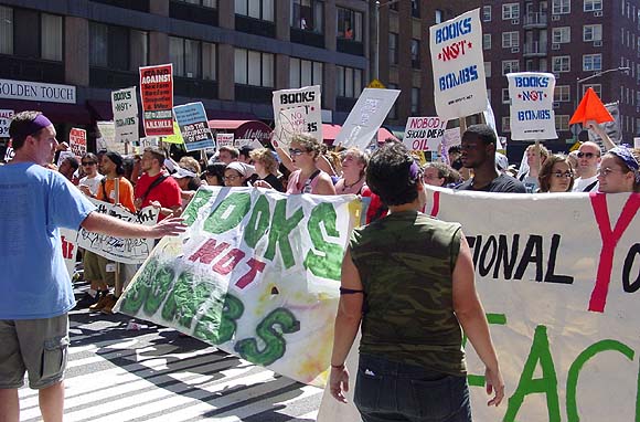
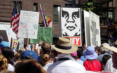
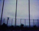
More RNC protest photos (click top two to enlarge). Previous group is here. Full set is here.

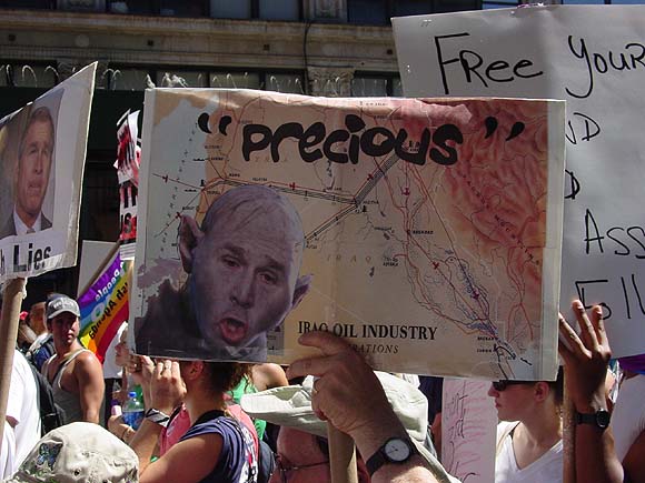
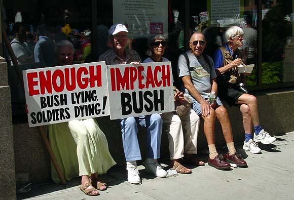

My photos from the United for Peace & Justice march welcoming the Republicans to NY. The huge throng started at 14th Street and moved north, filing past Madison Square Garden, where everyone did the requisite jeering. A spirited and orderly event, at least what I saw of it. A lot of cops standing around uselessly. I haven't read any reports since I got to the computer to process these pictures; I hope nothing ugly happened.
UPDATE: I just made the mistake of looking at Slate, the Microsoft-funded online journal, where man on the street correspondent Bryan Curtis follows what he and his headline writer call "the lefties" up Seventh Avenue. He makes the protest sound very silly and quaint, but of course no one can demand more balance from the magazine since there was no parade of hundreds of thousands of "righties."
UPDATE 2: More photos are here. Full set is here.
The Suspended Disbelief Puppet Theater performed tonight (Aug. 28) at Pete's Candy Store in Brooklyn. Interesting mix of dense, decrepit, Gothic ornamentalism in the puppetry and sets (think the Brothers Quay, Poe, Ivan Albright) and hip, urbane references in the songs and dialogue: Bogie and Bacall's sexually-loaded banter about horse racing from The Big Sleep; the inimitable Mrs. Miller singing "These Boots Are Made for Walking," and a bizarre novelty record by Melvin Van Peebles called "Eyes on the Rabbit" played for maximum pathos. Rose Csorba did the puppeteering, Jim Thomson of Plasmodium provided the voices and the found/treated sound, and Sarah White and Steve Ingham sang White's lovely songs on acoustic guitars between acts.
Normally Robert Christgau's writing is so unclear, but he really nails the the new Ramones documentary in the Voice. The movie's great, the only thing I still wonder is where in the world their sound came from. The film explains how intense it was for the bland mid-70s, but not why they made the particular choices they did: short, hard uncomplicated loud songs with "morbid" themes. Performance art is mentioned in the film (and by Christgau) as an analogy, but we still don't know why 4 guys from Queens who liked the Stooges and the Dolls invented this form of high-energy minimalism. They weren't from the arty set like the Talking Heads; in fact the most fascinating person in the film is Johnny, who is a Bush and Nixon-loving Republican (and who, we also learn, kept the band honed, driven, and together as a unit for 20 years). Where did his sense of style and the vision of the group come from, given that he's so non-reflective? This is not to slight the other members' contributions, but they all seem to agree at the end of the day that Johnny was the Nazi behind the Bop.
Check out Tyson the skateboarding bulldog, the canine personification of joy. [via] Be sure watch the videos: the March 2003 clip is especially good.
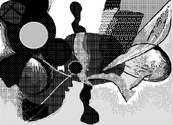
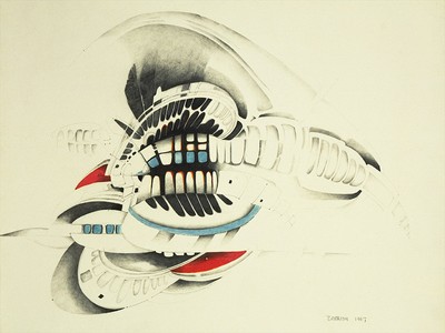
I did this drawing 20 years ago, when the Republican convention came to Dallas, where I was living at the time. It was published in BWANA-ART, a Dallas zine. I seem to be cursed to live in cities where Republicans flock to crown scary idiots.
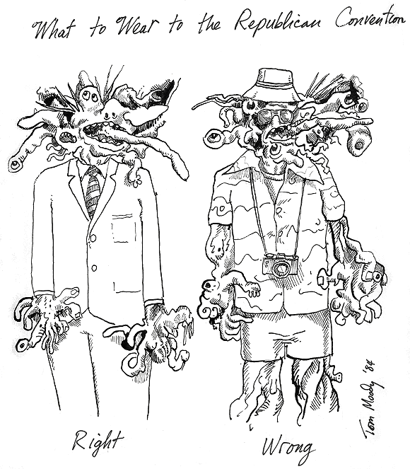
A few fleeting reminiscences of convention '84: (1) Dallas still had two papers then, and the coverage in the Dallas Times Herald by John Bloom (AKA Joe Bob Briggs) and Molly Ivins was some of the best newspaper writing I've ever read. (2) A few orange haired punks went on a rampage downtown--meaning yelling and handing out some leaflets. The whole city (a place of insurance companies, Christian sales motivators, repressed non-whites, and tit bars) was scandalized. I'm sure those kids did hard time. (3) The co-op gallery where I was showing hosted a political exhibit, "Left/Right: The Political Show." Sculptor Greg Metz (a former classmate of Texas ex-pats Gary Panter and Georgeann Deen) made an ambitious sculptural tableau called Reagan's Temple of Doom, with a fanged Gipper rising from a toilet in a funnel cloud. A reporter and a photographer from Time came to look at the show--handsome blowdried dudes in tight designer jeans--but snuck out the back door, leaving us artists standing there like fools.
A recent poll cited in the New York Times says 53% of New Yorkers fear a terrorist attack during the convention. Well, score one for Tom Ridge and the Fear Machine. What I'm most afraid of is that New York police will forget who they're paid to protect and start busting heads of average citizens fed up with three years of Republican kleptocracy, lies about 9/11, and bloody war. Protest is a right, not a privilege as Mayor Bloomberg would have it. The presence of riot gear and heavy handed crowd control tactics during the anti-Iraq war marches of 2003, which I witnessed firsthand, make me concerned that repression will lead to violence, as opposed to the other way around. In the February 2003 march, the police used barricades to keep people confined to the wide avenues and off the cross streets--which was fine unless you wanted to get across town from the West Side to 1st Avenue, where the rally was, which tens of thousands did. Bloomberg's tactic was to make the crowd give up and disperse by creating an impossible, exhausting maze of barricades. I wanted to scream at the cops who wouldn't let us walk on the cross streets--I mean, this was not a gang of criminals or anarchists here, just people who wanted to go to the rally. I found myself imagining a flash mob suddenly appearing and (non-violently) restraining them, through sheer force of numbers, allowing everyone penned in on the Avenue to exercise their constitutional right to walk the shortest distance between two points.

![]() ryan-gfx (skip intro if there is one)
ryan-gfx (skip intro if there is one)


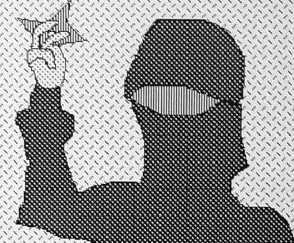
Death to the Fascist Insect That Preys on the Life of the People
The larger issues percolating around the 2004 Whitney Biennial were (A) whether the "quest for the adolescent" theme identified by the curators was real (as opposed to a thesis in search of evidence), and (B) if real, the extent to which the retreat into infantilism was (i) a response to the current pervasive terror-talk and war, (ii) a reaction to 20 years of verbal theory and no fun in art, or (iii) widespread, simultaneous opting out of participation in an art historical lineage in favor of private (outsider-ish) worlds. The pervasiveness of what Roberta Smith calls "the bedroom shows" and the rise of collectives of 20-something artists documented by Holland Cotter suggests that the trend is real. Militating against that conclusion, however, is anecdotal evidence that the curators were scouting for "young artists" out in the field, and may have skewed the survey in favor of "stuff young artists do." But then previous generations of "young artists" made ultraserious, high-toned work in their 20s, as opposed to wacky, pop-culture-driven room-filling jamborees: think Frank Stella, Gordon Matta-Clark, Eva Hesse, even Cindy Sherman & Robert Longo.
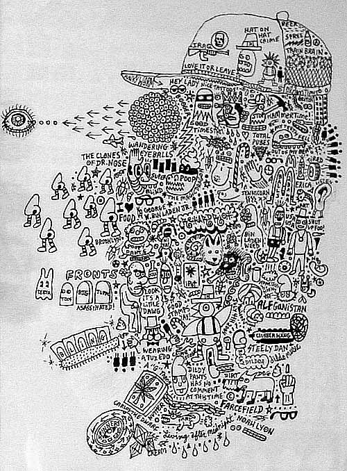
So, if we accept that this is a legitimate sociocultural trend, why the regression into the visual equivalent of baby talk? Perhaps it depends on which preschool we're talking about. The Whitney curators may very well have skimmed the most non-threatening and apolitical work out of the youthpool, while contemporaneous shows in Brooklyn and elsewhere show a "worried generation" mingling concerns about military, labor, environment, and culture-war issues with a faux-unengaged, faux-juvenile stance. Not precisely Dadaists waiting out WWI in Zurich, because overt references to current events are mixed in. I'm intrigued by James Wagner's reporting and pictures from a show I missed in DUMBO (Brooklyn) called "Death to the Fascist Insect That Preys on the Life of the People." The title is from the Symbionese Liberation Army (last invoked in the artworld in the early 90s "nihilistic" scatter art of Cady Noland), but here the grimness of Cinque De Freeze's social indictment is completely belied by the artwork on view: toys, stuffed animals, stickers, buttons, and crude thumbtacked drawings resembling an end-of-the-semester children's art show.
Based on James' photos and descriptions and what I know about some of the artists, the show looked to be an entertaining but tough-minded mix of influences: the Kenny Scharf Jetsons East Village blacklight funhouse thing, Basquiat "drawerly" cartooning, graffiti, the late 80s/early 90s slacker style, and, through manipulation of Saturday Morning sugar cereal advertising tropes, even the hardnosed, political "pictures" art of Levine, Goldstein, Prince, etc. The use of websites to document shows and present stand-alone pieces (by TAG Projects, who did the "Insect" show, but also BEIGE, Paper Rad, etc.) makes this a new animal, though. These are just the beginnings of a theory (and sorry it's so ponderous--just trying to get the thoughts down), but suddenly there's a lot of good work out there, and I'm excited by the role websites and bloggers like James are playing in documenting it, before it reaches the cooled down, institutional phase of magazine coverage and curatorial co-opting.
Noah Lyon, from "Death to the Fascist Insect..." Photo by James Wagner.
The "Infinite Fill Show" is now officially down, and the gallery, Foxy Production, suggested a way to pull up the somewhat obsessive posting on the subject here, which I hadn't thought of (duh): just click http://www.digitalmediatree.com/tommoody/?search=infinite+fill. That brings up 20 posts, including this one. Comments aren't included in the search, so you have to click on those separately. If you click http://www.digitalmediatree.com/tommoody/?search=infinite, you get 7 extra off-topic (but really good!) posts.
By the way, for anyone who wants to cite this page in a bio, press release or angry spam email, "Tom Moody" is preferred, or secondarily, "Tom Moody's Weblog." While "Digital Media Tree" sometimes appears as a cite for this log, that's not really correct; the Tree is a weblog collective and each of us has our own independent, wholly unedited content.
The blogosphere's all a-buzz over Kerry's "tough" ad called Old Tricks. It features a clip from a 2000 debate where John McCain tells Bush he should be "ashamed" for sliming McCain as anti-veteran, through fringe group surrogates. The camera moves to Bush's face, just as it is assuming what Joshua Marshall calls a "callow, trapped look," and freezes in a kind of "gotcha" way. The screen goes dark and the commercial ends with the caption "America Deserves Better." This is so manipulative--I hate that elections get decided on such gimmicky editing tricks. In case anyone else wondered how Bush answered McCain, here's an excerpt from a recent James Fallows article, liberated from the Atlantic's archive via the google cache:
McCain held a tight smile. "Let me tell you what really went over the line," he said shortly afterward, when asked by King for a reply. At a recent Bush rally Bush had stood alongside someone McCain called "a spokesman for a fringe veterans' group," who had denounced McCain for "abandoning" Vietnam veterans.
With feigned politeness, McCain told Bush, "I don't know if you can understand this, George, but that really hurts. It really hurts." No mention of McCain's service as a military pilot, nor of his imprisonment and torture in the "Hanoi Hilton"; everyone knew what McCain meant. McCain turned to King. "And so five United States senatorsVietnam veterans, heroes, some of them really incredible heroeswrote George a letter and said, 'Apologize.' You should be ashamed."
Bush sputtered, "Let me speak to that ..."
McCain faced him again, calm but contemptuous: "You should be ashamed."
It went on for minutes. Bush protested McCain's underhanded trickswhy, one of McCain's supporters, the former senator Warren Rudman, had said that the Christian Coalition included "bigots." Of McCain's military heroism Bush lamely said, "I'm proud of your record, just like you are," and concededin an "okay, are you happy now?" tonethat McCain had "served his country well" and had not abandoned veterans. But he was still unhappy himself: "You can disagree with me on issues, John, but do not questiondo not question my trustworthiness, and do not compare me to Bill Clinton." It was Bush's worst onstage moment in the 2000 campaign. He managed to sound both self-righteous and rattled by McCain's direct challenge to his tactics and implied slight to his courage. This is a tape the Kerry campaign will want to examinewhile remembering that Bush went on to beat McCain in South Carolina.
What is this, Self-Hating Artists Day? (friendly dig --ed.) We're talking about the James Elkins book What Happened to Art Criticism? Both simpleposie and Sally applied a word used here, "position," to artists in a rather noxious way. Just for the record, it wasn't used on this blog as a verb ("position themselves") or qualified with other words ("pretense to an art historical position"). Not sure where these pejoratives are coming from, attached to us artists: if we don't love and believe in what we do, how can we expect others to?
Elkins uses the word in posing the rather silly question of whether academic and journalist critics should "take a position," as opposed to, one supposes, being forever will-of-the-wisps and gadflys. And I responded that an actual debate that took place between an academic and an artist over an actual position, Minimalism, was more interesting than that question. In the Robert Smithson vs Michael Fried dustup of the late 1960s, Smithson was acting as spokesman for a group of artists who had come under attack (some didn't like having him as a spokesman, but that's another story). The object of the dialogue was not to nail down Minimalism's "place in art history" but first of all, what it was.
If we're talking about a position vis a vis an individual artist as opposed to a movement, a better word is "vision," or less grandiosely, "the artist's thing." The catalog essay or press release is the first articulation of that thing (after the thing itself). In a world where the first spin on your work is likely going to come from a harried journalist looking at dozens of shows, you should probably try to write that statement as well and clearly as possible to head off possible factual errors or misreadings of tone. The last thing you want is someone "interpreting" for you, if that means ignoring your own clearly expressed feelings (e.g, calling your work sad when it's not). Unless you truly don't care about how it's going to be read and discussed in the future.
Once that "first draft" is out there, then it's fair game. If a larger position emerges through comparison (by artists, academics, journos, the public, or whoever) of your work to other works, then so be it--or rather, cool! You certainly have the right to pitch in and argue for your thing during the process.
As for the abstract evalution of critical practice Sally mentions, I think it's interesting in a shop talk kind of way, but less important than discussing actual artworks, good ones of which exist in a substantial unevaluated-to-evaluated ratio.
To sum up an earlier post about James Elkins' book What Happened to Art Criticism? Asking that question is a bit like fussing over the drapes while a rhinoceros crashes about your living room (or whatever metaphor gets this across). Like it or not, artists keep making art; you can either describe it, using whatever tools and venues are available, until a theory becomes clear, or worry about less important "writerly" concerns, like classifying different types of criticism and asking whether they're up to the job.
Coincidences is a blog of photo criticism that refreshingly doesn't distinguish too much between "client" and non-commercial work (yes, I've griped here about ads but mainly when they're ruining my favorite songs; that's not to say interesting things can't be found in them). This post rounds up links on Southern shutterbug William Eggleston; a later post adds my reply to a Slate article where Jim Lewis proclaimed Eggleston's 1976 MOMA show "an annunciation of the coming of color." In a reply to my reply (in the comments to the Coincidences post), Stan Banos says:
Eggleston did "validate" color photography as an art form back in the day ('76). I remember it quite clearly. Here was this middle aged Southern guy hitting the photo scene like visual punk. Prior to him when color and "art" photography were mentioned, the usual work summoned forth was the droll, color pictorials of Ernst Haas. But just as the "English Invasion" was not just the Beatles, there was also the work of Sternfield and Shore (not a law firm). Goldin and Meisalis also pioneered and validated the use of color for photojournalism. And Meyerowitz was probably the most popular of the lot, and his lesser known color street work was every bit as mindboggling (if not as revolutionary) as Eggleston's.I don't doubt what Lewis called the "coming of color" was revelatory when so-called art photography was a grey, carefully controlled arena. My argument is that events outside the photo scene made that coming more inevitable than did the work of one man. But I wasn't there, as Banos obviously was, in the sense of being so involved with the scene as to be hit by a punk rock moment. I'd trust that gut impression more than Lewis's arguments, which just weren't very convincing (though I'm not sure Nan Goldin thinks of herself as a photojournalist). I still think the issue of the "validity" of color (i.e., whether it was important for photo departments to collect) diminishes in importance when you pull the lens back to view the entire visual (commercial art, conceptual art) picture.
 |
|
|  |
 |
|
|  |
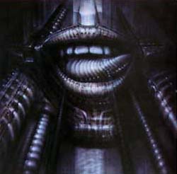
Donald Judd gave Bontecou an early critical nod, as practically every article about her reminds us, but her work is completely at odds with his minimal aesthetic. She started out in the assemblage camp, just as he did, but while he gradually shed more "stuff" from his art, she kept working with materials from the scrap heap, and worse to minimalist sensibilities, used it to make a kind of sculptural abstract expressionism. One oohs and ahs at her craftsmanship but the work comes off strangely inert in person; the Giger-esque vaginas dentata are overwrought and corny. In the early 70s she made vacuformed plastic objects somewhat reminiscent of the forms in Judy Chicago's biomorphic airbrush art--those were actually kind of good.
 (The story is she "turned away from the art world" at this time, but it's possible her career as a crypto-feminist surrealist abstractionist was going to jump the shark when she started making plastic fish suspended from the ceiling with monofilament--maybe the turning away was pre-emptive?) Lately she's looking more like Roger Dean of Yes LP cover fame, making Metal Hurlant/Hobbit Rock spaceship thingies that hang from the ceiling and resemble hypertrophied sea urchins. Some of this is good (and slightly off-topic, I happen to know the above-mentioned Alex Ross is a Dean fan, though more rigorously abstract overall--Dean's is still the cult that dare not speak its name in the fanboy-averse art world, regardless of the fact that his architecture is now getting some acclaim). The tepid copper, teal and, alabaster color schemes of Bontecou's "spaceships" are a turnoff, though. The bolder colors in her drawing above--or no color--would have been more satisfying.
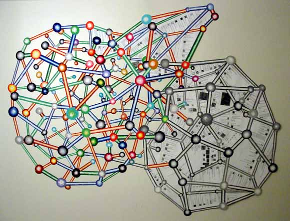
Dan at Iconoduel recently summarized a book by James Elkins titled "What Happened to Art Criticism?" While it is mostly fair in assessing the sources and limitations of criticism, Elkins gives short shrift to artists as originators of art world concepts, vocabularies, and judgments; in fact he gives them no shrift. He compares scholars who dispassionately critique critiques (in the field known as "reception history") to entomologists observing ant battles, with no stake at all in the outcome. And that's pretty much how he deals with artists--as people to write about but rarely read. So to Elkins' laundry list of critical sources (cultural history, philosophy, academic treatises, poetic criticism, etc.) I propose adding another: artist polemics.
Reviews, manifestos, transcribed panel discussions, artist's statements, press releases, interviews, studio talk, letters, emails, blog entries, slides, jpegs, Quicktime movies, chat room dialogue by artists: those are the engines that drive theory and judgment in the art world (electronic media being new components, obviously). Art writers who aren't also artists do participate, internalize concepts, write them up in a more dignified or cohesive or exciting way, maybe even put a new, brilliant spin on them, but their efforts will always be secondary to the main enterprise of artist-generated discourse, which necessarily includes criticism.
I think it was philosopher and former printmaker Arthur Danto who said artists don't make good critics because they're too focused, tunnel-vision-like, on their own practice (Elkins doesn't even give them that). Spoken like a true ex-artist! Donald Judd, Robert Smithson, Barnett Newman, Adrian Piper, Robert Motherwell, Art & Language, Joseph Kosuth, Barbara Kruger, Peter Halley (I could keep going) may not be the best writers or talkers in the world, but indisputably they catalyze, they content-provide, they know their history, and they judge. Clement Greenberg learned about flatness, color, push and pull and the rest of it from hanging out with artists, notably Hans Hoffman in the early days. Elkins writes as if Clem invented all his terminology himself.
Elkins devotes much ink to a weird distinction between Michael Fried and Jerry Saltz on the subject of whether critics should "take a position" when criticizing. Back in the day, the actual dialogue between Fried and an artist, Robert Smithson, on an actual position, Minimalism, was far more interesting. The only artist I can recall Elkins quoting at length is Andrea Fraser, and she is amazingly articulate. Possibly Elkins has a bone to pick with uppity artists, complaining early on that one changed what he wrote about her in a catalog essay. Deleting his word ("sad") without telling him was indisputably bad manners, but Elkins should have been more humble about his role as a catalog scribe, which is to help nail down the artist's vision as a kind of first draft of art history.
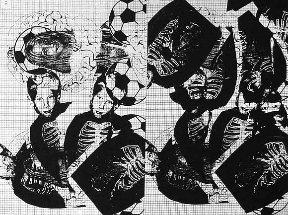
Ryan Compton, Mathematics of Composition (Brains and Grid), silkscreen, 2004, 17.5 X 22.5 inches, from "The Infinite Fill Show." "Compton invests what Leo Steinberg called the 'flatbed picture plane' of Rauschenberg and Warhol with the almost perceptible audial tint of a feeding-back electric guitar dropped from a considerable height." --October magazine (just kidding, I made that up). I believe that's Britney Spears posed like the Virgin Mary over the soccer ball and the brains.
Simon Reynolds on Beats as Fonts
The analogy that struck me was fonts. If your classic rock drum sound is something like Baskerville or Times New Roman, then the drums in the Belgian stuff or early Eurohouse or The KLF is perhaps equivalent to Arial or Lucida Console or something of that ilk: streamlined, almost-naturalistic, with a hint of futurity and this-is-the-modern-world. But like your classic rock drum sound, the beat/font doesnt really draw attention to itself, its functional--rhythm as division of time. Pure information. Of course rock drum sound hasnt always been like that--think of psychedelias effects-laden beats: the billowing, phased drum-rolls on The Small Faces "Itchycoo Park" being equivalent perhaps to the trippy typography on all those Fillmore Ballroom posters for bands like Sopwith Camel and Jefferson Airplane, woogly and pendulous to the point of illegibility.
Looksmart's FindArticles is putting old art magazine articles online; from the blowing my own horn department, I offer the following links:
Frances Colpitt's Art in America piece on abstract painting in Texas, which discusses an interesting scene we had going there in '94-'95 (continuing to this day even though several painters moved to NY). Also discussed besides yours truly are John Pomara, Aaron Parazette, David Szafranski, Jeff Elrod, Giovanni Garcia-Fenech, and others. It's amusing to read her description of Elrod's (then) slacker paintings of Atari game imagery, since he eventually became a somewhat stylish reifier of vector flotsam. (Boy, there's an article; I wonder who will write it?)
My Artforum review of the French (Corsican) artist Ange Leccia's solo at the Contemporary Arts Museum (CAM) in Houston. I described this big-scale Fluxo-conceptualist's entire show based on how it compared to various strains of abstract painting, using commodity art as a straw man. The show was good, but in retrospect I'd say it was a meditative climb-down from the work that got him known--the curious conceit of doing ephemeral Yoko Ono gestures with massive heavy-industry-produced technology.
From my first year of New York Artforum reviews, a piece on Barbara Gallucci: a 1996 show that Roberta Refused to Touch. Well, I remember she did a big roundup of hot new Soho galleries that month and managed not to mention Lauren Wittels' space, which was definitely hot at the time. There was some personal back story associated with the exhibit that I was definitely aware of, but I chose to review it with a "cold" interpretation.
 |
|
UPDATE: A large-ish image (750 x 1000) of Joe McKay's piece has been added and linked to in the post where it's discussed.
Don Wollheim Was Right: Philip K. Dick's: The Unteleported Man (AKA Lies, Inc.)
Philip K. Dick originally wrote The Unteleported Man (his title) as a 40,000 word novella for magazine publication, around '63-'64. It's a fairly tightly written, straightforward science fiction story about an Earth colony world that turns out to be a bleak garrison state rather than the pleasant place to immigrate advertised on TV (Dick claims he wrote it to go with a piece of cover art the publisher had acquired). It's not his best work, but has a good paranoid premise and features his classic "little guy" character with entrepreneurial dreams, who is dead broke and harassed by "creditor balloons." The morals are (a) governments should always monitor corporate activities (they might disguise a coup d'etat) and (b) the "good German" still exists after Nazism (which needed to be said forty years ago, one supposes). Ace Books asked Dick to expand the story, so in 1965 he wrote about seven chapters of hallucinogenic, parallel worlds nonsense ranging from brilliant to self-indulgent. Ace editor Donald Wollheim rightly rejected this material: unlike other Dick novels that contain dreamlike passages (Three Stigmata of Palmer Eldritch, Martian Time Slip), these chapters couldn't be artfully integrated into the existing nuts and bolts story, logically or dream-logically.1 The rejection nevertheless angered Dick, and after Ace went out of business, he planned to combine the original novel with the extra chapters. He hadn't completed the necessary rewrites before his death, however. Since then, publishers have released three flawed versions of the book, in a combination, I would say, of misplaced Dick-worship and the desire to cash in on every nugget of his work since he has become "hot property" in Hollywood.
There are essentially four published versions of this novel:
(1) The original 40,000 word novella, released by Ace Books as a "double" in 1966 and 1972. The title is The Unteleported Man ("TUM").
(2) A posthumous 1983 edition published by Berkley, with the "expansion chapters" originally rejected by Ace. Also titled TUM. The Berkley editor somewhat arbitrarily stuck this material (with three manuscript pages missing) at the end of the original novella, even though Dick had been working on a revised chapter order at the time of his death.
(3) A 1984 British edition titled Lies, Inc. ("LI"). This was Dick's uncompleted 1979 rework (not used by the Berkley editor for the 1983 edition), still with missing pages (only two now because he had shortened the expansion material). Science fiction writer John Sladek was hired to write connective material to fill the gaps.
(4) The 2004 edition of LI, including the expansion material and Dick's 1979 rewrites, but with the original missing pages restored after they turned up in the papers of the estate in 1985.
Most of this is explained in ex-executor Paul Williams' afterward to the 2004 edition. Aaron Barlow's online thesis chapter exhaustively outlines the differences between the 1983 TUM and the 1984 LI. Both Williams and Barlow are ardent fans and never seem to question whether it was proper to release or even consider the "expanded" novella as a finished work. While it's true the missing pages have been restored, they were unavailable to Dick when he did his 1979 revamp. Moreover, he never ultimately approved "Lies, Inc." before he died. In '79 he decided to insert the expansion material about 2/3 of the way through (completely destroying the flow of the original novella), wrote a new first chapter (not as good), and did some chopping and rewriting, but he never finished the project. Ultimately what the publishers are calling LI is a flawed or failed bit of posthumous writing: the reading public would be better served to have the original novella re-released and the expansion material and rewrites included in appendices, like DVD extras.
1. In the 1983 TUM, Rachmael is shot with an "LSD-tipped dart" after he goes through the teleporter to the garrison world to rescue Freya, and the resulting hallucinatory description is excellent, but the rest of the expansion material is meandering and meaningless, plot-wise (although there is much thoughtful and clever writing). In both editions of LI, Rachmael goes through the teleporter several chapters earlier, at a point when he is supposedly in a starship on his way to Fomalhaut. The feeble parallel world foreshadowing in the added first chapter just isn't enough explanation to justify this glaring non-sequitur. Only the most loyal fan will try to defend the hallucinatory chapters as somehow proceeding from--or subverting--the core novel.
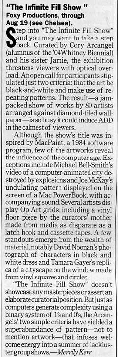 To the left is Time Out NY's "Infinite Fill Show" review; on the whole it's better than the NY Times'. Below is the accompanying photo. My notes on the review: To the left is Time Out NY's "Infinite Fill Show" review; on the whole it's better than the NY Times'. Below is the accompanying photo. My notes on the review:At least this writer got Jamie Arcangel's sex right, but it's Foxy Production, singular. "[F]ew of the artworks reveal the influence of the computer age..." This is to calm regular readers of the Time Out art page, who might be freaked out by too much computer art in a gallery. "Several of the artists display Op Art grids made from media as disparate as a latch hook and cassette tapes, including a vinyl piece by the curators' mother." That is how that sentence should read: I suspect editorial garbling in the published text. Props to Joe McKay for undulations catching the critic's eye. His piece is good, a sort of moving Suprematist abstraction gliding in and out of a permanent dark band on a broken PowerBook. Broken consumer tech=very good. [J]ust as computers generate complexity using a binary system of 1s and 0s, the Arcangels' two simple criteria [black & white + repeating patterns] have yielded a superabundance of pattern--not to mention artwork..." Yes! Bemoaners of the "crisis of criticism," you get your theory where you find it in the art world; this is a variant of Sally McKay's here on this blog (scroll down to comments). Roberta Smith only got the second half of this thought. |
 |
My studio-based artwork from the past couple of years has been archived in blog form; not all of it, but whenever I think of it. The 2004 archive is here and the 2003 is here; the 2004 wasn't getting regularly updated while I was doing a bunch of animation (even though I was making art, too)--I just added stuff today. By the way, I don't know if I've mentioned that my artistic heroes include Francis Picabia, Sigmar Polke and the late Martin Kippenberger, and I can't think of a better life project than trying to communicate their kinds of quirky, problematic sensibilities in digital-age terms. Not imitating them, but giving in to the perverse turns of mind I think they all represent. The animation, writing, music, and whatever is all a spinoff from, and contingent on, my studio practice. In case there's any question about what I'm up to.
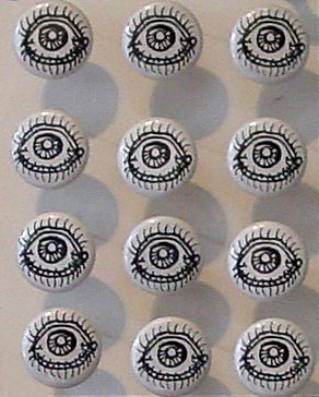
Two by Noah Lyon, from "The Infinite Fill Show." Above: "Paper Rodeo Head," ink and whiteout on Bristol, 2004; below: "12 Eyes," mixed media, 2004. Paper Rodeo is a Providence zine crammed with imagery such as Lyon's cartoon homage to Arcimboldo. (The grey smears to the left are shadows from the buttons, which are adjacent to the drawing in the show.) The explosion of psychotropic-influenced graphics coming out of Providence is duly noted; still waiting for a critic to stop complaining about the state of criticism and get down to the hard work of defining how this particular graphic revolution differs from the Zap comix '60s and the Raw magazine '80s (it does differ). These days my taste leans more towards the cartoon minimalism of the "eye buttons," though it's so damn easy to provoke a response with eyes.
About a year ago I posted a link to Eric Fensler's remixed GI Joe PSAs. Those links now redirect to his main page. I hadn't looked in a while, but he's added a few new ones. They're on this video page, which includes all 25. "Pork chop sandwiches!"..."Stop all the downloading!"..."It's such a wonderful experience here with the Indian"... Relive these moments from the magical year of 2003. And be sure to play PSA 25!
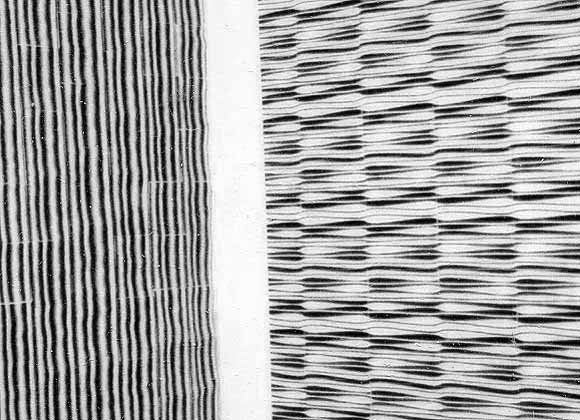
My 54th Street (Hell's Kitchen) studio, ca. 1998. Left hand image(s): Pipes 2, 1998, laser prints and linen tape, 88" X 78", previously exhibited here. The work on the right is untitled, same media. Each piece is essentially a giant paper quilt made of approx. three by five inch rectangles of xerox-printed paper taped together on the back (the linen tape is starchy and moistened when applied; when it dries it forms a "kite frame" of plaster-like strips that give the piece a sense of volume perceptible from the front). The big one hangs loosely on the wall, the small one is folded around a stretcher. Perhaps you can see where a group exhibition of black and white, repeating, Op art-like patterns, computer-made, with a kind of "jenky" outsider craft focus, would interest me. The "pipes" were originally intended to be cut out and used as struts or sticks for the molecules I was making, but I discovered that when placed side by side, they created intense, fairly painful optical vibration (not visible in these polaroid scans). These, and the allover patterns of spheres I was doing simultaneously, are what lead to my investigation and reworking of Op art rhetoric and ultimately my involvement in the "post-hypnotic" exhibition.
"p-h" traveled around the U.S. but never made it to NY. It would have been a hard sell here. I knew the idea of a (multiply-recontextualized) Op pseudo-revival was doomed when I read Roberta Smith's review of the Bridget Riley show at Dia. I'm paraphrasing here, but Smith basically said that Riley was tainted by her association with artists who would be forever on the margins, "especially in anti-Op New York." Wow, opposition to Op art is institutionalized here! Or was that another way of saying "anti-Op Roberta"? Considering the predominance of Op-like patterns in "The Infinite Fill Show," I guess it took the "teen bedroom angle" to override Roberta's dislike of the form and/or perception that it was discredited. Or, less cynically, maybe it was just the overwhelming evidence that artists find it more interesting than she does. [reposted from a few days ago with modifications.]
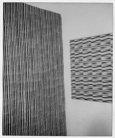
Work in progress; the back side of a piece prior to taping. It looks kind of elegant as a drawing.
Wishful thinking (?) by Steve Gilliard: "Bloomberg isn't going to risk a riot in Central Park. And if he tries to arrest people for that, he knows that is exactly what will happen. Forget the paranoid fear, a riot in New York during the RNC would be a nightmare for Bush and Rove. They don't want the attention taken away from the President and the party and this will do just that. UFPJ is families, is middle class people with kids. It is not the Ruckus society. If the cops go haywire on them, the whole city will react badly. Bloomberg's popularity isn't high now, chasing yuppie families down 79th St is not something people want on TV or on the cover of the Daily News."
M. Night Shyamalan's The Village is terrific; I like all his movies. There's a deconstructive element at work in them (I know, that word)--an emphasis on social subtexts and relationships to other films that takes them out of the simple O. Henry/Twilight Zone realm. Unbreakable focuses on the warped power fantasies of the invisible comic book fan who ultimately drives the superhero script; Signs presents another kind of script, the near-impossible chain of coincidences required for a lapsed believer to regain faith.
The Shyamster (as one smartass critic called him) is a master of the subjective POV, showing you only what he wants to show you and keeping you in a state of nervous tunnel vision throughout. Inexplicable imagery or behavior is explained eventually, sometimes immediately. This is highly manipulative but so what? I like the way gradually-introduced information from outside the frame changes the meaning of what's perceived, all within the filmic atom of "the shot."
Rather than give away The Village's plot, let's just say there's a constellation of supernatural or "artificial" works about America's small town past into which the movie could be inserted: The Crucible, The Lottery, Dogtown, A Boy and His Dog, Our Town, Signs. (And of course, Children of the Corn--just kidding.) There's a love story, and a larger enveloping story that is quite creepy and melancholy and gives you something to think about after the movie's over. Oh, and the lead actress is good--I found out afterward she's Ron Howard's daughter. Another surreal, small town connection: Mayberry RFD.
 |
 |
 |
 |
 |
 |
 |
 |
 |
 |
 |
 |
 |
 |
 |
 |
 |
 |
 |
 |
 |
|
 |
 |
Aya T. Kanai, "Polaroids Tokyo/NYC," 2004, spectra polaroid photos, from "The Infinite Fill Show." Web layout (rephotography, slight cropping of installation views) by Tom Moody.
Just walked past Madison Square Garden, and they're getting it all spruced up for the big übermenschen rally later this month. The place is already swarming with cops, and construction crews are building a big pedestrian skyway/habitrail thing arching over 8th Avenue, which will presumably allow bigwigs to go back and forth from the Garden to the old Post Office building across the street (some kind of temporary VIP headquarters?), without mingling with the hoi polloi. Incredibly intrusive and ugly, the skychute is a windowless, blue-painted wood and metal structure raised up on temporary girders, with the logo of a stars-and-stripes bedecked Empire State Building and "2004" emblazoned on the side. No Republican-specific signage yet, but I couldn't help but laugh at the several-stories-high banners currently on the sides of the Garden, featuring pictures of nasty, chitinous monsters and the inscription "Alien vs Predator: Whoever Wins, We Lose."
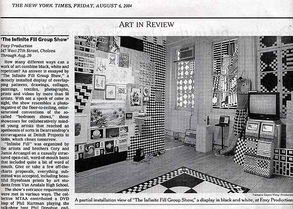
Still more thoughts on Infinite Fill. The so-called Bedroom shows Roberta Smith talks about in her review--she mentions Dearraindrop but Scott Hug's and Daniel Reich's shows also come to mind1--are mainly of sociological interest (collectives arise to challenge the hegemony of the individual genius, only to eventually be beaten down by the art world's need to market solo work--my cynical prediction), and backward-looking to the extent that they stand for some "rejuvenation of painting" discourse. The Providence collectives didn't invent the "colorful room full of manic cartoon imagery"--arguably that was Kenny Scharf's contribution to art...20 years ago. Whereas there is something larger at stake in IF, which is the merger of so-called new media art with traditional gallery exhibition practice. If art is to avoid shriveling into some finicky "cult of the hand," it's going to have to reconcile itself to technology, and eventually something interesting will emerge from what they used to call the "dialectic" between the two arenas. In Infinite Fill, the monochrome grid is the level playing field where the two opposed forces meet, intuitively connecting Sol LeWitt, needlepoint, and video games in an easy to read, "anyone can play" matrix. Also, as Sally McKay suggests in the comments to a previous post, "Infinite Fill" is a pun--it's about a computer filling up space and artists filling up a room with work. So far, none of the Bedroom Gang has come up with anything that elegant or concise, theory-wise.
1. I would exclude Paper Rad here, since their Foxy Production show was fairly tightly organized, with different walls devoted to different themes. I missed the Dearraindrop extravaganza at Deitch but friends said it wasn't so good--too much wall space to fill with manic creative activity. I did see their previous floor to ceiling effort at John Connelly, and like most people thought Billy Grant's video was the best part. You don't need a Soho barn for that, though--just a TV!
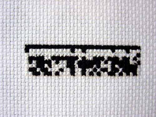
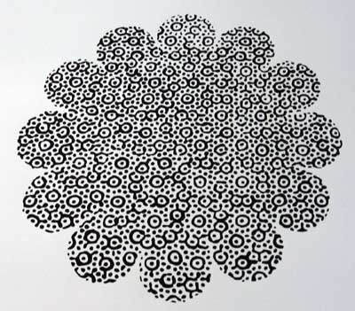
Cody Trepte, Why Are Numbers So Comfortable? (detail), cross stitch binary, 2004, from "The Infinite Fill Show".
Belatedly noticed that this image should be rotated 90 degrees counterclockwise. I don't know if it's the installation or my photo that got it wrong.
You're probably thinking "Those folks at preReview have packed it in. They had their little joke of reviewing movies they hadn't seen and getting written up in Time Out and being cool site of the day and now I'll bet they're dormant." Well, if that's what you're thinking, you are very wrong. The urge to preReview is a deep, abiding and very human hunger that never really goes away--just ask an agnostic what he or she thinks of Mel Gibson's Jesus movie, Rush Limbaugh what he thinks of Fahrenheit 9/11, or George Bush what he thinks of the Taguba report. Anyway, check out the new "point/counterpoint" on Breakfast at Tiffany's, which neither Joe McKay nor I have ever seen, and while you're there, peruse the cogent, uninfomed thoughts on Collateral ("Tom Cruise can no longer move the bottom half of his face"), King Kong ("The big secret of Peter Jackson's upcoming Kong remake is that he's gone 'high concept.' Instead of the CGI spectacular we're all dreading it's going to be a shot-for-shot remake of the 1933 original, a la Gus Van Sant's Psycho"), and The Village ("I had to watch the director's interview on the [Sixth Sense] bonus dvd. What a pretentious bastard. He's like, 'I used red to symbolize death...' and says this like he's Godard or something.")
Before MacPaint incorporated black & white, so-called infinite fill patterns into home computer graphics, most already existed and were used by design firms, newspaper paste-up departments, and cartoonists for shading camera-ready art. Manufactured as adhesive sheets, they were (and still are by some) cut out with X-acto knives and mounted on illustration board. Zipatone was the company cartoonists swore by; it's now defunct but Letraset has a mind-boggling array of fill patterns viewable (and/or downloadable) online.
Transfer Graphics - Letratone (physical media - comes printed on sheets of adhesive film)
Dot TintsPhototone Imagery - Textures & Tones - Single Downloads
Geographical & Architectural
Dots & Grids
Mezzotints
Miscellaneous
Excerpt from today's Daily Howler:
YOULL SEE IT [IN THE HOWLER] AND NOWHERE ELSE: By any measure of his votes, [Tucker] Carlson said [on CNN], Kerry is the most liberal member of the Senate. When GOP hacks say that Kerry and Edwards are first and fourth most liberal senators, they are citing a survey from National Journal. But on March 6, that very same Journalexplicitly responding to this misleading claimpublished its list of current senators with the most liberal lifetime voting records. Here it isthe Journals Top Ten. Guess whose names arent on it?
National Journal: Most liberal senators, lifetime voting
1. Mark Dayton, D-Minn.
2. Paul Sarbanes, D-Md.
3. Jack Reed, D-R.I.
4. Jon Corzine, D-N.J.
5. Edward Kennedy, D-Mass.
6. Barbara Boxer, D-Calif.
7. Tom Harkin, D-Iowa
8. Richard Durbin, D-Ill.
9. Frank Lautenberg, D-N.J.
10. Patrick Leahy, D-Vt
In case anyone quotes you this absurd RNC spin point, here's some ammo. --ed.
UPDATE: Obviously Kerry's not a liberal, now he's saying he would have invaded Iraq even without WMDs. What a putz; anything to get elected, I guess.
Coalition and Iraqi civilian casualty links added to column at left. (Who's tracking insurgent deaths? Aren't the "civilian" numbers increasingly fluid as more and more Iraqis take up arms?) Number of US soldiers killed in Iraq to date: 929. Number of coalition soldiers killed: 1052. Number of US soldiers killed since August 1, 2004: 17. Iraqi civilians killed: 11429 - 13398. All thanks to George W. Bush, who fails in everything he does, and is now taking innocents along with him.
There's been quite a bit of ruminating on various artblogs about "the role of criticism" recently, but the topic remains frustratingly vague since specific examples are avoided. As a case study--surprise, surprise--let's look at the critical reasoning behind the "Infinite Fill Show" (which we've been discussing here lately), as articulated in the exhibition materials and the New York Times review of the show.
Press release/call for entries theory: "The only rule is that [work submitted] has to somehow use black and white repeating patterns" (from the call for entries). "The curatorial concept was inspired by [MacPaint], the 1984 software application with varied 16-bit monochrome patterning that could be picked and dropped into areas of the screen to denote color and depth. For Cory and Jamie Arcangel, this rudimentary precursor to Photoshop's draw and paint functions provides a creative tool to explore multiple perspectives within a unifying aesthetic." (from the press release)
The "nostalgia factor" associated with old programs I addressed in an earlier post. Still worth considering are (a) how did pattern substitute for color and depth in MacPaint, exactly? are "bricks" a color? who came up with those patterns? how well did/do they work in actual practice? to what extent were artistic prerogatives usurped by engineering prerogatives? (b) MacPaint is a precursor to Photoshop, which is pixel-based, but how does it relate to vector programs such as Illustrator, which use defined curves rather than rectangular blocks? If the show is a form of ancestor-worship, whose family is being feted? are pixel-based programs more "important" because they've been subsumed into html and web design? (c) to what extent was MacPaint old news, incorporating pre-1984 print conventions such as Ben Day dot patterns (also frequently alluded to in "Infinite Fill"), zipatone, or letratone?
New York Times theory (i.e., everything but the purely descriptive parts of the review): (1) "How many different ways can a work of art combine black, white and repetition? An answer is essayed by 'The Infinite Fill Group Show...'" (2) "The show is intended as a homage to [MacPaint], an early computer application (released in 1984) that enabled the user to click and drag a range of black-and-white patterns into images of any kind." (3) "[T]he show resembles a photo-negative of the floor-to-ceiling, color-saturated conventions of the so-called 'bedroom shows,' those showcases for collaboratively minded young artists that reached an apotheosis of sorts in Dearraindrop's extravaganza at Deitch Projects in SoHo..."
The "youth culture" and "psychedelia/color saturation" issues were raised here earlier. Perhaps "Infinite Fill" was also a "photo-negative" (inversion) of the teenager's bedroom shows because if included artists of all ages? What was the kid-to-geezer ratio? Does it matter? Item (1) slightly restates the show's premise (as a way of saying how diverse it is): but did each work in the show in fact use B&W and repetition? (No.) Black & white schemes are sometimes used by curators (not naming any names) to unify group shows of quite disparate work but disguise the lack of a thesis. Is that the case here? (No!--but why?) Does the fact that MacPaint was monochrome and used fill patterns justify the inclusion of works such as needlepoints, enlarged newsprint images, and zebra rugs? How is the political work in the show justified by a formal premise? Is the premise "merely formal"? The Times doesn't answer these questions with specitic examples (and neither have I in this short post); unless or until someone does so, a gap between theory and description remains unfilled.
Returning to the point raised in my first sentence, I submit that the "role of the critic" is to answer questions and plug gaps such as the above. (Not holding my breath, though.) As long as there is work to be done you don't sit around bemoaning what you're supposed to do.
UPDATE: This post has been reworked a bit to take into account the wording of the Arcangels' call for entries. I also added the links about historic fill patterns (zipatone, letratone).
The "Infinite Fill Show" gets the lead review in the New York Times today (page E32 of the print edition). Critic Roberta Smith says the exhibit, with its all-black and white color scheme, resembles a "photo-negative of the so-called 'bedroom shows,' those [floor-to-ceiling, color saturated] showcases for collaboratively minded young artists that reached an apotheosis of sorts in Dearraindrop's extravaganza at Deitch Projects..." After that, the review is pretty descriptive; she concludes by noting the show is an homage to "Mac Paint (sic)." It's a glowing write-up (for this non-effusive critic), and congratulations all around, but Smith really ought to read blogs more. If she did, she'd know that Jamie Arcangel is female. Pretty funny--she describes "Infinite Fill"'s organizers as "the artists and brothers Cory and Jamie Arcangel."
Below: Zoms Zoms at Boogaloo bar in S. Willliamsburg, August 5, 2004. High-energy hardcore synthpop trio from Austin, with a heavy art/noise component. Surprisingly rocking. Songs are short and got the crowd going: I imagined an A&R guy hanging around, thinking, "Great, great, how can we ruin this?" Although the band expressed concern that the sound mix submerged the singer in these "vocally driven" songs, I liked the prominence given the guitar, which I noticed less on the recorded songs I've heard: an orgiastic, Beefheart-Henry Kaiser jangle balancing out the fast metronomic beats and synth woops. The band has .mp3s on websites here (myspace.com) and here (main site). "Static" and "TV" are recommended. |
More work from the "Infinite Fill Show." Above: Kevin McGarry, NIN.gif (detail). In the lower part of this image, not shown here, the ninja is carrying a scythe like the Grim Reaper--is this some game character I don't know about?
Louisa Minkin, Blindspot (detail of watercolor).
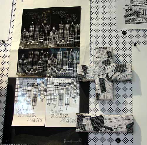
Jamie Arcangel did the New York City collage (in high school) and LoVid the patchwork plus and minus.
I just posted the comment below on the Agonist comment board, in response to editor Sean-Paul Kelley's report on a recent Fahrenheit 9/11 panel in San Antonio. "Where Moore went overboard is to suggest that Bush's family's financial ties to the Saudis were in any way a factor in the President's decision to go to war in Iraq," Kelley quotes Jan Jarboe-Russell, who he describes as "thoughtful and even-handed" and "known for her progressive stance on issues," despite the fact that "neither the [San Antonio Express-News] nor Texas Monthly, two publications she writes for, are beacons of the Left."
My comment:
I wasn't left with the impression that was what Moore was saying; maybe he did and I just discounted it, unlike the "liberal" who is making such a big deal of it. The "Saudi connection" part of the film gives a quite plausible reason why the Bushies were asleep at the switch on 9/11 and then sought to cover it up afterward. The Iraq part of the film mentions the standard reasons for the invasion--WMDs, "terrorist" activity, oil. I think it takes work to conflate the two parts of the film into "the Saudis wanted us to invade Iraq." The closest line I could find in the transcript is "I wonder if Mr. Bush told Prince Bandar not to worry because he already had a plan in motion"--which suggests Bush had a way of diverting attention from the Saudi connection and meeting some other Administration goals, not that Prince Bandar was a "factor" in the decision. Why do so-called liberals work so hard to undermine this movie?
Retired Pentagon analyst Karen Kwiatkowski on the 9/11 Commission whitewash, I mean report:
I naïvely expected more constructive and useful information in the report. A detailed discussion of FBI whistleblower Coleen Rowley and how her observations and actions led to change would be nice. She merited a brief mention in footnote 94. That is all.
I expected to hear how WTC 7 collapsed. The leaseholder of the building told the media it was "pulled." I expected to see more discussion of the mechanics of that presumably unplanned demolition in the evening of 9-11 as well as the collapse of the both 110-story towers, both impacted differently, both falling almost identically. Do we have an engineering design flaw no one knew about? It didnt come up in the report.
The Commission concluded that the FAA was not really capable of giving the military what it needed to know. Things have certainly gone downhill since 1999, when [golfer] Payne Stewarts twin engine Learjet quietly drifted off its flight plan, and was escorted by military jets from Eglin AFB and Tyndall AFB in Florida, ANG out of Tulsa, and out of Fargo, for several hours across several states before it ran out of gas and crashed in South Dakota. The difference was that Stewart was just a guy in a single private plane off course with no explanation, while on 9-11, it was one, no two, wait three, I mean four jumbo passenger jets. Unlike Stewarts plane which simply left its flight plan and was unresponsive, the FAA actually had hijack warning on AA 11 at 8:19 a.m., UA 175 at 8:52 a.m. After two hijack warnings, AA 77 made an unauthorized turn at 8:54 a.m. The Herndon Control Center knew UA 93 was hijacked at 9:34 a.m.
The commission reports the first fighter jets from Otis ANG Base were scrambled for AA 11 thirty-four minutes after the first hijack alert and again, from Langley AFB, a half hour or so later. At 10:38, fighter jets from Andrews AFB were airborne. None had a visual on any of the four planes plane until it was too late. In 1999, more military jets were on the job watching a lone Learjet over the Midwest than in the 2001 response to multiple hijacks on the densely populated East Coast. Rumsfeld and Wolfowitz should have both been fired at the time, saving us the trouble and expense of criminal trials for their roles in fomenting the unjustified and gratuitous Iraq war.
Jim Hamlyn, original .GIF, printed out for the "Infinite Fill Show." This image has been resized, the full image is here.
More about the show: Walter Robinson mistakenly describes the content in his Weekend Update column as "psychedelia and goth." Maybe he pasted in a paragraph from an old Whitney Biennial 2004 review by mistake? You have to stretch to find anything goth in the show, and psychedelia kind of implies color to most people these days, doesn't it? The keywords here are "Op Art" and "geek." Also, it's hard for me to imagine the phrase "eternal youth culture" coming out of the Foxy Production gallerists' mouth: who talks about shows that way? Besides, it's redundant, as I've argued on this page repeatedly: all of American culture is "eternal youth culture."
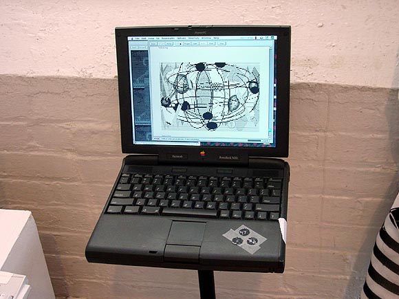
"Infinite Fill Show" installation view of collaboration: jimpunk (www.jimpunk.com) vs. tom moody, 2004, running on Netscape (slower than here, but it's fine that way, too). The gallery listed my and jimpunk's animated .GIFs as "URLs, not for sale" because I was too big a dork to burn them on a CD and demand several hundred thousand bucks for them. The small circles taped on the powerbook are checklist numbers.
Looks like there's going to be some national press for the show; I plan to keep posting about it, with more pictures coming, etc. This will be diary-style reportage, not criticism per se, since I'm obviously not detached.
The press has been ignoring Iraq since the fake transfer of power in June, but it's a slaughterhouse. According to an AP report cited on Juan Cole's site, four US soldiers died on Monday and Tuesday, bringing the total number of Americans killed since George Bush ordered the invasion to a total of 919. Robert Fisk, one of the few reporters telling the truth of what's happening there, describes a country on the verge of "implosion," with car bombings, kidnappings, murders of pro-US officials all on the rise (doctors and scientists also continue to be assassinated). The US has lost control of many cities and roads, but this is not being reported. Fisk also describes the manipulation of Saddam at his arraignment so he would appear disoriented on American TV--apparently he was lied to and told he was being taken to his execution.
Meanwhile, in the US, we keep getting bogus terror alerts such as this past weekend's, based on intelligence the government is now admitting dates back to before 9/11/01. I walked down Broadway south of Wall Monday afternoon and found it choked with media trucks with huge microwave antennas and helmet haired announcers doing their standup--they'd all converged to "report" on Homeland Security's non-terror-event, timed to spoil post-convention Democratic good will.
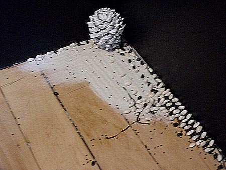
I went back to look at the "Infinite Fill Show" today and took some more pictures; I'll be putting them up gradually. This one came out blurry and I feel in all good conscience I should reshoot it, but I'm posting it anyway. It's an installation by Leif Ritchey, very easy to overlook down at your feet, in a corner. Yes, it's a zen rock garden with a black and white pine cone, beans, and raked sand, an elegant (but still somewhat lowbrow) counterpoint to all the digital brut up at eye-level. Ritchey's an analog guy, and I've been playing his video "Flatbush Windows" over and over and showing it to friends. I found it on the Nautical Almanac-related compilation Eyes of the Mind (which I've been meaning to write about--it's awesome). The video is as understated as this piece--grainy bits of one-step-removed footage shot off an awkwardly framed TV screen, depicting trees blowing in the wind, people walking up and down the sidewalk, clunky jump cuts of a pair of women's shoes (decorated with beads? I have to watch it again), with a soundtrack of jazz and quiet techno that's somewhat tinny, like it's wafting in from another room. The best kind of Cagean work, strangely gripping for being so ephemeral.
Amazon.com is weird, like a cult where the rules change daily. In an earlier post I described how their editors removed the word "sexual" from a review of mine and replaced it with "inapropriate [sic]." And according to the New York Times, they recently outed all their anonymous reviewers (in Canada) and started a companywide program that validates whether your reviews are written under your "Real Name" or a "Pen Name."
In the early days of the site they had a category called "I am the author of this book and I want to comment on it." I wrote an explanatory blurb about the post-hypnotic catalog, listing some artists depicted in the book, etc. and captioned it "notes from an artist and essayist in the exhibition." A couple of years ago, the "i am the author..." category was eliminated, and they moved the blurb to my list of reviews of other people's books, CDs, and movies. I thought that was strange, but let it go (it's not like they post an email for complaints). A month or two ago, the "review" disappeared from my list. It felt like they thought I was scamming, reviewing my own book. At any rate, I've always used my own name, but my "favorite reviewer" was dogmatico, who I see has also been removed from my page.
All this may ultimately mean less joke fodder such as this post celebrating the lowest ranked reviews of great works. dogmatico's favorite reviewer, "doo doo brown," to cite another example, made a career of writing dismissive reviews of canonical works of Western philosophy. (hat tips to Jim and Bill)
From the New Yorker, a review of a show mentioned on this weblog a few weeks ago:
DIANA KINGSLEYWell, "cute" is in the eye of the beholder, especially when a show is viewed selectively. Factual corrections: when a moth hits window glass, it's smashing (to the moth), and the tennis player falls three times if you watch the entire (two and 1/2 minute) loop.
Isle of August is a collection of videos and photographs of a well-heeled summer world. A tennis player, seen only from behind and the waist down, is oblivious to her flapping, untied shoelaces in Court Disaster. A stack of gilt-edged china plates teeters precariously in Fair field full of dainty, and a moth lured by a yellow flower bumps endlessly against a window in buster. But nothing smashes, no one falls, and the over-all effect is cute rather than menacing. Through Aug. 5. (Castelli, 18 E. 77th St. 212-249-4470.)
Painter Dennis Hollingsworth has a blog, which combines personal journal-style writing with documentation of his painting process, images and details of work, etc. Scott Speh's critical commentary on Hollingsworth was previously excerpted here.
artisforthepeople.com isn't a blog but rather art, meant to be consumed via the medium of the web. The site is anonymous as to authorship, but the man in the cooking show videos looks suspiciously like Ludwig Schwarz, who I mentioned here. Dallas never looks more abject than in his videos and photos.
Recent drawings, studio installation view.