View current page
23 matchs for op+art:
The unifying themes of this blog and the artwork depicted here (mine and others') are stated on my main page. That statement was written in 2001 and has only been tweaked slightly since.
I believe any serious artist these days deals with information technology because that's what makes the world go round (at least till the fuel and food runs out and our society resembles New Orleans post-Katrina). The cult of "painting and sculpting" (and the collectors who support it to the tune of billions) is either about burying heads in the dirt or actively denying this prevalent reality through some imagined return to the medieval.
But tech art also has its cult--futuristic assumptions that drive advertising, design, and consumption. That's why the artwork is low-tech here and why mute molecular forms, synthetic cubism, and '80s-style computer graphics are constant themes--all are utopian forms where the bloom is off the flower (kind of like the DHARMA initiative).
Guthrie Lonergan has identified two types of artists using information tech--hackers and "defaults" artists. I'm in the latter camp, using programs pretty much as they were intended and in ways that "blend in" with the wider Web the way a Pop artist's work blended in with commercial culture. The underlying intent is still art, but doesn't announce itself in the language of academic conceptualism or overt geekspeak.
Interesting historical show at Greene Naftali gallery opened last night: paintings and film by Tony Conrad, a cult figure who performed with La Monte Young, John Cale, and Faust in the '60s/early 70s. As the story has it, he invited people to a '70s film screening and instead of the avant garde Stan Brakhage-like art cinema they were expecting he hung a group of abstract paintings around the room the approximate height and orientation of film screens. The paintings had heavy brushy black outlines and resembled empty cartoon panels. These non-cloying pastel trichromes were painted on heavy paper and pushpinned to the wall; crimped and decayed after 30 years in the artists' attic, the same "screens" now fill the gallery and are extremely funky.
It's possible that Conrad invented "New Image Painting" with this show--that is, the injection of pictographic imagery into the uninflected language of minimalism as later, more famously practiced by Susan Rothenberg, Robert Moskowitz, and Jennifer Bartlett--and he should get props!
A real treat was seeing a Conrad film projected on one of the columns of the gallery. Seizure-inducing op art abstraction consisting of stroboscopic layers of horizontal and vertical bands triggering optical colors on the retina, all the stranger for being on scratchy, browning, aged film stock. Accompanied by a recording of John Cale's and Terry Riley's "Ides of March" from the Church of Anthrax album. This music--again, a cult fave in the music world--was played during the film's original screening, which I'm guessing must have been around '70-'71. Cale was Conrad's roommate at the time, I'm told. Slightly off-topic, I've read that the minimal-minded Riley strenuously objected to the energetic drum kit Cale dubbed onto this two-piano work.
Thanks to Greene Naftali for the time travel.
Update: According to Jeff S the film we saw was "Straight and Narrow," which Conrad made with his wife Beverly.
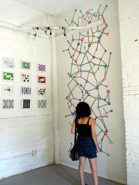
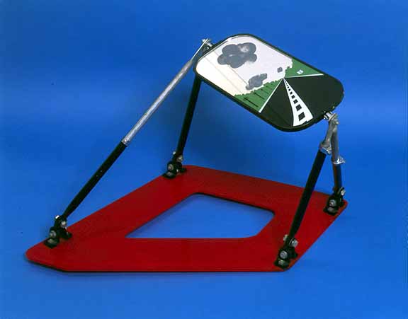
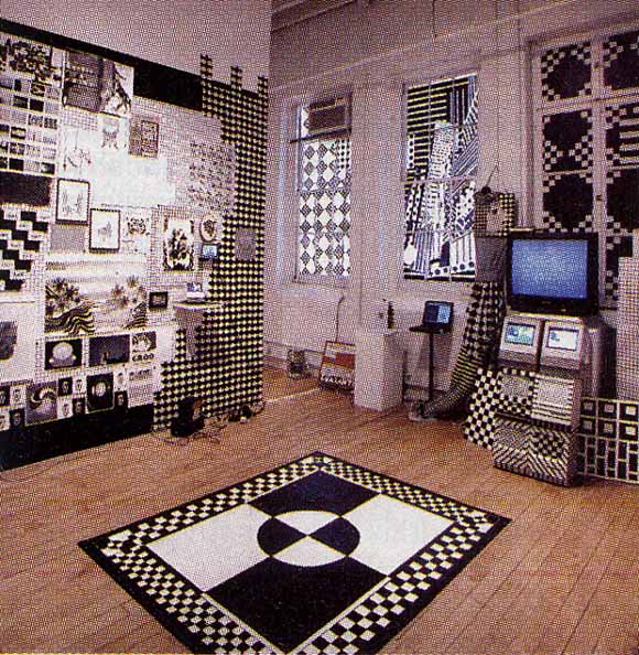
Found this photo on my hard drive; forgot I had it. Taken during my last open studio, when I still had a studio (that wasn't in my home). I had earlier posted an installation shot of this same work, but it's more effective with a human in it for scale. I was talking with M, an artist from Europe, about the relationship of work like this to Peter Kogler's, who is better known across the pond than in the States. In a nutshell, Kogler makes wallpaper of tubular, computer-modeled patterns and coats gallery floors and ceilings with it. It's hard to say what discourse is associated with it--it's his schtick, and M seemed to think it had slid into the realm of kitsch. "Computer-y" for people in the art world ignorant of computers, but too dumbed down for people working in new media with "generative art" models, etc. Screen saver art on an epic scale. Happily, M recognized that I was working in MSPaint(brush) and my work was a lo-tech goof and therefore not particularly comparable. I'm drawn to the "high school science fair" as a visual model, and the community museum Op art shows I remember from childhood, and I would hope the clunkiness of the work would make the irony and failed utopianism theme immediately obvious. Evidently it's not, though, to everyone. I actually backed off doing this type of installation because the response I was getting in my studio was lukewarm. Also I had to ask myself if I really wanted to go from show to show installing these things. The one above took about 8 hours of standing on a ladder--"I'm getting too old for this shit," as they say. I wouldn't rule it out as a component of a future show, so be forewarned.
New York Times review of Michael Bell-Smith's show at Foxy Production, 617 West 27th Street (Chelsea), New York, NY, up through June 3:
Michael Bell-Smith operates in the gap between animated cartoons and painting with unusual effectiveness. His short digital loops, shown on small screens or paintinglike wall monitors, portray landscapes, cityscapes, figures and oblique social commentary. But their main concerns are color, space and light, tweaked and amplified by digital technology and restrained animation. Whether we are flying high above an endless suburbia, as in "Some Houses Have Pools," or looking at the artist as he stands in the middle of a Midtown street, as in "Self-Portrait NYC," the excitement lies in grasping the layers of the image and the way they do, or don't, change.This is a nice review but treats the gallery as a walled garden sealed off from the Internet and the street. If anyone's work could benefit from a "digital non-site" analysis it's Bell-Smith's. How much does the imagery and animation derive from gaming, website GIF wallpaper, ringtones, and upload/download culture in general and how much is invented out of whole cloth by the artist? What is the value of putting "gallery brackets" around pop culture ephemera? Is this still Pop Art? Is it relevant to mention Bell-Smith's CD of acapella hiphop hits digitally synchronized with ringtones of the same songs? That he plays in a band? Or the fact that he was recently on a panel called Net Aesthetics 2.0, that considered a gradual tectonic shift in Internet art practice? That he has a blog and is an ardent curator of Internet cult phenomena of every description, with exquisite taste in same? "The gallery" and the "art review" are still excellent places to discuss these kinds of things--particularly how they can be translated into an elegant physical space. It would be good if our top gun critics could stretch just a wee bit.
In the post-Katrina "Continue 2000," a red-caped hero stares at the setting sun from the roof of a house adrift in a flood of shimmering, patchwork color. He is going nowhere, but the sun explodes and the world turns momentarily gray, like an omen.
"Up and Away" scrolls through an encyclopedic array of panoramic horizons city skylines, deserts, mountains, castles, forests, oceans that conjure up dozens of movie genres but are actually downloaded from video games (and are so coarsely pixilated they seem Pointillist, or knitted). Now it is the viewer who goes nowhere: space is deep but never penetrated. It's like watching a deck of cards being shuffled: pick a landscape, any landscape. Mr. Bell-Smith brings new and old and static and mobile into a promising, visually enthralling alignment. ROBERTA SMITH
Paddy Johnson interviews Cory Arcangel:
FANZINE: In fact it was a friend, Yael Kanarek, that organized your first talk in 2001 at Eyebeam. I remember this talk because you said some rather nasty things about Flashthe crux of your argument being that you should understand how a program is built if you are going to use it, and that Flash makes everything look the same. I saw your lecture at Columbia University in 2004 online, where you appear to have changed your opinion a little. Though you don't speak specifically about Flash, you do mention that you now believe that as long as you understand software imposes an aesthetic then it is fine to work with it. What was it that made you change your mind?
CORY ARCANGEL: Well in 2001, I was still a punk basically, and just thought it was my way or the highway. This was inherited from the BEIGE days, where we kinda rolled as a computer gang, and pretty much hated anything that wasnt exactly like what we were doing. But I guess as we grew older we started seeing all this work that we loved that wasnt necessarily 100% craft aware. In fact it was the opposite. I mean look at the Internet? How many amazing crappy Flash animations are there? And those are amazing!! Also, I began to see bad Photoshop art where the artist knew it was bad and was therefore OK. So I needed to find a way to accommodate this perspective.....otherwise I would be ruling out a lot of great self aware media art that is made these days. I had to have a way to deal with that in my own set of rules...
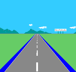
Interesting factoid I just learned: Cory Arcangel, whose hacked Nintendo cartridge piece Japanese Driving Game is depicted in the GIF above, is a relative of Pop artist Allan D'Arcangelo. Not sure the exact kinship--a cousin, but no one in the family's exactly sure how many steps removed. D'Arcangelo passed away in the '90s (and since we're talking about a distant cousin, this isn't a story of art world dynasty building, much as that might disappoint the dish-minded); some images via google are below. A frequent theme of D'Arcangelo's was road signs and American auto culture. The affinity between his art and the above piece of Arcangel's--which subtracted the cars from an '80s video game leaving the highway, signage, and surrounding landscape--is amusing. D'Arcangelo isn't as well known as Lichtenstein or Warhol, but I've always liked his work. He's one of those "impure Pop" artists, like John Wesley, whose personal style usually peeks out from behind the genre's bland corporate facade.
Update: According to family members Allan is Cory's great uncle.

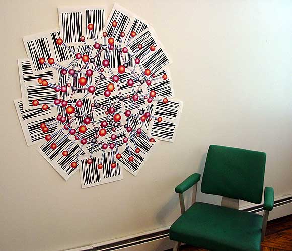
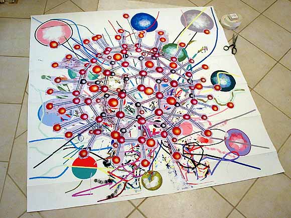
Finished the piece started over the July 4 weekend, finally. That's it above, posing with a chair. Below is the back, showing the strips of canvas-colored, gummed cloth tape that hold all the paper pieces together. The buckyball is an Epson print of a scan of a transparency of a handpainted buckyball I made years ago. The background xerox sheets are an Op art-like pattern I drew in MSPaintbrush--they would make a continuous wavy field if trimmed and arranged in a grid.
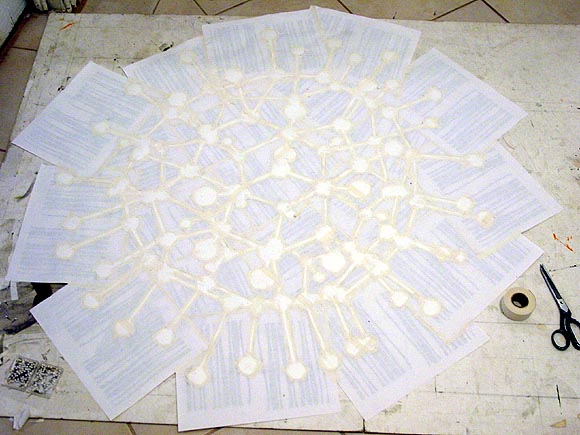
Today I cannibalized an older piece that wasn't working, going after it with scissors and an X-acto knife (woo).
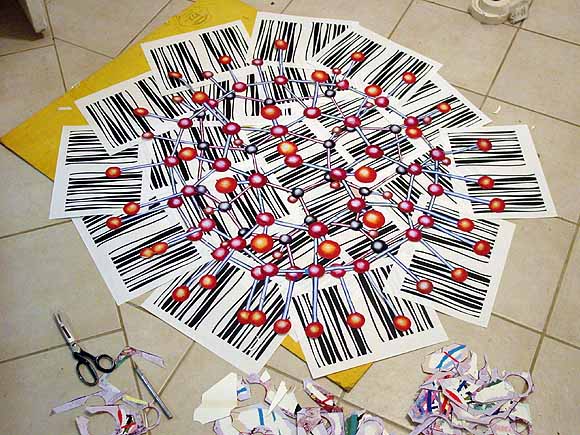
Approximately 5 CDs later (actually LPs, mostly prog rock), the shearing was done and a new background was in place. Now the real work starts--the whole thing has to be cut into pieces and taped back together in a mosaic/quilt that looks exactly like this. (Strips of cloth framers' tape will be applied on the back, along the seams.) Those bar code things are xeroxes of an op art pattern I made in MSPaintbrush and only used once, for a small piece.

This bit of unabashed, 40 years after the fact Pop Art is the best piece in Damien Hirst's painting show at Gagosian. The quality level/vibe of the rest of it is much like the canvases Ludwig Schwarz (and also an artist in Germany who's name I'm blanking on) did where they hired a company in China that will render any photo as a photorealistic oil. Hirst's contracted-out art is actually slightly more inept, hand-wise, than those guys'. The photos chosen were his typical death from life, life from death themes. He's having us on as usual, but also heading down the painting-on-canvas trail that many conceptualists follow to stay market-viable. Usually that's when they--sorry for the pun in Hirst's case--"jump the shark." (But of course Hirst has been producing paintings all along, clever bastard: the dots, which are kind of good, and the Walter Robinson-derivative spin paintings.) As joester points out on Sally McKay's page, the Gagosian set
...weren't painterly paintings. They had wiener symptoms (where every brush stroke looks like a wiener) and were really ugly to look at up close. Not ugly in a good way, ugly in a rushed "oh my god I have to paint 12 of these by wednesday" way.That's really all you need to know about the show. The work is too lame to merit any discussion of crack addicts, bloodied football hooligans, dissected brains, appropriation theory, and whatever else they they've raised. The forced "downer" themes also recall Cindy Sherman's vomit photos, an extended lament over the curse of success without end that attaches itself to "canonical" visual artists, more than any other type of creator (because we still have this medieval idea that art is iconic and forever, reinforced by a market that needs a canon). "I know--I'll make something they'll really hate." Except they don't hate it.
Paul Slocum suggests using knitPro to upload bad JPEG images so they could be rendered as cross stitch or needlepoint projects. Good idea, but man, that would be difficult to pull off. My sense is the stitched piece would have to be both enormous and extremely detailed to show the horrible "bicubic mush" that results from poor compression (which only the extremely perverse are apt to find funny anyway). Nevertheless, I have a candidate: it's a late Op Art piece by Julian Stanczak on the Stefan Stux website [Since removed]. In real life those stripes are super hard-edged, but on the Web, well...
UPDATE: Here's Paul's draft of a proposed "bad JPEG" fiber art project. He has more to say about it in the comments. I'll be away from the computer for a while but the obvious next step is to run this through knitPro.

More opinions on what the Stanczak image suffers from would be welcome--Paul pegs it as a bad resolution issue rather than a too much compression issue. I realize it's hard if you haven't seen the actual painting, but assume it's a black and white image with razor sharp lines. The whole thing is out of focus but mushy spots with added color at regular intervals look like the type of thing you see when saving something too many times at the "low quality" setting. It's important to know why things are an utter failure at communicating.
UPDATE 2: Another comment, from Dan, persuasively identifies the problem with the Stanczak image as one of bad resolution, not bad compression, but it's academic now because Stux has removed the murky black and white pic from its website. A new show of Stanczak work opens soon so I'm sure it was because of that. For bad jpegs of famous Canadian paintings, please see this post on Sally McKay's weblog, which she explains was inspired by a now somewhat quaint 1953 article by George Elliot warning that art should not be shown on television. " A painting needs an intellectual presence before it can work its magic. Placing anything between the viewer and the painting kills the viewer ."
In a comment to the previous post, Brent questions whether Chris Ashley's stationary HTML drawing and jimpunk's moving .GIF are comparable or compatible on the same page. My usual quip about showing video next to paintings in a gallery setting is that it's like bringing a baby to a wedding, but the browser is the great equalizer. A few more line breaks were added to the post so the pieces aren't quite so close together, but otherwise, yeah, I think they have more in common than not as art non-objects. Although neither artist is an Op artist in the old '60s sense, the pieces exploit optical tricks over and above their plain formal appeal: illusory depth in the Ashley and quite literal vibration in the jp. Moreover, they are fresh takes on the grid and opticality, which the New York Times and the Village Voice love to dismiss as the concerns of a bygone generation, in spite of all evidence to the contrary (e.g., the Infinite Fill show.)
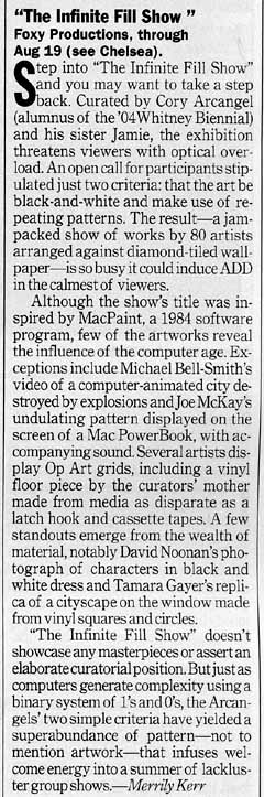 To the left is Time Out NY's "Infinite Fill Show" review; on the whole it's better than the NY Times'. Below is the accompanying photo. My notes on the review: To the left is Time Out NY's "Infinite Fill Show" review; on the whole it's better than the NY Times'. Below is the accompanying photo. My notes on the review:At least this writer got Jamie Arcangel's sex right, but it's Foxy Production, singular. "[F]ew of the artworks reveal the influence of the computer age..." This is to calm regular readers of the Time Out art page, who might be freaked out by too much computer art in a gallery. "Several of the artists display Op Art grids made from media as disparate as a latch hook and cassette tapes, including a vinyl piece by the curators' mother." That is how that sentence should read: I suspect editorial garbling in the published text. Props to Joe McKay for undulations catching the critic's eye. His piece is good, a sort of moving Suprematist abstraction gliding in and out of a permanent dark band on a broken PowerBook. Broken consumer tech=very good. [J]ust as computers generate complexity using a binary system of 1s and 0s, the Arcangels' two simple criteria [black & white + repeating patterns] have yielded a superabundance of pattern--not to mention artwork..." Yes! Bemoaners of the "crisis of criticism," you get your theory where you find it in the art world; this is a variant of Sally McKay's here on this blog (scroll down to comments). Roberta Smith only got the second half of this thought. |
 |
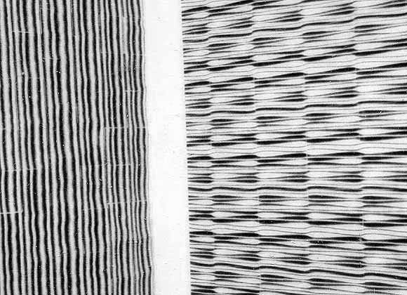
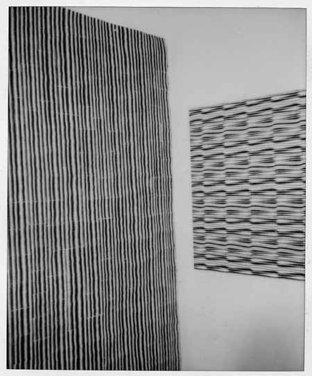
My 54th Street (Hell's Kitchen) studio, ca. 1998. Left hand image(s): Pipes 2, 1998, laser prints and linen tape, 88" X 78", previously exhibited here. The work on the right is untitled, same media. Each piece is essentially a giant paper quilt made of approx. three by five inch rectangles of xerox-printed paper taped together on the back (the linen tape is starchy and moistened when applied; when it dries it forms a "kite frame" of plaster-like strips that give the piece a sense of volume perceptible from the front). The big one hangs loosely on the wall, the small one is folded around a stretcher. Perhaps you can see where a group exhibition of black and white, repeating, Op art-like patterns, computer-made, with a kind of "jenky" outsider craft focus, would interest me. The "pipes" were originally intended to be cut out and used as struts or sticks for the molecules I was making, but I discovered that when placed side by side, they created intense, fairly painful optical vibration (not visible in these polaroid scans). These, and the allover patterns of spheres I was doing simultaneously, are what lead to my investigation and reworking of Op art rhetoric and ultimately my involvement in the "post-hypnotic" exhibition.
"p-h" traveled around the U.S. but never made it to NY. It would have been a hard sell here. I knew the idea of a (multiply-recontextualized) Op pseudo-revival was doomed when I read Roberta Smith's review of the Bridget Riley show at Dia. I'm paraphrasing here, but Smith basically said that Riley was tainted by her association with artists who would be forever on the margins, "especially in anti-Op New York." Wow, opposition to Op art is institutionalized here! Or was that another way of saying "anti-Op Roberta"? Considering the predominance of Op-like patterns in "The Infinite Fill Show," I guess it took the "teen bedroom angle" to override Roberta's dislike of the form and/or perception that it was discredited. Or, less cynically, maybe it was just the overwhelming evidence that artists find it more interesting than she does. [reposted from a few days ago with modifications.]
Jim Hamlyn, original .GIF, printed out for the "Infinite Fill Show." This image has been resized, the full image is here.
More about the show: Walter Robinson mistakenly describes the content in his Weekend Update column as "psychedelia and goth." Maybe he pasted in a paragraph from an old Whitney Biennial 2004 review by mistake? You have to stretch to find anything goth in the show, and psychedelia kind of implies color to most people these days, doesn't it? The keywords here are "Op Art" and "geek." Also, it's hard for me to imagine the phrase "eternal youth culture" coming out of the Foxy Production gallerists' mouth: who talks about shows that way? Besides, it's redundant, as I've argued on this page repeatedly: all of American culture is "eternal youth culture."
Three exhibits currently up at 526 W. 26th in Chelsea take major steps in the ongoing project of materializing 1s and 0s (art world department). The installation view at top is Millree Hughes at Michael Steinberg (9th floor). No static picture could do this show justice because every surface is lenticular printed plastic (a kind of pseudo-hologram often seen on gag postcards) encoded with five distinct abstract paintings. Each painting reveals itself in turn as you walk past the piece, and you are always looking at a "transition state" where 2 or more paintings are visible. This idea was done in a very obvious way by the Op artist Agam in the '60s (using ribbed, painted panels), but Hughes' layering of multiple viewpoints is much more shimmery and fluid--like a screen dissolve in tangible form. Miraculously recuperating Spencer Gifts technology, the show rethinks how painting can be experienced, making the spectator a participant, much as in an exhibition of Minimalist sculpture. (The floor-pieces aren't sculptures, per se, but rather paintings in a variety of elevations, orientations, and groupings.) The tangles of abstract expressionist silhouettes are done in a Flash program, very much informed by old-school paint-handling but with stretching, resizing, and color-tweaking features unique to digital programs.
Claire Corey's show at Ten in One (3rd Floor) makes us question our commitment to touch and spontaneity, supposedly the last remaining hallmarks of painterly as opposed to photographic practices. At what point do we stop caring about "the hand" and "humanity" when machines can perfectly duplicate drips, smears, and other signifiers of studio passion--that is, when we can no longer trust our senses to connect us to another's experience? Abstraction has no equivalent to portraiture's "uncanny valley," where heightened similarities make us concentrate distractingly on differences. Corey also has a show up in Germany right now, with an essay well worth reading, placing her work in the context of postmodern AbEx and explaining how she removes it one more step, from imitating a machine look with paint processes to actually using the machine to make art. Shirley Kaneda & Co., watch out: the bar has been raised.
Ditto ChanSchatz, at Massimo Audiello (5th Floor). Thinking this work was done like Corey's, all with the computer, I was disappointed to learn they cheated and used paint. What I thought were airbrush and stencil effects are apparently just airbrush and stencil (if I'm wrong about this, please leave a comment). Even worse, they've got that damn conceptual back story, obligatory for all recent Columbia MFAs: They didn't just make paintings, they're quick to explain, they gave their friends* preference sheets and had them check off favorite shapes and color combinations. Their aversion to the Individual Genius Author is laudable, but at a certain point decisions have to get made, and I'd guess these paintings lost their committee involvement fairly early in the process. They're intelligent and compelling images (except for the cheesy portraits) in which the computer is obviously integrally involved at the design stage; they don't need to be legitimized with all the discourse about "information management," corporate branding, blah blah.
*A who's who of New York curators, critics, and artists. What a coincidence! Also the friends' names are in the titles of the pieces. Touching. *retch*
Last night was the opening of "Outpost," an exhibition curated by Ada Chisholm at Smack Mellon (50 Water St, Dumbo, Brooklyn). Highlights were Joe McKay's big screen video game (pics here) where players achieve heights of competitive blood lust in order to...match colors, and Cory Arcangel's power-point-presentation-with-Van-Halen-guitar-solo. In the McKay piece, players sit at a console and work simple RGB sliders (levers raising and lowering the amount of red, green, and blue light). Each player is arbitrarily given a "starting color" and must shift the levers until a "target color"--say, a large dot moving around the screen--is duplicated. When one player hits the exact hue (and it takes some concentration), he or she is declared the winner of that round and the game resets. Each new game has a different "op art" pattern--circles, stripes, spirals--and the color-combinations are often quite dazzling. The installation does something often claimed for color field painting that invariably never happens when you look at it: that is, it teaches you about the physical properties, relativity, and context-specificity of color. A few rounds of the game are equivalent to a short Bauhaus course with Albers and Itten, and I love that the competition is centered around Kandinskyesque harmonics rather than blowing apart zombies or whatever.
Cory Arcangel was also in the education mode last night, giving one of his trademark nerdy laptop slide lectures, but instead of explaining some obscure point of 8-bit computing, he delved into a pop-cultural moment of the type geeks enshrine on the internet in mind-boggling detail: specifically Eddie Van Halen's Paganini-like 1978 guitar solo "Eruption." With amusingly clunky graphics Arcangel explained to a somewhat skeptical, slow-to-warm audience how Van Halen put the pickups from a Les Paul into a Stratocaster body so he could play "up high and nerdy," wired his amps to think they were playing at a lower volume than they were, and got Floyd Rose whammy bar effects with a stock, Strat-style whammy bar. (Simulating the sound on his own guitar, Arcangel momentarily got the wrong vibrato and said "Whoops, that sounds more like Steve Vai.") As the minute fanboy details kept coming and coming, the crowd finally started getting the joke, and then was roused to cheering applause when Arcangel ended his lecture with a blistering note-for-note recreation of the solo. Trips to art galleries should always be this fun.
The thought train that would not die. I added the following paragraph as an afterthought to my essay on Jim Lewis' Slate piece on William Eggleston (that's four prepositional phrases in sequence!):
It may well be that Eggleston's "breakthrough" enabled photo departments to collect color photos for the first time, but this is really a minor achievement, important only within the rigid, internecine structure of the contemporary art museum, since color photography *was* being collected a few doors down the hall, in the painting department. Thus, what he really did was give photographers who wanted to use color permission to do something, a handful of years early, that artists were already doing. But to be important, we expect artists to rewrite the rules of the game, not just a few intramural regulations.
If I had to pick a "great man" it would probably be [Richard] Prince, for finally, belatedly extending the logic of Duchamp and Pop art to photography (and being a malicious wit). The reason breaking the color barrier was important was that at last photography could be as permeable to the everyday (commercial, media-defined) world as painting had become under Warhol. More than a color progenitor, it might be interesting to think of Eggleston as a proto-appropriator, photographing banal commercial subject matter in a landscape setting before Prince et al came along and just removed the setting. But that's a stretch--I still think Eggleston is mainly an art photographer, whose principal contribution is injecting the poetry of color field painting into mechanically produced images.
And what comes after Prince? Found vernacular photography, culled from the internet and smartly curated. Highly recommended is a book series called Useful Photography. It's some Dutch curators (artists?) compiling photographs taken from a wide range of sources. Issue #2 is all pictures of things people are selling on ebay. It's mostly abject crap lying on blankets--stereo speakers, model kits, old shoes and hats--but the photos are magical, and all they seem really sophisticated in this context. Here's what the authors wrote on the back cover (the book's sole bit of text):
MANY THOUSANDS OF PEOPLE NOW OWN A DIGITAL CAMERA. MANY THOUSANDS MORE SELL THEIR PERSONAL ITEMS THROUGH EBAY EVERY DAY. EVERYONE IS A PHOTOGRAPHER AND ALL THEIR HOMES ARE STUDIOS.
The folks behind this project are Hans Aarsman, Claudie de Cleen, Julian Germain, Erik Kessels, and Hans Van Der Meer. Buy the book! Eschew photo fetishism!
WILLIAM EGGLESTON: NOT COLOR'S DAD
Make the rounds of the Armory show in NYC this weekend and you'll see hundreds of color photographs, or "c-prints." The art world loves color photography--it's becoming almost as ubiquitous as painting and sculpture--and it might surprise you to learn that it's all because of one man, an eccentric Southern photographer named William Eggleston.
At least that's what critic Jim Lewis argues, in a recent profile in the online magazine Slate. Lewis claims that Eggleston's breakthrough, all-color show at MOMA in 1976 was an "annunciation of the coming of color," paving the way for ready acceptance of chromatics in new art photographers such as Nan Goldin, Mitch Epstein, Richard Prince, and Andreas Gursky. Without a trace of irony (I'm pretty sure), he dubs Eggleston "The Father of Color Photography."
This pronouncement is just irritating, for a couple of reasons. First, it overlooks major developments around the time of Eggleston's show that were also bringing color to the fore, in favor of the tired "great men" view of history. Second, the four successors mentioned are completely unrelated to one another conceptually; the pictures Lewis chooses to illustrate his argument show surface similarities but ultimately do a disservice to the meanings of the artists.
Of course, Lewis immediately hedges by saying that ready acceptance means only acceptance of color and not acceptance of the four artists work itself. Nevertheless, it's hard not to keep them in mind, because they're the only concrete examples he gives of why the photo world's expansion to color might be important (other than generally explaining that the move was long overdue). By emphasizing the vernacular side of Eggleston's work, Lewis seems to be building a connection to, in particular, Epstein (for the sometime banality of his subject matter) and Goldin (for the snapshot casualness of her style). But apart from considering the good or bad taste of color snapshots, he doesn't really tell us how artists are using the full spectrum in the wake of Eggleston.
Art after Art Photography.
Lewis phrase "new art photographers" glosses over a not-so-old schism in the world of Museum-collected photography, between art photography and what might roughly be called artists with cameras, a distinction outlined in Abigail Solomon-Godeaus famous essay Photography after Art Photography. Almost exclusively shot in black and white and practiced by the likes of Walker Evans, Robert Frank, and Lee Friedlander, art photography was firmly ensconced in the museum in the 60s and 70s under the stewardship of MOMA curator John Szarkowski; it emphasized darkroom practice and objective standards of quality in photos.
The "conceptual photography" of Prince, Cindy Sherman, Laurie Simmons, and others, however, emerged from the world of painting, sculpture, and video. These artists used photos to document a performance, advance a theory, or critique the mass media, and didn't much give a damn about photographic values (including the old prohibition on color). In addition to this generation change in America, developments in European contemporary art gradually came to light in the late 70s: Gilbert & George, for example, used vivid colors in their photopastiches at least as early as 1975, and the conceptualist Jan Dibbets had no qualms about color in his images of tilted landscapes and car hoods. And finally, as Lewis mentions, color printing technology was vastly improving during this period.
Thus, while Szarkowski may have taken a big leap vis a vis older art photographers by giving Eggleston a one-person museum exhibit in 76, other trends were fast making that radicality a non-issue. The Europeans and young Americans werent invited into the tea circle of art photography because William Eggleston opened the door: instead, they found their own critical advocates, and after a few years of publicity and sales, they simply took over the show--and color came along with them.
Everybody's an artist.
Photography now is actually a mishmash of the art and conceptualist camps: the "snapshot aesthetic" of artists such as Wolfgang Tillmans and Richard Billingham rubs shoulders with anal retentive compositions by Gursky and the ultra-stagy Gregory Crewdson (and the latter's former students). All of the above now just call themselves artists, and the term "art photography" is in disrepute as the domain of camera club perfectionists.
Of the practitioners invoked/not invoked by Lewis as Eggleston successors, only Epstein might be called an old school art photographer lineally descended from Eggleston (although he claims Gary Winogrand as a mentor). Gurskys work springs from the Euro-conceptual tradition of his teachers Bernd and Hilla Becher; Goldins 80s photography was verite involvement in the lives of a group of boho friends in New Yorks East Village (seen as performative, post-Sherman); Prince was an American appropriator (see rephotographed cowboys below). While all of them may ultimately have emerged at the end of their careers as photographers Szarkowsi would probably love, thats not how they started out.
Eggleston certainly had some influence on the current generation as a poetic formalist, but Lewis keeps emphasizing the (apparently) casual, snapshot side of his work--garish color, bad lighting, banal subject matter. I put all these terms in quotes because Eggleston isnt really that casual. When I think of him the images that pop into my head are his tributes to "found color"--painted stripes on walls, product displays in Southern grocery stores, and that outrageous red ceiling (above)--revealing the exacting eye of a color field painter. David Byrne's curated selection of Eggleston photos for the 1986 True Stories book likewise included only this type of photo and none of the Diane Arbus-like images of odd southern characters.
Regardless of the subject matter, Eggleston's "snapshots" of the rural South are very carefully put together. Hilton Kramer couldn't see that in 1976, but he was famously wrong about many artists. Eggleston's "mistakes," such as the overexposed tree Lewis mentions, or non-sequiturs, such as the boy lying incongruously on a garage floor, occur within pictures that precisely balance chromatics, shape, composition, and so forth. Lewis discusses such formal strategies (turning the "perceived vices" of color into virtues, balancing shallowness and depth, creating "odd spirals") but without identifying them explicitly as such. You get the feeling Lewis mainly has Goldin in mind when discussing Egglestons casualness, but thats inapposite because her early work was genuinely rushed, capturing the heat of the moment.
Eggleston had help.
As for the great man thesis: Lewis creates the impression that Eggleston traveled to NY with a box of slides under his arm and the most powerful photography curator there had the perceptiveness to immediately give him a show. According to an Art on Paper article, Eggleston befriended photographers Friedlander, Arbus, and Winogrand in the '60s, all of whom were Szarkowsi's "New York School" proteges. Szarkowski may indeed have been "immediately" impressed by Eggleston's work, but having the support of his circle couldn't have hurt. Also, Washington, DC artist William Christenberry plugged Eggleston to curator Walter Hopps, who wanted to do an Eggleston show but dropped it when he found out about Szarkowski's. In any case, Eggleston made his famous trip to NY in 1967 but it took Szarkowski nine years finally to give him a show.
I would argue that Eggleston truly is an art photographer, in the old Szarkowsian sense, and if he seems contemporary at all now its because artists that were once threatening have grown more traditional. This is especially true of Prince, who started his career sardonically rephotographing Marlboro ads, but has been taking some pretty tame pictures of his upstate New York environs lately. Calling Eggleston the Father of Color Photography is annoyingly patriarchal, and ignores what Brian Eno calls "scenius"--a kind of collective innovation that includes changes in technology and the efforts of many lesser-known people working in the field. The story of the brilliant outsider coming to the big city and cutting through all the bullshit is very American, but in this case the photo world's tectonic shifts are the more interesting tale. Maybe Eggleston isnt as dismissable as Martha Rosler once said he was (she saw his promotion by MOMA as a Kodak-inspired plot to sell home color darkroom equipment), but his conservative brand of difficulty makes him an ideal patron saint for backsliders.
Afterthoughts. It may well be that William Eggleston's "breakthrough" enabled photo departments to collect color photos for the first time, but this is really a minor achievement, important only within the rigid, internecine structure of the contemporary art museum, since color photography *was* being collected a few doors down the hall, in the painting department. Thus, what he really did was give photographers who wanted to use color permission to do something, a handful of years early, that artists were already doing. But to be important, we expect artists to rewrite the rules of the game, not just a few intramural regulations.
If I had to pick a "great man" it would probably be Prince, for finally, belatedly extending the logic of Duchamp and Pop art to photography (and being a malicious wit). The reason breaking the color barrier was important was that at last photography could be as permeable to the everyday (commercial, media-defined) world as painting had become under Warhol. More than a color progenitor, it might be interesting to think of Eggleston as a proto-appropriator, photographing banal commercial subject matter in a landscape setting before Prince et al came along and just removed the setting. But that's a stretch--I still think Eggleston is mainly an art photographer, whose principal contribution is injecting the poetry of color field painting into mechanically produced images.
Daniel Wiener makes a new kind of Pop art, twisting the language of cartooning and toymaking into convoluted psychic landscapes. He got exhibited and written up quite a bit in the early to mid '90s, before the New York art world had one of its (not infrequent) mass attacks of stupidity and let him slip away from the scene. ("But it's sculpture!" I can hear the dealers whining, "It's hard to se-e-e-lll!") Check out his page here and see for yourself how unfair this was. Especially recommended are the Quicktime and Flash animations (e.g., Bluecraters), wherein Wiener's Sculpy and Hydrocal creations come to life, like a cross between Oskar Fischinger and Gumby cartoons. It's awe-inspiring work.
The 19th Century romantics used to talk about art "aspiring to the condition of music"; certainly this urge still existed by the time Kandinsky and his circle came along. By the 1970s, though, art had acquired a heavy additional burden that I suppose could be called "signification." The representational art of yesteryear (history painting, say) has been replaced by an underlying, not always obvious narrative about some social or political condition that bothers the artist. I've written about this before. The job of the writer or the curator then becomes decoding the artist's exact political meaning and passing this narrative on to others. The "Tempo" show, which opened a couple of weeks ago at MOMA's new Queens facility, is a good example. The galleries are filled with objects, more or less interesting, on the theme of "Time," and in the exhibition brochure, the curator gives a line or two to what each object means. In all likelihood, if the curator hadn't been able to come up with that soundbite, the piece wouldn't have been in the show.
How is it that music continues to escape this requirement of signification? If Simon Reynolds writes about a house track, he doesn't judge it a failure it if doesn't contain a sped-up sample of, say, George Bush uttering the words "axis of evil." If it did contain that sample, he might note it, but the track is going to stand or fall on the basis of other criteria. For certain he's not going to say, as many curators do about art pieces, that it's "merely formal" if it doesn't have the sample. These days, I'm more and more interested in work that critics would condemn as merely formal. At least I can be reasonably sure that it won't contain some puerile, easily decodable political sentiment.
Another example: a few years ago I took a pair of German dealers on a tour of some New York studios. All of the work was dumb, in-your-face, latter day Op art, but with some material or perceptual hook that made it not so dumb. The dealers looked at the floor most of the time and seemed really embarrassed. Later, on the subway, they showed me pictures of art they'd exhibited in their gallery. I remember one piece consisted of pharmaceutical boxes that had been stuck to cylindrical columns in the gallery with green stripes wrapping the columns at the exact level of the boxes. The piece had a nice postminimal vibe and wasn't far off the things I'd been showing them, but for them the pharm packaging was the absolutely necessary "axis of evil" sample. All it took was one "political" element to validate the work (though they never explained why those particular drug boxes were "political"). I couldn't resist saying: "I think these pieces would be great without the drug packaging," which got me surly looks.
Revisionism runs rampant these days: first we had Gerhard Richter as loving family man and now we have a non-creepy Spider-Man. (I haven't seen the movie yet, but please let me critique the hype.) First Scintillatin' Stan (Lee), Spidey's co-creator, gets a crack, in a New York Times op-ed: "I have often thought Spider-Man's worldwide appeal also owes something to his costume. Sharp-eyed fans are sure to have noticed that Spider-Man's costume covers every inch of his body. There is absolutely no skin showing beneath his oh-so-trendy red and blue fashion statement. When Steve Ditko first dreamed up our hero's threads, he created one of the most unique designs in comic-book history. But more than that, Spidey's costume is completely user-friendly. Any reader, of any race, in any part of the world, can imagine himself under that costume and fantasize that he himself is Spider-Man." I'm not sure friendly, user- or otherwise, is the word I would use to describe those malevolent, pupilless eyes, muscle-hugging cobwebs, and black widow between the pecs, but Lee's "big, sloppy heart" (as Jonathan Lethem calls it) tends to make us forget such details. While you wouldn't expect the creator of a lucrative franchise to admit that it has any dark underpinnings, what's critic David Edelstein's excuse? Here's his take in Slate: "The Marvel Spider-Man comic was born at the beginning of the Pop Art eraits colors are primary. Unlike Bruce Wayne's Batman and Bruce Banner's Incredible Hulk, Peter Parker's Spider-Man has no metaphoric component. The spider persona doesn't emanate from any aspect of Parker's troubled psycheit's just a cool conceit." C'mon, the kid looks like a Mexican Santo wrestler, creeps and crawls around buildings, has connections in the underworld (remember "Patch"?), spurts semen-like goo out of his wrists--sure, Lee and Ditko made him a lovable everyman with personal "hang-ups," but let's face it, the appeal of the strip was the "normal" kid flirting with the Dark Side. This was never stated by the Marvel's merry men (who were ever mindful of the Comics Code) but the message came through loud and clear to us 8-year olds who enjoyed the strip back in the day.
Another early-'60s creation that artfully mixed the heroic with the macabre was The Scarecrow, played by Patrick McGoohan, before he was the Prisoner or even the Secret Agent. This Disney-produced mini-series (later released as the feature Dr. Syn and the Scarecrow) had good guys fighting King George III to save the public from punitive taxation, but in costumes guaranteed to keep sensitive children awake at night. McGoohan's raspy voice and crooked smile, Hellspite's "leatherface" mask, and Johnny Banks' Evil Barn Owl get-up were the stuff of pure black nightmare. By day McGoohan was the mild-mannered Vicar Syn, hanging out with the aristocracy; by night he roamed the marshes on horseback, robbing the King's supply caravans. Today we would call him a terrorist, though all the violence in the show was implicit. The Scarecrow's specialty was psychological warfare: in an unforgettable scene his band of masked men judge and "hang" a traitor: at the last minute he is cut down, his near-asphyxiation serving as a warning. I saw the film in my late teens and was a bit let down but my childhood memories of the show are potent: I recently discovered a website devoted to the character [since disappeared] and got a case of goosebumps that wouldn't go away.
Back in 1999, Angstrom Gallery in Dallas asked me to participate as an artist in a group show devoted to Op art-influenced painting. Hard up for an exhibition title but wanting to be cheeky and up-to-date, the gallery came up with (ouch) "Optopussy." I had just been re-reading Rosalind Krauss's book The Optical Unconscious (see these excellent notes for a summation) and told them that the title might not be as dorky as it sounded. This led to the following text, which went out with the press release (and was greeted with the usual dismal silence from area critics):
"Although 'Optopussy' is, on one level, a double-groaner based on one of Ian Fleming's most desperate book titles, it is also intriguingly consonant with some recent theory on the subject of vision. In her book The Optical Unconscious, art historian Rosalind Krauss discusses how optical art was the undoing of the rationalist model of seeing, rather than its apex, as many people believe. Tightly-spaced parallel bands, stereograms, and depth perception experiments exposed glitches in the visual apparatus (for example, 'internal colors' generated by the body in response to scintillating stripes, or pairs of distinct images 'assembled' by the brain into awkward 3-D composites), which led to our current view of the eye as an organic computer constructing reality piecemeal--instead of merely reflecting it, like a camera, into the disembodied Cartesian mind.
"Krauss makes a persuasive case for the carnality, or what she calls the 'cuntishness,' of vision, in contrast with Clement Greenberg's view of it as something cerebral and asexual. She praises Marcel Duchamp--with his vibrating colored hearts (Couers volants), lewdly pulsating rotoreliefs, and most especially Etant Donnes, his shrine to voyeurism now permanently installed in the Philadelphia Museum--as an early proponent of this view. Based on an analysis of the latter work--a not-very-convincing simulacrum of a splayed female nude, visible only through a peephole--and its elaborate system of perspective, the French theoretician Jean Francois Lyotard argues that there is a symmetry of viewpoint and vanishing point (a pair of inverse, intersecting cones), which places the voyeur and vulva in a kind of parity. 'Thus, when the peeping eyes think they're seeing the vulva, they're seeing themselves.' Lyotard concludes that the piece is another arch joke by Duchamp on the history of optics: 'Con celuit qui voit (He who sees is a cunt).'"
Hence, Optopussy!
I made my debut at the Whitney Museum today. Well, in the sense that anyone could who attends the "Data Dynamics" portion of the "BitStreams" exhibition. Maciej Wisniewski's netomat (TM) wraps around three walls and projects large, floating, overlapping images (and text fragments) on a floor-to-ceiling scale. You sit down at a keyboard and type in a word or phrase, then netomat searches the web, pulls up words and pictures corresponding to what you typed, and blows them up to enormous size on the darkened gallery walls. This is real Exploratorium, Montreal Expo '70-type stuff, of limited artistic interest but fine for fifteen minutes of farting around. The brochure describes the software as "a new audio-visual language designed specifically to explore the unexplored internet," but that's just hype. Essentially netomat is a search engine, not that different from Google; instead of giving you a list of "hits" it goes directly to the sites and starts grabbing words and pictures. The program then enlarges the sampled content, colorizes it, layers it over other content, and causes the sampled snippets to creep inexorably around the walls. Also, there is another terminal nearby, so it's possible for you and another viewer to display two sets of information and have a slow-motion "image duel" (which sounds exciting, but it isn't really). When I came in, the walls were full of Jennifer Love Hewitt photos and various unrelated ad banners. I lamely typed in "Frankenstein" and about four minutes later, pictures of Boris Karloff and Gene Wilder began to surface (the program also found a really poorly-rendered boltneck that reminded me of a Jim Shaw drawing). The woman next to me didn't speak English well but quickly caught on, typing in "Wharhol." I suggested deleting the "h," and soon images of Andy appeared, superimposed over Boris. Opportunistically I typed in "'Tom Moody' +artist," hoping a choice pic might show up; instead I got the words "Op Art in the 90s by Tom Moody (originally published in VERY Magazine #3)" (which I recognized from the Abaton Book Company website), printed in purple and emblazoned across thirty feet of wall. Unfortunately the museum was closing up, so I didn't get a chance to use "katie holmes nude naked no clothes" (an actual search request from a site that logs such things) to test the kidproofing software.