View current page
47 matchs for Whitney:
Below is Paddy Johnson's review of Cory Arcangel's "...participatory culture" show at Team Gallery last year. While critical, it is ultimately respectful and merely expresses what many thought about the show but were too cautious to say for fear of jinxing the first non-sucky computer artist to break through to art world recognition. Including me, even though I felt the show was a step back to the "BitStreams" era. I'm bringing it up now because recent writing about the artist seems to be adopting a strangely defensive or belligerent tone--it's as if you have declare whether you're for or against him, and I think we need to get over this. This review was not reBlogged by Eyebeam or Rhizome, the main new media sites, which also seems like a partisan and slightly juvenile snub. The issues are worth discussing.
I have been spending a lot of time thinking about how to discuss New Media artist Cory Arcangels new exhibition, subtractions, modifications, addenda, and other recent contributions to participatory culture at Team Gallery, and its not the exercise in fun it usually is. Writing about my friends is great when Ive only got compliments to bestow, but its another ball of wax when I leave their exhibition with a mental list of artists who have done similar work.Dont get me wrong, subtractions, modifications, addenda, and other recent contributions to participatory culture, isnt entirely derivative, nor is it a bad show per say, but it does inspire a number of questions, that arent easily resolved. Probably the strongest work in the show is Untitled Translation Exercise, a modified version of Dazed and Confused, a film by Richard Linklater, which now features the redubbed voices of Indian actors performing the screenplay in English. The original movie is a coming of age story about a group of American high schools students experiencing the anxiety, boredom, and fervor of teenage years, so Arcangels choice to outsource the dialogue, both heightens the viewers sense of what it means to be American, and reflects the development of new industries in the United States.
Youd think these ideas would be enough to stamp the piece as good and be done with it, but I cant reconcile the feeling that the decision to outsource the films dialogue isnt entirely resolved. There are simply too many loose ends at play here. What does the work gain by outsourcing labor that has already been completed? Was it necessary to make a feature length movie? Does the films narrative support the alteration? These questions dont come up in Woody Allens similarly conceived, Whats Up Tiger Lily, a 1966 film whereby the director purchased a Japanese spy movie, removed the sound track and replaced it with his own. Clearly the two films are different, but you cant say the approach doesnt, at the very least, merit comparison.
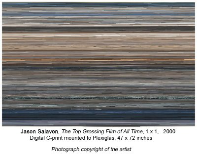
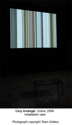
The other video based works in the exhibition do not invite specific film references the way Untitled Translation Exercise does, but they do seem awfully close to work that has already been made. Arcangels Colors for example, extends pixels line by line in the Dennis Hopper movie by the same name to create a moving vertical pattern reminiscent of New Media artist Jason Salavons The Top Grossing Film of All Time 1×1. Exhibited in 2001 at the Whitneys exhibition Bitstreams, the artist uses the average color of each frame in the movie Titanic, and arranges them in a digital c-print to follow the narrative sequence they would have appeared in. I suspect the programs each artist wrote to create their work were difficult to execute, but unlike the work of Salavon, those with even a small amount of website construction experience will be familiar with the technique of expanding pixels, and subsequently wont find the Arcangel manipulation all that interesting. Even without this knowledge, I imagine many viewers will still be left wondering what the point of the alteration is (other than to create a moderately attractive picture).
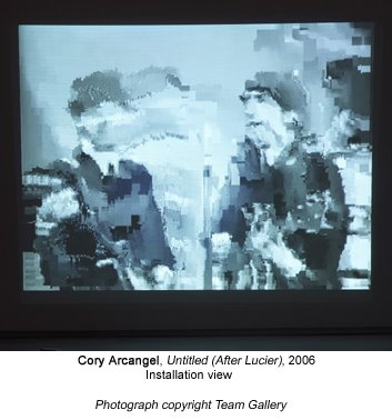
The reason these issues exist in this work, as with Untitled (After Lucier), a video loop of the Beatles on The Ed Sullivan show which compresses and loses image quality with each repetition, is that in each case, the content is subservient to the technology. And unfortunately, just as painting about painting is dull, so is tech art about tech. The thing is, Arcangel knows this, so despite the fact that some of the work in this show falls short, I have trouble believing that the exhibition is some sort of sign of things to come. Two weeks ago at Vertexlist, the artist performed pieces from his record The Bruce Springsteen Born To Run Glockenspiel Addendum (also part of his show), and while, I cant claim to understand why the record needed to be a remix album (the artist composed five Glockenspiel pieces for the Bruce Springsteen album Born to Run, in addition to the three Springsteen had already written, matched them to the time count of the music, and removed the original music), his performance demonstrated his usual brilliance. There was a charming awkwardness to his playing, which made the piece at once humble, moving, and strangely funny. In fact, it was so enjoyable, that the thought occurred to me that while subtractions, modifications, addenda, and other recent contributions to participatory culture, isnt the best thing the artist has ever done, if he had thrown a performance into his show, nobody would have ever known the difference.
At the Whitney Museum coat check, I swear my recollection is they just take your bag and give you a plastic chip. At MOMA they make you open your bag, ask you about the contents, and reject certain items! Here's how a recent visit went down:
"Sir, you have to open your bag."
"You're kidding. OK, check it out. There's a scarf in here, a music software manual, my Daytimer..."
"What's in that pouch?"
"Checkbook..."
"I'll have to ask you to carry that."
"You're kidding. Say--when did you start doing this, interrogating people about their bag contents?"
"I've only worked here six months but" (eyes widening) "of course all bags have to be inspected since 9/11."
"Yeah, right, but that was six years ago!"
At this point some tourists were looking over uneasily, wondering what the "scene" was about.
Thanks, MOMA, for setting a friendly, contemplative mood at the entrance to your museum.
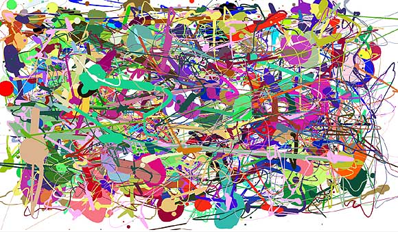
Above is an image I created using a Flash "make your own Jackson Pollock" program created by Miltos Manetas. He didn't design the software, completely--the code is from a downloadable web toy called "splatter" that he appropriated, customized to allow the application of multiple colors, and renamed "jacksonpollock.org." The idea is you can make drippy "Pollocks" by moving your mouse around.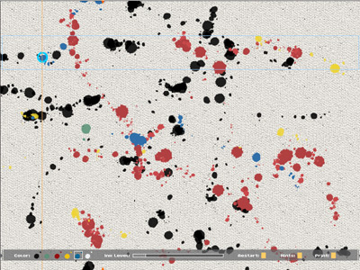
This is a screen shot from another make-your-own Pollock utility, currently on view at vertexList, by C.J. Yeh. Instead of cursor sweeps, you play notes on a keyboard, and Yeh's software translates the tune into Pollockesque colors and drip spacings. These "Pollocks" are more naturalistic than the output from Manetas' repurposed splatter device, reproducing canvas weave texture and avoiding the obnoxious secondary colors.
Pollock is a perennial target for computer geeks. Besides these DIY-Pollock programs (the former insider-ironically smartass, the latter insider-sincerely "deconstructive"), we were recently subjected to a barrage of hype about the computer science prof who could purportedly identify fake Pollocks by measuring drip sizes, fling rates, and so forth. And a few years before that, critic Pepe Karmel used computer analysis of Hans Namuth's studio photos of Pollocks-in-progress* to determine that beneath the convoluted abstraction lay images of the human figure, which Pollock "always drew first."
At the core of this all this computation--cheeky, earnest, or pseudoscientific--lies the assumption, essentially, that Pollock is stupid, and that his art, far from being the "difficult" thing art mavens have built careers defending, is really rather simple. See, you can do one. He's just another "brand." His dripping was so predictable that a machine can recognize it and simulate it. When you get past all the art-crit theory positing the work as "industrial," "oceanic," and "decentralizing," it turns out that deep down Pollock just loved people. In theory circles this is known as "recuperation." You'd have thought it would have happened already with Pollock, but apparently it's still ongoing. Is it possible that computer nerds (including computer nerd artists) are 40 years behind interior decorators? Or--gasp--that there's something about Pollock that's still getting under people's skin?
*see, e.g., Francis V. O'Connor, Ph.D., writing about Karmel's analyis of Number 27, 1950:
Pollock began the work, as Karmel documents, at the bottom left corner of the narrow end of the long canvas, in the area just above where the present signature is, with a drawing in black paint of a large-headed, childlike, striding, humanoid figure. He then filled in the rest of the canvas with other humanoid and animal figures until he had an overall structure of line-drawings on the blank canvas. He used these forms to create a web of hubs radiating black lines, and then covered them with the colors and forms now visible on the surface, with a few of the black lines visible around the edges. It is these black forms around the periphery of the painting that now "work" when the painting is viewed as a vertical composition -- which it was to begin with. I suspect that Pollock thought of the whole enterprise in respect to the little figure with which he began it -- and that determined the greater coherence of the vertical composition. Since he also had a tendency to want to obscure recognizable images with which he probably identified (see Supplement to the JPCR, p. 79), he may have signed it near the figure to accomplish this. Whatever the unknowable inner motivations, the painting self-evidently works best as a vertical, and it ought to be hung that way at the Whitney from now on, along with Namuth's photo proving the precedent.
In fairness to geeks, the Karmel analysis only used a computer technician as a hired gun. The "search for the figure" beneath the paintings' actual stated (surface) premises had more to do with critical conservatism than geeky reduction. If Pollock had drawn an engorged penis before covering it up with abstract patterns, would that have made the work sexual? The point is, he covered it up. The "research" was spurious and ultimately soothing to bourgeois anxieties about art with "no subject." It's mentioned in this post because the computer--which Karmel & Co. used to rectify canvases seen at odd angles in the photographs, the better to perceive those hidden stick men--gave the enterprise a patina of scientific rationality.
Updated after I learned the Manetas piece was a goof on a designer's work--I didn't know the source, but do wish we could get past "canonical artist" jokes.
Updated again Sept. 30 with minor edits and a more Pollocklike Pollock from jacksonpollock.org.
Paddy Johnson on New Media: Why It Doesn't Suck (her title). MTAA on What a New Media Person Has to Do To Cross Over to the Gallery System (my title):
There are some new media artists who cross over and make it look easy. Cory Arcangel and Jennifer & Kevin McCoy come to mind. Arcangel succeeds by acting a bit like a ethnographer who travels into hacker culture and exports the bits that make sense to the art world. The McCoys succeed by addressing the older tradition of film and not letting themselves geek-out when addressing the art world.Speaking as someone with a sneakerhold in both worlds, I'd rather spend my remaining dwindling critical energy explaining the sacred mysteries of the gallery universe to Internet users than trying to tell a gallery person why a spaceship flying over an endlessly scrolling videogame landscape with the caption "lol, usenet" is funny. My sense is the former crowd is genuinely curious while the latter is boastful of its own cyber-ignorance. I will, however, take a crack at defending a Net Art 2.0 piece that I happen to really like. As Paddy describes it,
[The] Guthrie Lonergan piece MySpace Intro Playlist, a curatorial project that consists of 20 [actual, found] MySpace intro videos, inspires the same questions video art has posed to the viewer for years, Why am I watching this? To be honest, even as someone who uses these tools on a regular basis, I still have problems figuring out what to do with this piece. It is a cabinet of curiosities I feel I'd rather see on blogger Jason Kottkes remaindered links, than to have it exist on the more aggrandized Rhizome Timeshares page.I'd say it's the essence of traditional video art, which deals with themes of construction of identity, guerilla theatre, acting out, and "problematizing" the medium (i.e., using it so badly it becomes self-conscious)--except there is no auteur operating the camera and doing bogus sociology. Nevertheless, as a viewer of this "artist as curator" work, as I said in an earlier post, "I feel a bit like James Stewart in Rear Window watching these normal people doing their awkward and occasionally very funny home movie bits to introduce themselves to a million total strangers. It's completely public domain but feels invasive somehow." That's the artist making me uncomfortable.
Update: In fairness to Paddy, I first encountered that piece on Lonergan's page with a link to YouTube. Some art works best "underground"--as in, you found it yourself or through a small network--and doesn't always survive an institutionally enlarged context. Cory Arcangel's Whitney Artport page is one of the few instances I can think of where an artist's anarchic sensibility completely trumped the "normalizing" effect of a museum web page.
Via MTAA comes the news that Harlem gallery Triple Candie is doing a Cady Noland survey show, consisting of re-creations of her past artworks based on the Internet and other documentary sources. The re-creations are not approved by Noland, who "dropped out" of the art world in the mid '90s but "tightly controls" her work; this is not to say she disapproves--according to the press release she simply "was not consulted or notified."
Noland is a proto-slacker, neo-scatter artist whose themes are consumerism, nihilism, and politics as refracted through tabloid media; she achieved instant notoriety in the late '80s/early '90s with installations of beer cans, machine parts, and other urban or post-industrial detritus. Triple Candie sees her as an influence on a large range of current artists, including Wade Guyton, Sarah Lucas, and Banks Violette.
I'm curious what Noland's reaction to this will be. The press release says she "haunts the art world like a ghost" while scrupulously limiting the exhibition and publication of her work. This project is kind of fascinating coming so soon after Jack Pierson pitched a fit over the sign letter sculptures at Barneys that resemble his conceptualist/assemblage works. Pierson followed Noland in the art world's every-couple-of-years "new car rollout" hype cycle (both showed at the influential American Fine Arts gallery), but he stayed in the game and became a successful market entity. Does she care that Triple Candie is doing this? Would she have the clout or stamina to stop faithful re-creations of her work (as opposed to a mere window-dresser's homage)?
And finally, doesn't Elaine Sturtevant's inclusion in the current Whitney Biennial, showing exacting Duchamp knockoffs, legitimize this project (and delegitimize Pierson's huffing and puffing)? Some interesting questions here.
More WhitCrit, this time from January Blog. I like blogs that talk about work. Yes, Midnight Dusters gets Elaine Sturtevant completely wrong, and mistakes Jutta Koether for Trisha Donnelly, but that's where commenters are helpful (they were right on top of it).
Wednesday I attended the less glamor more clamor, second, "artists'" opening of the Whitney Biennial. My first impression of the exhibition was that it was almost unbearably arch, clever, cold, soulless and ultimately depressing. I hated it. [No second impression is stated so this criticism will have to stand. --tm] The focus of the show seemed to be very much about "issues" that the art world seems to care about, not all of which are formal, but which seem to have little relevance in the world at large (witness Matthew Day Jackson's handmade, kitsch-owl commanded covered wagon with its bonnet of sewn-together state flags and undercarriage of rainbow colored fluorescent tubes). Not to be outdone, the worst work in the show was a series of large fake monoliths by Dan Colen. Giant (6 feet or so high by about the same in circumference) gray zoo-rocks covered in chewed gum wads and graffiti rest on 6" high wooden triangles carved to spell out "phrases from the street" like "eat shit and die." Everything about the objects themselves is overly precious and, like the art direction for West Side Story, completely removed from the physical reality of its ostensible subject matter.That's pretty tough, let's have some more:
Peter Doig's much anticipated paintings were shockingly old-fashioned. [Why shocking? They've always been old fashioned. --tm]
Less devastating is the continued presence of "rock art." Jennifer Allora and Guillermo Calzadilla's Sweat Glands is a large video projection of a lady rocker playing a guitar around a monolithic amp. Maybe it's a 2001 reference? Who cares?Trisha Donnelly, a performance/installation artist from San Francisco,Jutta Koether presents a big room with one panel of silver plastic curtain streamers [in] the middle of the room, a very large Marlene Dumas-ish ink on canvas of a naked woman on one wall, a silver Swiss Ball, perhaps a mirror ball? and a collection of shabbily-made flat-black wood panels with "abject teen" notes pinned to them. I wasn't present for one of the unscheduled performances, which are intended to "disrupt the temporal logic" of the exhibition.
AFC sez, about the current Whitney Biennial:
It's hard to get past the feeling that rather than examining current trends, Biennial curators Chrissie Iles and Philippe Vergne began with a set of concerns they were interested in and then sought out artists who met those interests. There's nothing necessarily wrong with this, but it does strike me as an intensely egotistical practice to be making the claim that contemporary art making is about the things you happen to be interested in. Old school political activism is not the pulse of [the] nation.Hear, hear. No, I still haven't seen the show--take this for what it's worth as a preReview. An artist friend who had a frustrating studio visit from Vergne and Iles reports that they didn't look with their eyes, or even their ears, but with their mouths (especially him, and she deferred to him). And what is it with Europeans and the fucking spirit of '68? Catherine David took that same tack with Documenta a while back. Yes, a crazy liberating time for young Parisians, running wild in the streets, believing for a few moments in the possibility of universal socialism---GET OVER IT! I mean, Deep Dish TV? As much of their politics as I might agree with, what they do isn't art, it's political activist media. This is like Larry Rinder touching Rural Studio with the curatorial magic wand a few years ago and saying "I have the power to make you an artist." It's just not fair to people who do art 24/7 and deserve some comprehension. OK, I will shut up until I see the show. We're quibbling about the themes and the people, not the work.
Despite impressive resumes, having heard Iles and Vergne speak I find it hard to believe the curators had a real understanding of what inspired the work they managed to find. The most engaging art in the show often used recycled imagery, or constructed fictional narratives, and the curators forward increased travel as the explanation for this phenomenon. I guess artists with nominal pre-Whitney success are making a lot more money than I knew, because I just assumed travel was as much a credit risk to these people as it is to me.
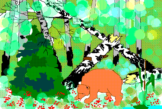
This lovely bear in the woods image was made with MSPaintbrush--the old one, pre-Paint, the one I use, but never this lyrically. Travis found it in this gallery (I couldn't view it in Firefox, had to switch to IE). He's been digging up some great drawings made with these simple paint programs.
On the opposite end of the Internet art content spectrum, check out Karl Klomp's glitch videos ("It seems much of his glitch output, and very tasteful it is too, comes via repurposing video mixers or even burning DVDs with 'impossible bitrates' for challenged DVD players to read," says dataisnature) and prints.
Meanwhile, back in the real world, looks like the Whitney is rehashing Gordon Matta Clark and the spirit of '68 again, based on this Times review of the 2006 Biennial and other reports. I promise to keep my mouth shut and mind open till I see it, but till then, I'm groovin' on that bear.
Kathryn Bigelow: A Great "Problematizing" American Movie Director
(Near Dark, Strange Days, K-19: The Widowmaker)
1. Her IMDb bio: "A very talented painter, Kathryn spent two years at the San Francisco Art Institute. At 20, she won a scholarship to the Whitney Museum's Independent Study Program. She was given a studio in a former Offtrack Betting building, literally in a vault, where she made art and waited to be criticized by people like Richard Serra, Robert Rauschenberg and Susan Sontag. She later graduated from Columbia's Film School. She was also a member of the British avant-garde cultural group, Art and Language. Kathryn is the only child of the manager of a paint factory and a librarian."
2. Excellent article on K-19: The Widowmaker. In a nutshell, this is the true story of the maiden voyage of the USSR's first nuclear sub with missile launching capability, in the early 60s. The reactor sprang a leak and the ship almost exploded--World War III narrowly avoided. The captain and crew were heroes for saving the ship but Russia hushed it up till the end of the Cold War.
Excellent movie, beautifully, kinetically filmed, as with all of Bigelow's work. Not a big commercial hit, and how could it be? Aside from the presence of bankable stars Harrison Ford and Liam Neeson (the latter way better than the wooden former), it's contrary to every Hollywood formula and enfatuation. All male cast--no submariners' wives back home, crying and clutching hankies. Female director, like, there's about two of those, and as the article above discusses, this was entirely Bigelow's project. She went to Russia, did the research. Doomed ship: People die horrible, pointless deaths because of bureaucratic stupidity. Russian subject matter: the US Navy lent very little assistance, like they do for Top Gun and all that crap, because it wasn't about the great American military.
We've seen a lot of K-19's moves in Das Boot--the "other side of the war," men on boat undermined by civilian leadership back home. The latter very relevant now with our troops getting chewed up in Iraq because of bad leadership by Rumsfeld, Wolfowitz, and Feith. What's unique and very Soviet is the nuclear theme, with its resonance to Chernobyl--the possibility of death and disfiguration from unseen radiation, caused by the negligence of your own side, is much creepier than just running around evading Allied depth charges.
I read somewhere that women, in polls, say they hate movies like Crimson Tide where two men butt heads to see who has the greater authority. Denzel Washington and Gene Hackman basically bicker throughout that entire dreadful film. "Mutiny" is a subplot of K-19, too, but it plays out in a less expected, more anticlimactic way.
When I first saw the work of painter Kara Hammond, she was drawing Precisionist style graphite drawings of old Russian satellites and spaceships. The "other" of Soviet tech piques a fascination of American artists who are forcefed images of our own wonderful gear. K-19 is a (cinematically centripetal, ever-changing) museum of old Russian tech. See paragraph one about Bigelow's background. More needs to be written about the artistic subversives running silent and deep within the Hollywood system.
Image from IMDb. One quibble, and another big reason for the film's lack of box office buzz: the title. "K-19: The Widowmaker" sounds like a combo of some scientifically formulated dog food and a lethal bar drink.
More.
Saturday, Jan. 28 is the last day of "Breaking and Entering: Art and the Videogame" at PaceWildenstein. Planning to go later today; have held off for two reasons: (1) really more interested in videogames for the music and the visual shortcuts than thinking about them as an art movement; and (2) For blue chip PaceWildenstein, final resting place for nearly-dead canonical artists, to jump on this particular bandwagon is a bit like watching your pot-bellied, combed-over high school chemistry teacher "krumping."
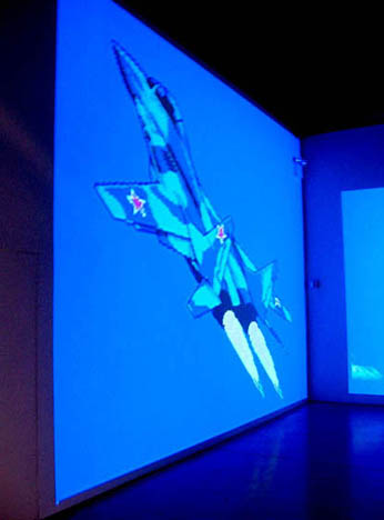
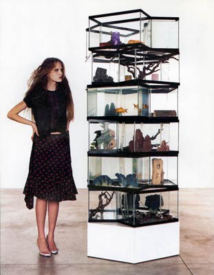
But I want to see the Cory Arcangel installation above: that image looks drop dead gorgeous to me, and I can't believe the artnet reviewer's mildly sniping take on this.
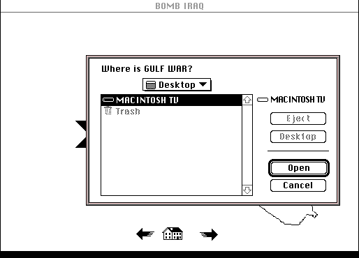
The normally dynamic Cory Arcangel offers a large, static projection of a video game fighter jet and clouds to complement a primitive "found video game" displayed on a small portable laptop. Titled Bomb Iraq, the game depicts a crudely drawn bomb that the user can bring nearer to an outline of Iraq by pressing the arrow keys. Its inclusion is fine as a document of Americas meat-headed relation to the Middle East, but does nothing interesting with it -- except to prove that video games can be used as found objects just like everything else."A static projection of a video and clouds"? Hello, mural painting? James Rosenquist's F-111, maybe? And would it be worth mentioning that the laptop game, originally found on a Mac in a garage sale (see GIF below for a taste), dates to the first Gulf War? That's fifteen years of meat-headedness! Arcangel's pretty post-found object, I'd say. Is this bit of brain-damaged DIY propaganda really in the same category as the arch, Francophone disquisition of say, a Duchamp snow shovel? Perhaps, considered with the wall mural, it's actually a straight-up political statement, reportage from the frontiers of TV-addled suburbia. Maybe when I see the work I won't wonder about any of this. If I'm wrong I'll fess up.
The artnet article by Ben Davis, about current tech art, is otherwise good: it covers Dorkbot and the Superlowrez show at vertexList, in addition to "Breaking and Entering." I like what he said about the inclusive, curious spirit of Dorkbot as opposed to the regular art world's closed-mouth competitiveness (my phrasing). More about that in a later post.
Update: Just saw the show and the Arcangel piece is definitely not "static": the clouds scroll and the jet engines shoot bitchin' flames (that move). One good thing about nearly-dead canonical artists is they generate lots of cash to throw at artist projects. Paper Rad's hyperkinetic video was especially effective in a museum-scale installation. And Jon Haddock's real-world tragedy Sims illustrations looked much better in a huge wall-sized grid than the scattering that were in the Whitney's "BitStreams" show. I was feeling kind of bad about the comb-over reference till I got to the gallery and was met at the door by a big security guard, who lurked not so discreetly while I was looking at the show. Stuffy atmosphere or what?
Update 2: Changed "rich, near-dead white guys" to "nearly-dead canonical artists" since this whole videogame art trend, at least as represented at Pace, while arguably youthful, is very white. I'm keeping the krumping reference because it captures the scene-killing absurdity of what Pace tried to do here.
This stylish work on canvas, by Claire Corey was made with a, um, er, computer. The canvas is canvas, but the brushwork is virtual and the paint is Iris. Corey is showing with a couple of galleries in Europe but her New York space recently closed. Why an artist this good, whose work pushes all kinds of interesting buttons about painting supposedly being the last refuge of authenticity in a synthetic world, was not instantly snapped up in her home town is quite mysterious. But it might have something to do with...the work pushing all kinds of interesting buttons about painting supposedly being the last refuge of authenticity in a synthetic world. Also, because New York is having a "head up its ass moment," with nouveau riche collectors buying art that as January blog has noted reminds them of work by their kids, or the kids they never had:
That last post of mine was pretty cheeky. I dont think I wanted to critique Zak Smiths work as much as I wanted to critique the Chelsea/Grad School scene that puts so much machinery behind young artists. It is like collectors want to buy the work that reminds them of their children. The effects are not devastating to art you cant kill that. The effects are devastating for individual artists. Zak Smith is already a brand name his future potential limited by this fact. Those gallery lights are pretty bright and wont mind burning him and several hundred other kids to a crisp.(Zak Smith replies to that, by the way, and while you would never expect him to agree that maybe he wasn't ready to join the stream of canonical art history [via the Whitney Biennial] on the strength of his illustrations of pages from Gravity's Rainbow, which lots of people have read, by the way, although not me, I only read V and The Crying of Lot 49, it would be nice to hear a stronger self defense based on something other than enjoying the freedom to make tons of paintings and not have to work a day job. What's really at stake in this blotchy, "maximalist" work? What's its theory, not in the sense of regurgitated late 70s French philosophy but in the sense of what does it intend to add to, or change in, the culture and the visual landscape? Are "innovations in the field of rendering or paint-handling" enough now? Are "fascinating women?" OK, well maybe the latter.)
The "Zeus' Forehead" Award* for Shortest Documented Period of Emergence by an Artist
And the winner is: Gareth James, who was the subject of an Artforum "First Take: 12 New Artists" column in 2004 and is now Chair of the Visual Arts Department at Columbia University. This suggests either that James is an incredibly fast worker or our system of evaluating art and artists needs to go to the shop.
Ironically, two years ago James almost received the "Young Methuselah" Award for Longest Documented Period of Emergence by an Artist, since it appeared he had been around quite a while before his "First Take," which is supposedly for unknowns. (Then-Whitney Museum Curator Debra Singer picked James, who was, for a time, assistant to the director of the Whitney Independent Study Program.) In '04, an ISP alumnus convinced the committee (me) not to give that award because he swore James was still emerging.
*Formerly the Sixth Day Award, after the Schwarzenegger movie where all the clones grow to full maturity in a matter of days.
Also via NEWSgrist, I was reminded that John Kelsey of the conceptualist art outfit Bernadette Corporation picked for his December 2005 Artforum top ten list...Hurricane Katrina! Please feel free to lambast me in the comments if I ever write anything this insensitive and pretentious:
HURRICANE KATRINA Ask Stockhausen. As if timed for the opening of the Whitney's Robert Smithson retrospective, this was arguably less a natural disaster than a case of Land art gone horribly wrong. An environmental and political tragedy of Spielbergian proportions, Katrina produced images of the sort of "naked life" we'd previously only identified with non-sites like Iraq. The drowned ghetto, the shooting of homeless looters, the police suicides, the forced evacuations, the superdomes filled with refugeesthese are visions we can only try to erase. For some reason it was impossible not to imagine the hurricane as a terrorist act. And I guess it wasMade in USA.Yes, Artforum's an art magazine, but that doesn't make every damn thing you mention in it art. Curator Thelma Golden went down the same road a while back, discussing the 2003 blackout as some kind of art event. Oh, and by the way, bloggers, it's Artforum, not ArtForum. Sick of seeing that mistake.
A friend emailed to say he finds the synth sounds I'm using to be a little too much like factory presets--what come packaged with the instrument before any user programming. He says he's not sure if it's "the lack of layering, or that they're dry and don't have many filter/pitch/mod/etc controls." He likes the "Guitar Solo" video, though. I replied:
Thanks for the suggestions. I haven't made any pretense on the page of using anything other than presets. My feeling is MSPaintbrush is one big preset, and your suggestions would be like telling me I should use more layering and effects in Photoshop, to try to be more naturalistic and painterly. Not saying I'm not listening and won't absorb some of [the ideas in your email], but I like things straightforward and stupid. The guitar solo was a total one-off, I had just bought Kontakt and started turning as many knobs as I could find--it started getting distorted. The piece got more interesting when I started chopping the notes up and repeating them in a Wav editor. There's really no layering. It's just off the shelf distortion and brute surgery.
But I'm interested in the compositions being some basic, minimal, easily apprehended structure as opposed to building up a lot of texture in the sound. In "Clip City" I meant to contrast the subtle drumming with that dorky keyboard arpeggio I wrote and played absolutely dry on the Sidstation. The thought of doing a fluid, Basic Channel type drum track appealed to me, but then I just rebelled. The only analogy I can come up with is bad painting. Why would you want to do something bad when you can do something well? (A dealer once asked me that.) On "Permanent Chase" I added a little chorus effect to soften the Sid, but it's totally preset city. I really like the sounds those Swedish guys programmed! I've been lurking on some electronic music chatboards and am amazed by some of the complex things people are doing with drum programming etc. But I find the glitchy granular sound overrefined and boring. My favorite techno music is blindingly obvious. I think maybe I don't care about layering and quantizing because I like to hear all the instruments, and I like machines to sound like machines. Kraftwerk always appealed to me because it was wind up music, like looking at the inside of a watch and seeing how the gears move.
My friend replied that part of his confusion about the music was "that it's kind of sitting somewhere between german trance and a more minimal conceptual sound work, and I guess my personal preference would be for it to be a little more one way or the other." I'm abbreviating his comments, which were fairly detailed in how the music could go in either direction. I appreciate the suggestions but I'm resisting, as I explained in my emailed reply:
I guess my feeling is "german trance" and "minimal conceptual sound work" are both known genres, with their own sets of conventions, but the space between the two is maybe not to so mapped out. I'm not just trying to turn your criticism into a compliment. I think all my best work occupies that awkward middle ground between "failed commercial art" and "conceptualism with imagery too stupid to look at."
Where I'm still a little uncertain is, do I really need to learn to make good trance with all those subtleties you mentioned, or is it possible to fail at it for artistic purposes with only a working half-knowledge?
Part of me would like to be a club star with German girls putting their hands in the air, which is maybe why the music gets better without being entirely there as dance music. I keep working at it because I like it.
But trance is basically a dead art form. What is the point of getting really good at it?
Sounds like maybe the one that's bugging you the most is "Lysergic Interlude"? Those are definitely presets, from the Linplug Alpha softsynth: one is called "club run." I can hear everything you're criticizing about its lack of subtlety, but at the end of the day I just like that wind-up music box feel. (I subtitled it "Ice Cream Dude Sells E" because it sounds like an ice cream truck to me.) And there's almost nothing conceptual about it.
Anyway, I know the music's not perfect. I'm just leery about improving it too much because I don't know how relevant or valid "good" techno is at this point. I also feel the deconstructive art things (with sustained loops etc) are either too familiar or not fun. (Not saying [your piece you described in the email] is bad--I'm sure it's great.) There was a lot of finesse in the music in the Whitney's BitStreams show but not one composition had a beat or a melody. My hope is to keep working in the middle ground and a few good things will emerge from that process
And is if that wasn't enough, I added in a later email:
The bigger philosophical issue for me is the same issue I faced as an visual art student years ago. I had a teacher who left a note in my portfolio at semester-end saying I needed to "face very squarely" whether I was a cartoonist or an artist, because he saw the former winning out most of the time. Arguably he was right and that's why I [am where I am today], ha ha. As for making "good" techno--part of me wants to, but part of me wants to stay innocent and incorporate the misconceptions, fixes and workarounds of the self-taught musician into the final product, which loiters irritably halfway between trance and conceptual art. (The musical equivalent of my paintings, maybe.) BTW, the recent songs that matter the most to me are "Posse on Greenwich," "Glitch Western," and "Robollywood," none of which are actually that trancy.
Future rant: a walk through this selection of Net art at the Whitney from a couple of Biennials back, which was just impossible to interact with, or to want to interact with, in a museum environment, versus this great page Olia Lialina alerted me to a short while ago, which would have been tons of fun in a museum if properly presented and would have given Net Art a good name, as opposed to an invitation not to come back for future Biennials. Olia explains about the piece: "in 2003 my students were celebrating 10 years of the WWW. One of the objects was made of found bullets." Bullets, yes! Just f*cking bullets. No page-long back story, no navigation nightmares, no frozen screens (well, maybe the last). Student work or no, it's a bang-on elegant piece, continuing the Schwitters tradition of making art out of pop trash, in contrast to the Mondrianic mien of hermetically sealed art perfection. One could envision this projected really large, and with something other than a mouse, say a foot switch or button on a podium, that could steer you around the web ring of bullet patterns. People would be standing around ooh-ing and aah-ing as each new magnificent phalanx of back buttons loomed before their eyes, instead of disgustedly walking away from the workstation ghetto with a terminal case of knotted up shoulder muscles.
Rhizome.org's Net Art News has a nice writeup on the ART@><*WORK show. Lauren Cornell begins her piece with the following hackle-raising anecdote:
A New York gallerist once took the wind out of my sails by telling me "If you're not trying to make it to the top in this town, then GET OUT OF THE WAY!" Umm, what top? What way?Let's briefly answer those questions. The top: Gagosian, Matthew Marks, PaceWildenstein. The way: art school with influential 70s/80s figure on faculty, show with Connelly or Reich, inclusion in the Whitney, move to the Boesky/Rosen stratum and if you survive midcareer hell thence to canonization and high-level commerce at the aforementioned "top" galleries. That's it, folks!
Speaking of alternatives, Joy Garnett has a report on the second Blogging & the Arts panel here. Fun event but too sparsely attended! I guess everyone was busy making it to the top. Thanks to Francis Hwang for organizing these events (there'll be more), also under the auspices of Rhizome.org at the New Museum.
Update, 2011: The Rhizome link has been changed to http://rhizome.org/editorial/2005/may/18/how-to-succeed-in-the-arts-by-really-trying/
"Greater New York 2005" to Revisit Previous Group of Artists
The Museum of Modern Art's alternative space, PS1 in Queens, announced today that "Greater New York 2005" will consist entirely of artists from the 2000 exhibition "Greater New York." "We wanted to see what all our artists were doing five years later," said PS1 director Alanna Heiss, "and frankly we're sick of this 'fresh young talent' paradigm." She says she fears that New York is "becoming like LA, where the scene is centered around artists still in grad school" and protested the "increasing infantilization trend" of the rival 2004 Whitney Biennial. At an impromptu press conference, she read the following quote from a 1987 Dan Graham essay as further justification for the Museum's somewhat unexpected and daring project:
According to [Walter] Benjamin, "progress," the 19th-century scientific and ultimately capitalist myth, is expressed in commodities, fashion goods which "produce a sense of eternal newness." This makes progress a mythical goal, never to be reached, for there is always the new and it is always superseded by the next new. For Benjamin, then, progress is actually a state of stasis. And yet it is this very stasis that makes the recovery of the just-past potentially subversive.Below, images by "Greater New York" artist Michael Phelan, then and now:
Michael Phelan, from the "Driftwood and Dried Arrangements" series shown in "Greater New York" (2000)
Michael Phelan, from the "Bears" series, to be shown in "Greater New York" (2005)
From MTAA: PS1s website redesign sucks
How does PS1s web site bite? Let me count the ways rudely.Originally from MTAA Reference Resource, ReBlogged by francis on Mar 12, 2005 at 04:02 PM, Apologetic disclaimer removed by tom.
1. Splash page (need I say more?)
2. Cheese ball flash animation announcing GNY2005 [Greater New York is a kind of Whitney Biennial for New York artists, held at PS1 in Queens, the Museum of Modern Art's "alternative space." This is the second; the first, a perceived "career launcher," took place in 2000. --tm]
3. Evil pop-up from cheese ball flash animation announcing GNY2005
4. The artist list in the stupid pop-up from the cheese ball flash animation doesnt do anything! Yes you can rollover an artists name and it lights up, but a click does nothing!
5. The exhibition section just has the stinking press release? How about some friendly copy (and larger text). PLUS, the navigation of stinking press release is too small and too confusing (the page youre on should be highlighted not the page youre not on, duh!).
6. Why is there a press section when the exhibition section already has the press release? Oh, I see, so you could put a really big dumb graphic that says Press, Greater New York 2005, which clicks off to MOMAs site.
7. At least make the friggin top-left logo clickable back to the homepage for chrissakes! This has been web-site navigation convention from before the turn of the century!
8. It dont validate. (snigger, snigger) And its so fd up, it would be hard to figure out where to start.
9. Change your meta-tags now! NOW! NOW! NOW! (Its a shame to see the free and open-source Mambo put to such wicked uses.)
Ahhhh. That felt good.
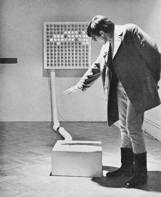
Juan Downey and Fred Pitts, Against Shadows, 1968, plywood, Formica, and electronic parts (photo by Shunk-Kender from Frank J. Malina's Kinetic Art: Theory and Practice, 1974). It's as simple as it looks: a grid of photocells on the formica cube responds to shadows and mimics them in reverse on the wall screen. The klutziness of it (e.g., that huge conduit) is, I believe, intentional. Downey's conceptualist-style statement for the work is still refreshing:
"If the choice were given to me, I would pick complete inaction for my entire life. Nevertheless, I persist in the activity of building electronic sculptures because:
Their existence or destruction is irrelevant to the life of them.Such a contrast with the Whitney's "BitStreams" show, where all the art had to have a purpose, and/or the curator killed it with pedantic overexplanation.
They cause people to play.
They make people aware of the vast number of different kinds of energy in the universe.
They are ephemeral. This is part of a new development in the history of art: to create works that are not supposed to last for a long time.
They pose a problem for the collectors of art objects.
They create the illusion that the public can participate in the work of art. Actually we are still spectators mystified by the order that makes the world grow and move, although, we pretend we are determining what happens to us.
It is fun to talk with friends about them.
They imitate aspects of movement in life. Art is more concerned with thinking about what people experience than with producing objects.
They make people aware of lively relations between different kinds of things.
Children like them.
Sometimes they produce a reversal of natural phenomena, for example, as demonstrated by the sculpture Against Shadows."
Another recycled reBlog post:
Matt Pyke recently left tDR [The Designers Republic --TM] to join Transistor Studios - the most excellent demo reel of his is here, and his latest project, a music video for Nuno Felipe, can be seen here. Good stuff!The Designers Republic was the vanguard of the graphics revolution (or what might be called the "vector revolution" for its use of Illustrator, Flash, and the like), most conspicuous in electronic dance music packaging but also embraced by Globo Youth Marketing Capitalism. It's nice to put a name to a product, even if tDR was supposed to be about anonymity and collectivity. I didn't watch the music video but the demo reel is pretty mind-blowing. Sorry to always keep harping on Jeremy Blake, but this is better, innit? I liked Blake during his Morris Louis phase (which PT Anderson picked up on and then Blake abruptly dropped) but for a full-service digital collage artist, Pike is doing more tricky and I would say paradigmatic stuff. It's just that one is "high art" and was in the Whitney three times in as many years and the other is "low art" that is probably making the producer oodles of money--as clear an argument as I've seen for the need to rethink the distinction, at least where digital media are concerned.
via KALIBER1000
Death to the Fascist Insect That Preys on the Life of the People
The larger issues percolating around the 2004 Whitney Biennial were (A) whether the "quest for the adolescent" theme identified by the curators was real (as opposed to a thesis in search of evidence), and (B) if real, the extent to which the retreat into infantilism was (i) a response to the current pervasive terror-talk and war, (ii) a reaction to 20 years of verbal theory and no fun in art, or (iii) widespread, simultaneous opting out of participation in an art historical lineage in favor of private (outsider-ish) worlds. The pervasiveness of what Roberta Smith calls "the bedroom shows" and the rise of collectives of 20-something artists documented by Holland Cotter suggests that the trend is real. Militating against that conclusion, however, is anecdotal evidence that the curators were scouting for "young artists" out in the field, and may have skewed the survey in favor of "stuff young artists do." But then previous generations of "young artists" made ultraserious, high-toned work in their 20s, as opposed to wacky, pop-culture-driven room-filling jamborees: think Frank Stella, Gordon Matta-Clark, Eva Hesse, even Cindy Sherman & Robert Longo.
So, if we accept that this is a legitimate sociocultural trend, why the regression into the visual equivalent of baby talk? Perhaps it depends on which preschool we're talking about. The Whitney curators may very well have skimmed the most non-threatening and apolitical work out of the youthpool, while contemporaneous shows in Brooklyn and elsewhere show a "worried generation" mingling concerns about military, labor, environment, and culture-war issues with a faux-unengaged, faux-juvenile stance. Not precisely Dadaists waiting out WWI in Zurich, because overt references to current events are mixed in. I'm intrigued by James Wagner's reporting and pictures from a show I missed in DUMBO (Brooklyn) called "Death to the Fascist Insect That Preys on the Life of the People." The title is from the Symbionese Liberation Army (last invoked in the artworld in the early 90s "nihilistic" scatter art of Cady Noland), but here the grimness of Cinque De Freeze's social indictment is completely belied by the artwork on view: toys, stuffed animals, stickers, buttons, and crude thumbtacked drawings resembling an end-of-the-semester children's art show.
Based on James' photos and descriptions and what I know about some of the artists, the show looked to be an entertaining but tough-minded mix of influences: the Kenny Scharf Jetsons East Village blacklight funhouse thing, Basquiat "drawerly" cartooning, graffiti, the late 80s/early 90s slacker style, and, through manipulation of Saturday Morning sugar cereal advertising tropes, even the hardnosed, political "pictures" art of Levine, Goldstein, Prince, etc. The use of websites to document shows and present stand-alone pieces (by TAG Projects, who did the "Insect" show, but also BEIGE, Paper Rad, etc.) makes this a new animal, though. These are just the beginnings of a theory (and sorry it's so ponderous--just trying to get the thoughts down), but suddenly there's a lot of good work out there, and I'm excited by the role websites and bloggers like James are playing in documenting it, before it reaches the cooled down, institutional phase of magazine coverage and curatorial co-opting.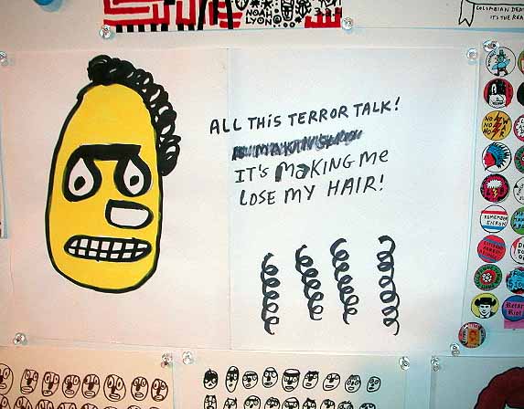
Noah Lyon, from "Death to the Fascist Insect..." Photo by James Wagner.
Jim Hamlyn, original .GIF, printed out for the "Infinite Fill Show." This image has been resized, the full image is here.
More about the show: Walter Robinson mistakenly describes the content in his Weekend Update column as "psychedelia and goth." Maybe he pasted in a paragraph from an old Whitney Biennial 2004 review by mistake? You have to stretch to find anything goth in the show, and psychedelia kind of implies color to most people these days, doesn't it? The keywords here are "Op Art" and "geek." Also, it's hard for me to imagine the phrase "eternal youth culture" coming out of the Foxy Production gallerists' mouth: who talks about shows that way? Besides, it's redundant, as I've argued on this page repeatedly: all of American culture is "eternal youth culture."
A woman in Europe named M_____ 0______ (name permission pending) is researching "artblogs" and sent these questions to artist & blogger T.Whid. He forwarded the list and my slightly edited response is below. All this stuff vomited out, probably, because it was so shocking to see this level of interest about something American galleries usually say "huh?" about:
After having done research on the artblog phenomena for a couple of months now, Im surprised to find that not many artists use this media. Personally I would find it an ideal space for artistic exhibition, exploration and exchange. Do you have an explanation to this?
What made you start blogging?
What keeps you blogging?
Do you perceive your blog primarily as a personal or as a professional project?
Does your blog affect your work process as an artist?
Do you know of other artists blogging (besides M.River)?
Do you know of artists reading your blog?
Do you feel part of the blogosphere? I mean do you feel part of a community of (art)bloggers?
Have you met any problems being a blogger?
Dear M_____ O______,
The non-responsiveness of the art world to blogging is a recurring theme with me. I write from New York but the syndrome is widespread. I attribute it to several factors:
(a) somewhat rapid change in tech--just as the galleries are getting all their fancy dot-com era Flash sites up and running, this thing called blogging comes along. Worse, some bloggers make fun of the Flash sites! Galleries and artists tend to rely more on tech experts to do their updating and even if they know about blogs, not everyone has (or should have) the personality for daily ranting.
(b) art galleries (and artists who produce for them) are still stuck in the era of steam trains and butter churns. In this world, it's all about print--hard copy reviews from recognized institutional authorities that can be sent to collectors and curators. Ethereal pixeled criticism is regarded as too impermanent and likely the work of lone cranks.
(c) institutions like the Lower Manhattan Cultural Council perpetuate the divisions between gallery art and new media art by requiring painters to send in slides for fellowships, residencies, etc., whereas a new media artist can just send a URL. This idea that a photo emulsion glimpsed through a Magic Lantern contraption on a metallic screen in a dark room is the "best" or "most accurate" way to judge physical work is très 19th Century. Once the medium of information exchange changes (to URLs, etc) then metacriticism linked or patched into those resources will seem more natural.
(d) the economic (collector/donor) base of the art world includes many tech-savvy people, who stare at computer screens all day for a living and by damn, when they want to relax they don't want more screen stuff, they want to immerse themselves in the healing balm of the "old ways"--viewing pigment-impregnated vegetable oil smeared on coarse cloth; standing in a clean quiet room having elevated discourse about exquisite, handmade objects; reading elegantly typeset reviews on solid paper stock with good offset printing (see (b) above). Dealers and artists tend to follow the collectors' preferences.
(e) as T.Whid mentioned [in his response to you], many artists are quite simply tech-phobic and/or uninclined to check in on a blog. Some are excited by the idea of jpegs of their work being viewable all over the world and the subject of ad hoc critical dialogue while their shows are still up; others don't give a hoot and would rather avoid the computer and wait 9 months for an Artforum review (possibly) to come out.
Tom Moody
PS There is an emerging community of art blogs out there that tends to draw its lines of
subject matter narrowly, chewing over news of museums, auction sales,
gallery gossip, old school art
appreciation... I'm more interested in the crossover of visual art, tech,
electronic music, film, science fiction, and politics than just replicating
the art world online. I sometimes get linkage from the pure art sites when I
do something "out there" like
criticize the Whitney, or one of the major magazines, but rarely when I just
talk about a show (in Williamsburg or wherever), and never when I stray
outside their specialized field of interest. I'm happy for the traffic, of
course, those are just some patterns I've noticed. I do read and link to some of
those blogs. As for blogs causing me "problems," I
was a print critic for years so I'm already screwed. Actually the blog has
been quite helpful in clarifying that my art practice and thoughts about
other artists are intertwined--it was a way voluntarily to take the
institutional edge off my writing.
Via thickeye we learn about an upcoming Michele Handelman performance where she surreptitiously photographs and audiotapes people in a public park and then, on another day and in the same places in the park, stages reenactments of what they were doing and saying. Live performers--surrogate humans with white hair, white skin, white clothes, and orange-lensed goggles--will sit in the same positions as the tapees and the audio of their conversations will be transmitted through loudspeakers. Fine, so far, but the press release description just gives me hives:
Michelle Handelman will spend one day in Bryant Park clandestinely documenting visitors to the park, recording their conversations, photographing them, and taking note of their location/time in the park. During a single performance, entitled Passerby, she will work with performers to recreate five of the situations she observed in the exact locations at the same time they originally occurred. Handelman's project addresses the possibility for or lack of privacy in public space as well as the prevalence of and high tolerance for surveillance and will take place on Tuesday, June 29th, from 1-4PM in Bryant Park, 6th Avenue between 40th/42nd Streets. Rain date is Thursday, July 1st.The phrase in bold is the type of earnest curatorial recap they use in Whitney wall labels, taking the edge out of the art and making it "socially responsible" for skittish newbies. Plus, it's not accurate. To say the work addresses our "high tolerance for surveillance" is just wrong if these people don't know they're being taped. What if a kid is agonizing out loud about whether to come out, or a couple is trying to decide whether to have an abortion, or, if this seems too farfetched, what if a guy is just obsessing to his girlfriend about his BO? Will Handelman edit conversations down to material she feels is "not too invasive"? Is she going to get releases, now that likenesses and voices are increasingly treated as intellectual property? Or is she just going to throw caution to the winds and see what happens?
Many of the same issues were raised by Sophie Calle 25 years ago in her "Venetian Suite" pictures, where she followed a man around and photographed him without his knowledge. Is the artist critiquing surveillance or just being a voyeur? Also, films such as The Conversation and Blow-up taught us that these little slices of life can be utterly unlike what they appear to be and have only as much meaning as one reads into them. Maybe that's where our tolerance of surveillance, if it's true we tolerate it, comes from? At any rate, those are the kinds of issues that ought to be raised in the press release. I look forward to checking out the performance.
More things will be said about the upcoming show in which Handelman's work appears, "public.exe: Public Execution," organized for Exit Art by Michele Thursz and Anne Ellegood with participating curator Defne Ayas. Stay tuned.
Update: review of the Handelman performance here.
In case you haven't heard, curator Larry Rinder is leaving the Whitney Museum, not for another power-position in the art world but to return to the school from whence he came in California. Wow, can we have the last three years back? "BitStreams," "The 2002 Biennial," "The American Effect"--critically panned, enervating shows (or reportedly enervating; the picture of the superheroes in wheelchairs with IV drips, etc., did not inspire a $1.50 card-swipe for a trip uptown to see the last of the three).
The "whoops--never mind" of the Rinder years happened because of the Backlash Effect. Former director David Ross's supposedly "wild" programming (e.g. "Black Male") scared some trustees, so they hired "dapper fuddy duddy" Maxwell Anderson, as Slate.com described him (also now departed), as director. Anderson hired Rinder, who had served on the curatorial team for the bland 2000 Biennial. Despite a near-universally acknowledged mediocre eye, Rinder received much adoring press from non-critic journos, for reasons that remain mysterious. All that publicity, so little to publicize.
Three "work in progress" performances by artists from the 2004 Whitney Biennial debuted at the Kitchen last night. Tracy + The Plastics, a one-woman (virtual) band, consisted of Wynne Greenwood seated at a keyboard, playing and conversing with two prerecorded Wynne Greenwoods on DVD. The three are ostensibly sitting around their "band house" performing snippets of songs and having mock-lame arguments about the direction of their music. While frequently funny, Greenwood's passive aggressive slacker-chick persona wore thin after a while: I know this year's Whitney was about the "quest for the adolescent" but her self-absorbed conversation with the video mirror seemed trivial next to the mid-to-late 90s electro-femme performance work it somewhat resembled (e.g. Kristin Lucas, Monotrona). Alex Bag also inevitably came to mind.
Golan Levin's work was tech-intensive and nerdy (maybe it was the lab coat) but also fun and playful. He and his fellow performer Zachary Lieberman each used a combination of overhead and digital video projectors to make semi-abstract shadow-outlines (basically Rayograms) of their hands and other objects, with the overlap of the respective projector arrays creating dramatic color separation effects. The shadows in turn interacted with custom software to synesthetically translate shapes into sounds. A silhouette of a balled fist opening into a two-finger V caused a sequence of chiming musical notes to alter in mid-cascade; three fingers changed the sequence again, and so on. Clunky cut paper objects dropped onto the projector beds had their own unique audio signatures. Manning their opaque projectors like gamers at battle stations, the performers held a back & forth dialogue-cum-duel of changing silhouettes, which was exquisitely timed and quite charming.
Framing the other two performers was Cory Arcangel's "Pizza Party"--a demonstration of how to hack into the Dom1no's website and order pizza using only command line instructions. These green-on-black text-only options, which Arcangel accessed with a Perl script, lurk below Dom1no's (and every other business's) GUI, or graphic user interface, and consist of filling in "y" or "n" next to mushrooms, anchovies, thin crust, etc. and specifying a delivery address. As he walked the audience through the process on a large screen, Arcangel commented drily (but enthusiastically) on the essential uselessness of online commerce, and even greater uselessness of hacking into it, when a simple local phone call would suffice. And although he warned that failure was a possibility in his performance, his confident demeanor when he came back after the other acts told us that our pizzas had arrived.
UPDATE: "Pizza Party, a free text based software package for ordering pizza, or for throwing pizza parties" is available online here.
UPDATE 2: Somebody posted an article about security vulnerabilities in "Pizza Party," the software. No one seems to know if it was satire or not.
Animations from the Internet Raytracing Competition are below (each .mpg is around 5MB). How POV Raytracing differs from the stuff Pixar does, or things made with 3D rendering software like Poser or Bryce, I'm not entirely sure. The main feature seems to be how light rays reflect and refract off/through various materials and surfaces, and the folks who make these things are as nerdy as car body fetishists about their various glints and sheens. As for subject matter, the Whitney curators' "quest for the adolescent" could have started and ended here. ("Uh, we meant, a different kind of adolescent...") To cull the rather minimalistic samples below required wading through dozens of one-act plays about muscly aliens and "trips through the wormhole" populated by characters that look like Woody and Buzz. But these are good. The fact that they were done by individuals as opposed to corporate teams weighs heavily in favor of them as a nascent, internet-spawned art form.
Digital Mousetrap Game (the only one with [so-so] sound; the rest are silent)
The End of the Cape Hatteras Lighthouse
Notes on the 2004 Whitney Biennial
1. If you like work made with a jigsaw, painted, and stuck at right angles to the wall, this is your Biennial.
2. Started on the 2nd floor and worked up to 4. "Is this the fey, twee Biennial or just the fey, twee floor?" ("Fey": everything from Banks Violette's black, stalagmite-infested drumkit to Elizabeth Peyton's pale, perpetually red-lipped popstars; "twee": the preponderance of little craftsy cut out-y things in the show. Sensitive boys meet sensitive girls and ignore each other for their respective playworlds.)
3. Stood gaping at Assume Vivid Astro Focus' busy, businesslike post-psychedelic installation for a long time and finally said, though gritted teeth, "I don't like this."
4. Bad painting, and not in a good way: Mel Bochner's happy, colorful "word art" channelling Jessica Diamond, Kay Rosen, et al. Laura Owens' fake-zany, fake-clumsy giant tree with birds, etc.: uggh. Cameron Martin: boring!
6. Too many installations!
7. Wanted, for curatorial malpractice: Shamim Monin, Chrissie Iles, Debra Singer. Crime: Placing Cory Arcangel/BEIGE Nintendo clouds piece next to brilliantly lit mirrored room, washing out the lower right corner of the video projection. If they did this to a Barnett Newman they'd have old men with cigarettes hanging off their lower lips and romantic stubble sending them critical letters the rest of their lives.
8. Too clever by half: Golan Levin's interactive piece on the popularity of numbers. Does "3" beat "89908" for the most uses out there in the world? And what are those uses? Scroll and see! If this is a satire of the computer nerd's relentless drive to quantify everything, it's pretty good; if it's a celebration of that same tendency it's the world's most elaborate executive toy.
9. Having said all this mean stuff, the show was still fun: better cumulatively than object by object. Even mass infantile regression beats Larry Rinder's earnest, tedious 2002 effort. It helped seeing it with a large audience of toddlers, teens and bus-tour seniors: through their eyes, it was an adventure. If only that sense of awe & enthusiasm could be piped into Chelsea's dreary classist environment.
10. Best of show: the films and videos. Sue de Beer's two-channel piece, discussed here earlier, works even better in a small room than it did in Postmasters' big cube. It was great to see the Jack Goldstein loop, an undersea travelogue missing only a Film Board of Canada soundtrack and boomy male voice saying "When lava pours out of the sea mount, islands are formed..." For positive things about these and other artists, please see Sally McKay's report.
UPDATE: Here's one explanation for all the "youthful exuberance." I'm told that in setting up studio visits outside NY, the curators asked to see "young artists." That sounds like pimp talk. Hypothetical local museum director: "Are you looking for someone good?" "No, we're looking for someone young."
We're continuing to discuss that dumb New York Times article about Net Art here. There has been a sea change that the writer completely missed--an influx of artists redefining the medium, not so much through browser-dismantling code a la Jodi.org, but testing the limits of how much a window can hold, like turning an amplifier up to 11. These largely basement producers handle Net graphics in a painterly or expressionistic way, cocking a half-appreciative, half-horrified eye on all the weird content out there on the Internet. The phenomenon isn't about marketing (yet) but rather thrives within the Net's potlatch or "gift economy" of upload exchange. Artists put up simple animations made with .GIFs or Flash, with sound or without, as well as appropriate, resize and mutate found .GIFs and jpegs, attacking visual phenomena the way a junglist attacks sound (to make an electronic music analogy). Rebellious defacement and smartass humor trump the tedious academic-cum-Sol LeWittoid pallette of earlier net practice. In the Times thread Sally sums up the first generation of self-defined Net Art as "long-loading, find-the-place-to-click-me narratives packed with theoretically correct reference to the body or lack thereof." There are just too many sites resembling university sociology projects, rarely repaying the time you invest in them, illustrated with diagrams like this one from 1997:
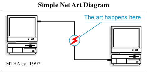 .
.
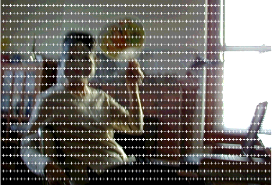
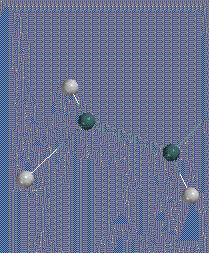
It's not that MTAA is humorless, but their art is very much about pointing and clicking and following steps, rather than just having raw sensation flooding into your browser. For an example of the latter, check out this remix of the above diagram by Abe Linkoln, one of the bloggers at 544x378(WebTV). Talk about the Oedipal slaying of a forerunner. Here's another piece from the WebTV site (I think also by Linkoln). This was done by searching "544 X 378" in Google Images, picking a blurry, faintly appalling image out of a page full of possibilities (in this case a random dork in a mask sitting at his computer), then adding a kind of Sigmar Polke screen of "plus" signs as a shifting psychedelic overlay. This use of dimensions to search for images has the randomness of a drive-by shooting. Or check out this .GIF by jimpunk, an image both sublime and gritty, resembling a sleek physics demo that appears to be destroying its own background:
With more of this happening, the Whitney might think about setting up those terminals again!
UPDATE: My own reconfiguration of the "MTAA simple" and "Linkoln complex" net art diagrams is here.
UPDATE, 2012: The GIF I thought was posted by Linkoln was, in fact, posted by Linkoln (then called Abe W. Linkoln), on March 15, 2004 (permalink to the post doesn't work).
The NY Times ran another in its endless series of chin-scratchers on "Internet Art" yesterday. The writer talked to a few of the players but couldn't reach any conclusions, so he opted for the annoying "on the one hand/on the other hand" format, while still trying to make it sound like some Rubicon had been crossed. Or retreated from. Or something. He mentions one noteworthy fact as evidence of the "death of Net Art"--that the Whitney included no internet section in the Biennial this year--but then doesn't talk to the current Biennial curators to ask why that decision was made. (Maybe it's just because the terminals never worked.) Instead, he tracks down the curator of the 2002 Biennial and gets some exquisite hot air on the subject.
Below is an annotated version of the article.
March 31, 2004
DIGITAL
Internet Art Survives, but the Boom Is Over
By BEN SISARIO
IT'S dead. It's thriving. It's everywhere and nowhere.
Like most things in the online world, the state of Internet art is subject to no small amount of exaggeration. During boom times, as art made with ones and zeroes entered Chelsea galleries [Postmasters] and blue-chip museums, the new form was seen as the wave of the future [by reporters and publicists]. But now, ask an artist or a gallery owner or a blogger about it and you are likely to get a groan [; ask an artist about it and you're likely to hear that no one calls it Net Art anymore; ask a blogger about it and he will mention a hundred wack things he's found lacking any institutional imprimatur.]
Beige Programming Ensemble at the Whitney; The Slowes
I missed Cory & Jamie Arcangel and the Beige crew at the Whitney last night because I had to w_rk, but fortunately Thickeye is on it with an excellent report. I like his description of the line of kids wrapped around the block for free admission night, soon to be groping in the darkened video rooms, contrasted with the image of middle age people sitting at tables in the downstairs dining room, politely listening to the Beige-rs explaining their new 8-bit iPod concept.
Beige has a music download page that I highly recommend, consisting of their vinyl releases in mp3 format. Cory also recorded several songs as The Slowes, which I am pleased to offer here. The melodies are faux-dumb and very catchy. I say faux-dumb because they're actually fairly ambitious in terms of musical reach--a lot of pop music history is integrated in them (lounge, 60s-electronica, progrock, Pink Floyd...). The lo fi-ness keeps the homages from being overt or too reverent. Here's how Cory explains them in an email (edited slightly):
yeah,...the slowes is just me. most of the melodies were written by a melody writing program i wrote called "Rudy Tardy Generator Pro"..it was a cgi script. every time you went to its web page, it generated a new song and melodies (in the slowes style, which is lotsa open roller rink kinda chords) so....... i would have the program spit out 10 melodies...i would then pick the best few, turn them into a song, and go into my bedroom and record them. i used an organ, atari, drums, + guitar////The Slowes downloads:the whole myth of the slowes that I made up was that it was this guy who sat in his basement all day and worked on his atari. his name was Rudy Tardy. This was his band. For a few years, i used Rudy Tardy to sign all my art projects...[Beige recording artist] Paul [B. Davis] to this day still Dj's under the name DJ Rudy.
"Fat Bits" [.mp3 - 1.33MB]
"Starship Izod" [.mp3 - 4.12MB]
"The Anthem" [.mp3 - 2.29MB]
"Hooked on a New Thing" (cover of 3Nuff Z'Nuff) [.mp3 - 5.2MB]
Suite: All Four Songs Above [.mp3 - 13.14MB]
Left: my lo-res, "remixed" clip of Rebecca Allen's Kraftwerk video Musique Non Stop, a pop-cultural landmark from 1986. The video was actually completed in 1983-4; Allen visited Kling Klang studios and hung out with Ralf, Florian, et al in Dusseldorf. They shipped their dummy heads to New York and she did the computer modeling at the Institute of Technology there. No slouch, Allen is another pioneer figure sadly overlooked in the Whitney's lousy "BitStreams" exhibition. Check out her website, which now has streaming video of some of her other projects, including the video wall for the Palladium in 1985, Twyla Tharp's "Catherine Wheel" projections, and more recent work such as "Bush Soul #3" (no, not that Bush), where clever science fictional extrapolation manages to overcome the overall new age-y aura.
This is the third in an informal series of posts called "Wireframe Aesthetics." Part 1 (John Carpenter, Tron, Stephen Hendee) is here and and Part 2 (all Tron, all the time) is here.
Announcing the "Young Methuselah" Award for Longest Documented Period of Emergence by an Artist (This isn't a cynical category, but a hopeful one; because of the art world's perennial boneheadedness, you can still be a "new artist" for a very, very long time.)
And the winner is:
Scott Grodesky, who was the subject of an "Openings" column in Artforum in 1992 (which "introduced the work of artists at the beginning of their careers"), and is included this month (Jan. 2004) in "First Take: 12 New Artists" in the same magazine. "First Take" selector Carroll Dunham tries to account for this absurdity by explaining that Grodesky's work has "evolved" over the past 12 years, so he needs to be reevaluated as a new artist. Go figure.
Runner-up: Judith Eisler, whose first one-person show in NY was in the Luhring Augustine viewing room in 1995. She is also included in "First Take: 12 New Artists" in the January 2004 Artforum. I'm afraid to even look at the resumes of the other 10.
And as long as we're handing out awards, the Sixth Day Award for the Shortest Documented Period of Emergence by an Artist goes (somewhat belatedly) to Jennifer Pastor, the subject of an 1996 "Openings" column in Artforum. She was included in the Whitney Biennial (for many artists a career milestone) exactly one year later. Just keep working, people, none of this makes any sense.
UPDATE: A second runner-up for the Young Methuselah Award, Gareth James, has been named. Please see the comments to this post for a real laugh.
UPDATE 2: A friend of Gareth's says he's still emerging so I guess it's not so funny. The intimidating-sounding blurb for the architecture course he teaches at Cooper Union fooled me into thinking he was already there.
In the earlier thread on whether Ron Mueck is really still a Muppeteer, Sally gave some examples of things we'd miss out on with a narrowly drawn definition of "artist." One is "guitar solos as art performance," referring to a certain Cory Arcangel piece. But the art wasn't really the guitar solo, it was a mock power point lecture about hyperspecialized internet communities, in this case electric guitar nerds who devote whole sites and chatboards to legendary guitarists and famous solos. Arcangel took many of the technical details in the lecture from such sites, and then surprised the audience, at the end of the performance, with his prowess in playing Van Halen's "Eruption" solo note for note. The event combined visuals, talk, and music. Is the art world big enough to embrace this? I'd say yes. But what if Whitney curator Larry Rinder went to Williamsburg, heard a guitarist he liked, and invited him to play his instrument at the museum, as art?
Rinder is actually one of the worst offenders in the "I have the power to make you an artist" game. The 2001 Biennial included Samuel Mockbee's Rural Studio, which applied cutting edge design and economizing principles to housing for the disadvantaged in rural Alabama. The designs (captured in photos and models) were nice, but wouldn't this have been more meaningful in an architectural context? Also, could the NY museum audience ever really "get" the work without directly experiencing it? Rinder also bestowed Chris Ware's comix with the magic art aura, mounting the individual pages on the walls, behind glass, as drawings. But who's going to read all those pages in a museum gallery? There's an ideal form for viewing that kind of material--it's called the "comic book." The inclusion of Ware and Mockbee meant two less slots for validating folks who have been working away as visual artists, and who are possibly even expert at projects meant to be experienced in a gallery-type space.
Sally also mentions Damien Hirst's cut-up cow as something that perhaps took a wrong turn on the way to the natural history museum (my phrasing). Should it be banned from the art arena? No, because it's very self-consciously aware of how it fits in the chain of postwar art movements, referencing Minimalist seriality, the (Robert) Smithsonian critique of 19th Century museological and taxonomic principles, even animal gore a la the Viennese actionists...much of which ground (round) had already been covered in the '60s with Paul Thek's "meat in a vitrine" pieces, only not so literally. That's Hirst. But again, if a curator had a fishtank shipped over from an aquarium because he thought the tank-designer was an artist...
UPDATE: Some may remember my "revised BitStreams" roster included all kinds of folks outside the art world, which may seem like a contradiction. My point there was that in the case of emerging "digital culture," which is so new and undefined, you have to look elsewhere to find a technical yardstick and context. Rinder did that a bit in "BitStreams," he just picked crappy examples. Does that mean people who make title sequences for movies are artists? No, just that you ought to take them into account when evaluating whether, say, Jeremy Blake is any good.
Sue de Beer, Making Out With Myself, 1997, color video short.
Sue de Beer, whose work will be appearing in the 2004 Whitney Biennial, started her career with some fairly blunt, often violent imagery, circling around the theme of the doppelganger. (An essay I did on Heidi 2, her collaboration with Laura Parnes, fills in some background.) She is fascinated by the late-90s high-school shootings and adolescent trauma in general. Her 2-channel video installation last year at Postmasters, Hans und Grete, featured a male and female actor, each of whom played two parts: a Gothic and a "normal" teen. Highlights include a sex scene with giggle-inducing prosthetic ejaculation, the bloody dismemberment of a stuffed dog, and some seriously wack guitar playing, taking place mostly on charmingly handmade sets littered with heavy metal posters and bits of Teutonic kitsch such as plastic garden gnomes. Two stock "bored teenagers in class" scenes used sampled teacher-student dialogue taken from Nightmare on Elm Street (a discussion of Shakespeare) and Halloween (a much headier colloquy on Thomas Costain and free will with brainy Jamie Lee Curtis nailing the answers). The video shifts back and forth between good kids and bad kids, all of whom seem equally alienated, with much mawkish diary reading and eventually, gunshots.
An issue de Beer wrestles with is the impossibility of a true outsider stance, in a world where goth, punk, and goth-punk moves are heavily recycled, researched, and marketed. Like an art world version of Quentin Tarantino, who equates film and life, she makes no distinction between real teens and media teens, and the boredom we sometimes feel listening to/watching their existential dilemmas mirrors the vacuity of popular entertainment, from coming of age films to reality TV. It made little difference to me to learn that the parts of the script were taken from writings as diverse as Ulrike Meinhof's and Kip Kinkel's; it all sounded like bad TV dialogue of "disaffected youth" to me. Whether the kids shoot up a school or become CEO of Raytheon, they (we) all wade out of the same sludgepool of media cliches. The banality of the dialogue is belied, however, by de Beer's complex mise en scene mixing game imagery/sounds, cult insignia, scrambled architectural references, and pop culture bric-a-brac from both sides of the Atlantic.
De Beer's next work shows signs of brightening up: perhaps her trajectory will be the reverse of Cindy Sherman's ingenues-to-vomit trail. Below is an image from a new installation titled The Dark Hearts, "a nostalgic romp through punk coming-of-age in suburban America. Part road movie, part Mike Mills romance, the loose narrative revolves around two teenagers sneaking out of their parents' house to go prowl the neighborhood." Looking forward to seeing where they go (and she goes).
Congratulations to Sue de Beer, Cory Arcangel/BEIGE, and James Siena for getting picked for the Whitney Biennial this year. Other names I appreciated seeing on the list were Erick Swenson, Yayoi Kusama, and Richard Prince, although you couldn't find a more unrelated group of artists. I had a longer post written with my thoughts on this year's lineup, but I just don't feel comfortable second-guessing the choices. Well, yes I do, to the extent I don't understand the inclusion of Robert Mangold, Paul McCarthy, Robert Longo, or Elizabeth Peyton. The institutional politics and horse-trading that go into such a high-profile project weaken it considerably, and one always wishes it would say more. Sometimes the curating's just bad: Larry Rinder might have pulled off his "high tech/primitive" duality last time if he'd picked more compelling art. Anyway, I was glad to see some people in it this year whose work I really like.
UPDATE: Someone asked to see a list of the artists; it now appears in the comments to this post.
Bloggy and Travelers Diagram both mention a Herbert Muschamp article in the NY Times about the Ellsworth Kelly "proposal" for the World Trade Center site: a simple collage with a solid green trapezoid pasted over a photo of the site, connoting green space. Of course nothing of the kind will ever be seen in the real world, but the Whitney has acquired the collage and is treating it like a major statement (it is a nice piece). Muschamp's support makes me roll my eyes, though. Here's a comment I wrote on bloggy's page:
Absolutely, a large greenspace would have been the most poignant and elegant solution. As if! (Land values must be utilized! Investments recouped!) Muschamp is getting all mushy about minimalism here but let's not forget he's a prime exponent of delirious maximalism, as embodied in the work of Rem Koolhaas and the execrable Frank Gehry. The Kelly tribute is more than a little disingenuous considering Muschamp's role in promoting "more is more."What happened was, two years late for the collage to be considered as a serious proposal, Kelly sent it to Muschamp in a Fed Ex box as a ...gift? (Not sure exactly). Muschamp writes himself into the story as the noble fellow who felt the design too profound and important to keep and who arranged for its acquisition by the Whitney. Then he pens a tribute that seems both untimely (where was all that research on burial mounds two years ago?) and patronizing (since Muschamp supported the rather busier designs of both WTC finalists at one time or another). Perhaps after Muschamp's embarrassing flipflop on the Libeskind proposal, this is his way of just not thinking about the whole thing.
When is a graveyard not a graveyard? Answer: when it's a porno set! The title of the above photo, by Laura Carton, is www.ebonyplayas.com--no, I'm not kidding. Other images by her are here, all pretty innocuous and bearing titles of x-rated websites. These are some of the best (wittiest, most patiently executed) examples I've come across of the "erased porn" genre, a kind of deliberate, art world cousin of those altered news photos the papers keep palming off on us. Each originally had, let's just say, a human figure or figures in it, but they've been removed in a photo program so you're left with a kind of empty stage for smutty-minded projection. To do them requires getting inside the image and matching colors and textures and light--basically making a photorealist painting, a skill similar to that of an "inpainter" who restores missing chunks of old masters. By removing all the hot action, the pictures become quirky vernacular photography, as much a catalog of the archetypes and tropes of "place" as Cindy Sherman's were of "feminine roles." The porn charges up the innocent or banal location, and Carton taps the residual energy.
I referred to what she does as a genre; here are a few more examples. The first is proto-porn: Kathy Grove's erasure of Thomas Hart Benton's pin-up nude from his painting Susanna and the Elders, leaving only the old codger staring at her blanket on the grassy riverbank. Istvan Szilasi, a Hungarian artist working in New York, and Arizona artist Jon Haddock (scroll down pictures at left), however, are doing work somewhat similar to Carton's. Szilasi doesn't attempt to hide the fact that he's removing figures, he's almost expressionistically sloppy in his use of Photoshop tools. I find his approach pretty amusing. Judging by the Kent State/Vietnam photos in the Whitney's "BitStreams" show, Haddock attempts to hide the erasure, but poorly--the telltale marks of the rubber stamp or "clone tool" are obvious, and not in a good way. Carton's images aren't infallible (almost nothing in Photoshop is), but they pass the "close enough" test when printed and laminated on Plex. On a content level, Haddock's porn photos are just a record of tacky motel interiors--there's none of the sense you get with Carton's work that porn is a strange mirror for the "normal" side of life: the everyday world of recreation, communications, plumbing, TV repair, dentistry, and, um, cemetery caretaking.
Revising "BitStreams" (a curatorial thought-experiment in progress)
"BitStreams" was the Whitney Museum's big "computer art" show in 2001. Like the Matthew Barney exhibit at the Guggenheim this year, it was an inexplicable hit with the general public but few artists I know (including many so-called computer artists) liked it. One problem was the curator tried to float a bunch of "discoveries" from the Bay Area and elsewhere that didn't measure up to the exacting standards of us rough, tough New Yorkers. The show suffered from a kind of mid-30-something parochialism, favoring a bunch of earnest data-crunchers the same approximate age as the curator over younger artists with a much more instinctive handle on the medium and also interesting pioneers, like Nancy Burson. And finally, it's tricky to include so-called pop culture in a so-called high art show but let's face it, there's stuff out there kicking the art world's sedentary ass. (George Bush helped word this post.) I wrote about the show here but continue to think of work that would have improved it. Some of the revisions below are tongue in cheek but most aren't:
John Klima ecosystm Joe McKay Color Game
DJ Spooky DJ Assault
Marina Rosenfeld Monotrona
Jeremy Blake videos Cory Arcangel Data Diaries and Clouds
Paintings "based on" the computer Paintings made with the computer
Lew Baldwin milkmilklemonade.net JODI % MY DESKTOP
Paul Pfeiffer Paper Rad
Jason Salavon The Top Grossing Film of All Time Jason Salavon Golem
John Simon LoVid
Planet of the Apes with sod Planet of the Apes without sod
The Spacewürm Scanner
Lutz Bacher dealercam 100 random camgirls/guys - videowall - nudity
Sally Elesby mouse drawings Kristin Lucas mousepad drawings
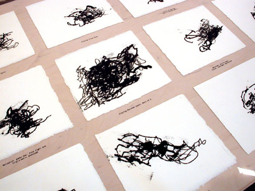
Jim Campbell Ambiguous Icon #5 (Running Falling) BEIGE ASCII hotdogs
Richard Devine Dynamix II
Jordan Crandall Matt & Mike Chapman
Inez Van Lamsweerde Me Kissing Vinoodh (Passionately) and/or Jon "Clone Tool" Haddock's Kent State/Vietnam backgrounds Laura Carton erased p0rn images
Jon Haddock Sims Tributes Creepy Clown
etc etc
JODI's current installation % MY DESKTOP at Eyebeam Atelier raises everyday machine disfunction to the level of the sublime. Occupying one long wall in Eyebeam's cavernous raw space, four standard computer screen desktops are projected side by side: two Windows on the left and two Apples on the right. The screens tower over the viewer at about ten feet in height. Invisible users appear to click the menus and desktop icons in real time, but what you see are actually recordings of these activities, presumably on DVD. To stand before the screens is to be immersed in an elegant chaos.
On the far left, a user attempts to move groups of icons to other positions on the same desktop. The new positions don't "take," but instead leave grey silhouettes, which gradually become cumulative, tangled masses of icon-shadows. In the middle left, the user methodically clicks unintelligible lists of wingdings, opening dialogue boxes full of more wingdings, and so on. In the middle right, sound files are randomly triggered, filling the space with a cacophony of clicks, martial arts grunts, and punching noises. And way over on the right, the letters underneath icons become long, conjoined strings of verbal gobbledegook, which are superimposed again and again.
There's nary a pigment stroke in sight, but the scale and handling of these pieces is very painterly, specifically Abstract Expressionist. JODI's process of cyber-vandalism--tinkering with browser software and then further abusing it through excessive, mindless icon-clicking--recalls strategies of "creative destruction" familiar from the work of the de Kooning generation (build up, wipe away, leave a residue, build up again...) It's also a cyber-critique, specifically playing on our legitimate fears that information-processing technology will break down when we're using it the hardest.
The messy visual record of "incorrect," panic-stricken choices is the kind of disobedient, Dionysian use of the computer sadly lacking in "BitStreams," the Whitney Museum's 2001 survey of computer art. If % My DESKTOP could have somehow been included in that exhibit, the focus and tone would have dramatically shifted from the utopian magic of thinking machines to their ad hoc, poorly-understood nature. With its size, ambition, and (refreshing) lack of reverence, it would have been a much stronger centerpiece than, say, ecosystm, John Klima's gee-whiz videogame salute to the raptor-eat-raptor world of global capital.
Last night (March 6) I attended PSYCH-OUT 2K3 at Anthology Film Archives, which was part of the New York Underground Film Festival. Here's the blurb from the organizers, followed by my notes:
BEIGE and Seth Price Collective present:
Cartoons & consumer electronics in the 70s and 80s were bigger and trashier than ever and they had freaked kids out to the point of a whole generation got A.D.D. so now they are older and freak every person else out using this same old throw-away trash shit culture mind warp reversal....MESSY. You're either with us or against us.... Never fess.
PSYCH-OUT 2K3 = one night only live performance freak out featuring live music/video by the Extreme Animalz / PAPER RAD crew, NAUTICAL ALMANAC, and LOVID
In between bands there are videos by Leif GOLDBERG and Matt BRINKMAN,
Forcefield (from the archives), Devin FLYNN, MUMBLEBOY, Ray Sweeten, Andy
PULS, Seth PRICE/Michael SMITH WEB INFANTILISM, Billy Grant and Joe Grillo,
US Military Games and anon. Commodore n64 video HACKERZ. MTV circa 1990,
... LAME.
That's LoVid in my underexposed photo at the top of the post, with Kyle Lapidus standing on the right wearing a video monitor cap and Tali Hinkis, also capped, disappearing into the murk on the left. They video-projected sizzling static patterns made in real time with a sound interface that disturbs the raster scan in the guts of the TV; these minimal-but-eye-assaulting patterns towered behind them on a fifteen foot screen. Nautical Almanac and Extreme Animalz also played live, with prerecorded video accompaniment. Extreme Animalz (logo above right) is an offshoot of PAPER RAD, out of Providence RI: to get a flavor of their visual presentation, check out the dense psychedelic jungle of blinking gifs on this home page (while you're there, be sure to look at the cartoons). Nautical Almanac's video was more performance based, with the two masked artists doing eccentric body art type things (e.g., trying to climb into a cabinet wearing a leg brace) inside a ruined building at night. Think Paul McCarthy meets the Blair Witch Project. Their music, which I described here, is intense, bleeding-edge noize that synched well with the frenetic video.
In between acts a variety of short vids rolled: a lot of high-speed, insanely pigmented hallucinations, as promised, heavy on recycled/mutated kid imagery: Ronald McDonald on acid, My Little Pony in slo-mo, and some butt-awful karaoke footage. Other highlights included video art legend Michael Smith in full-on diaper mode destroying a birthday cake and blowing on a noisemaker till he got bored, an Army training film defaced with an 8-bit "PSYCH-OUT 2K3" logo (right on), and Devin Flynn's manic vision of everything in the world competing with everything else. One video really stood out, enough that I want to describe it in a separate post: a ten minute work called Assassins Ride, by Forcefield, another Providence collective which has apparently broken up recently in the (disgusted?) wake of the Whitney/Artforum/NYTimes' drive to turn them into stars. In this eerie piece, three masked figures in overcoats stand around a trash barrel fire, unmoving, while an industrial/tech score pulses. The fire flares erratically, and every so often the screen fills with glowing green light, as if some weird energy is breaking through From Beyond. The mood is hypnotic and unsettling. More later, but above is a frame I snapped off my TV at home, after I picked up a copy of the tape.
[More (or rather, better) images from this event, taken by Aya Kanai, are here.]
Two works by Cory Arcangel:
Carnivore: "This project is a standalone home TV unit which connects via Ethernet to a packet sniffer and counts the number of times the phrase "boo yaa tribe" is passed through the network displaying the result on a television screen [note: the television is woodgrain!]. It is done in collaboration with RSG and made entirely out of discarded computers and salvation army bought equipment."
Landscape Study #4: "Essentially I decided to create a background for a game that doesn't exist about my home-town of Buffalo, New York. To accomplish this feat I took 360 degree landscape photographs of a neighborhood in Buffalo and scanned them into a computer. I then formatted them to fit the graphics format of the the Nintendo Entertainment System which because of its severe hardware limitations can only hold 8K of graphics. Once formatted for the Nintendo, I wrote a program that would scroll the graphics [remember Mario?] and my partner Paul Davis wrote a sound track. I then melted the computer chips off a Super Mario cartridge and replaced them with chips I manufactured." (This piece is currently on view at Bitforms gallery in NYC.)
Another Arcangel project (with others): A vinyl record called 8-bit Construction Set ("Atari vs. Commodore").
Interesting interview with Arcangel, Davis, and other artists on the Beige label expressing their "fat bits" and "post-data" philosophy of art/music, and dissing Oval's Markus Popp for using pre-programmed software.
Much of this material on Arcangel, et al, can be accessed through this page hosted by a major museum.
Scott Speh's review of the Whitney Biennial 2002 is right on, and not just because I'm listed as an also-ran. Yes, the big New York critics all trashed the show, but their reviews aren't helpful because none puts forth an agenda any better than the Whitney's. "Why no Elizabeth Murray instead of Vija Celmins?" asks the Times. Puh-lease. I get the feeling that those bad reviews are curator Larry Rinder's "Welcome to NY" hazing, and now he'll be with us for decades. A few years from now these same critics will be saying "Mr. Rinder got off to a rocky start with his first couple of shows, but he's shown great improvement, blah blah."
What Rinder attempts to do with the show is actually fairly interesting: a kind of Mondo 2000 vibe, emphasizing the high-tech on one hand and the primitive, handmade, and "tribal" on the other. Yet in order for a vision to leap wildly from mind to mind it must have what Robert Storr once called "the juice," and as every critic of the show noted, that's sadly lacking.
Speh has a somewhat different take: he believes there's been an upswing in good, new abstract art that the Whitney flat-out missed. I wish he had made more arguments for that position, but even the long list of people he supports shows more focus than the major media critiques of the show. Also, he's much better than Schjeldahl, et al, in conveying the boredom-bordering-on-disgust the show inspires. Those Detroit banners by Mike Kelley and Jim Shaw are awful, aren't they? Talk about forced zaniness. Two rich art stars reliving their art-garage-band youth, presenting clunky mural-style paintings of John Sinclair, MC5, Grand Funk Railroad, Sun Ra, etc...
And notably, in a show that so badly wants to be current, the boomer-centric time-line in the banners stops about 1982. When many people think of Detroit now, they think of techno pioneers Juan Atkins, Derrick May, Kevin Saunderson (and later, Carl Craig, Underground Resistance, Drexciya, DJ Assault...): all musicians who stayed in the city and created a scene--one that got worldwide attention. Whereas Shaw and Kelley bailed, made it big on the West Coast as artists, and now are getting all nostalgic. They love Motor City, but not enough to live there.
Nancy Burson was a digital imaging pioneer (art gallery variety) and her omission from the Whitney's BitStreams show last year was just one more example of that show's 30-something parochialism. That said, she kind of lost her way when she started taking photos of people with craniofacial deformities (can you say...exploitation?), and looking back at her classic work, it appears that the tech world has passed her by. Nowadays anyone with Photoshop can combine a man's face with a gibbon's (e.g., Will Self's Great Apes book cover from a few years ago), or give someone a bulbous forehead. And I always thought her "aging software" was a bit of a scam--taking what a police sketch artist does intuitively and dressing it up with pseudoscientific bells and whistles. Nevertheless, her morph of Reagan and Brezhnev (with a pinch of Thatcher, Mitterand, and Deng) is still a grabber. Also noteworthy is her Ordinaires CD cover, where the nine band members merge into a blandly smiling whole.
A website for her current retrospective is here, slow-loading Flash intro and all.
Jed Perl, art critic for the New Republic, is a scold in the old Hilton Kramer, "art's-going-down-the-toilet" mold, but reactionary criticism can be useful for focusing your thoughts. He gives "BitStreams" at the Whitney serious consideration, and then comes to the same conclusion that the NY Times and Village Voice did: so-called "computer art" hasn't arrived yet. Here's his pitch: "Art has for centuries now been more or less a realm unto itself, dominated by technologies which are distinctive precisely because they are throwbacks to a time when just about everything was handmade. The computer artist means to merge two distinctive modern sensibilities, two very different ways of thinking about creativity. Artistic thinking is cyclical. Scientific thinking is progressivist. The desire to bring technologies derived from the fast-forward world of science into the world of art is a perfectly understandable one, but it is a utopian desire, a desire to reunite what was long ago broken apart. Computer art remains a sort of pipe dream. It's the pipe dream of the moment." Perl is confusing artistic motivation with curatorial aspiration here: if you read the hype on "BitStreams," it's full of future-centric utopian claims (that's what my satirical 1969 news clipping makes fun of), but if you look at the art, you find that most of it is neither forward nor backward-looking, but focused intently on the present. My main problem with the show, in fact, is that it's too full of sound-bite-friendly, grad school-style critiques of "power relations" or "the media" (an eternal '80s nightmare from which we can't seem to wake up). Having said that, however, I don't think you can accuse the artists of using the computer just to be current. Most of them are doing so because it allows them to say things they couldn't say by more antiquated means. Worshipping the future may be problematic, but saying that art must always cycle back to the cave painting era is just as obnoxious.
Back up to the Whitney tonight for a panel on digital sound art. (I'm working on an article on "Bitstreams" and other recent digital shows, so a lot of the notes are going here). The panelists played excerpts from their work and/or performed, and then fielded questions.
Elliott Sharp used a small microphone attached by a cable to his laptop to make a pocket symphony of white noise/metal machine music. He held the mike in the air to pick up room sounds, twirled it like a lasso, dangled it over the keyboard, and hummed into it, but the sounds coming out of the speakers bore no resemblance to the sounds you'd expect to be produced from such activities. He constantly clicked buttons on the laptop, changing the texture of the sounds as he performed, from clicks to roars to feedback honks--all very downtown and "no wave" and enjoyable.
John Hudak presented "nature sounds as minimalist music": field recordings of crickets time-stretched into ambient washes. The lecture part of his segment was so timid and halting that I noticed the critic next to me writing "MINIMALIST SPEAKER" in her notebook.
The highlight of west coast artist Pamela Z's segment was a brief demonstration of the "body synth": a group of sensors attached to her arms that turned muscle flexion and extension (i.e. dance movements) into synthesized hiccups, trills, and Art of Noise-style vocal stabs. This could have been bad, but it was quite charming and unpredictable. Marina Rosenfeld played a live recording of her 17-woman band Sheer Frost, consisting of 12 guitar players (hitting the fretboards with nail polish bottles in accordance with a strict score of basic "moves") and 5 laptop players reinterpreting the performance in real time. This wasn't so good--it reminded me of Fred Frith's late-'70s experimental period when he was using a light bulb as a slide and refusing to do anything virtuosic.
Last, the inevitable DJ Spooky (with shaved head) treated the audience to a mad whirl of self-promotion (passing out stickers and LPs), name-dropping of French critics and American jazz musicians, and video-game style graphics from his laptop. The guy really talks the talk--"the net mirrors the street; as above, so below," "architecture is frozen music," and so forth--but does he walk the walk? I liked one loop where a brief flurry of typography on the screen was accompanied by steroid-enhanced Smith Corona sounds, but I was not convinced by his manifestation of "dub architecture": wireframe images of a 3-D graffiti tag writhing above glass-and-aluminum balconies. He brags about his club dates but he's really a creature of museums, wowing curators with drum-and-bass and hip-hop quotations. I would have enjoyed him more if he wasn't so pedantic: "Have you ever heard of [so-and-so]? You haven't ? Well, he invented the record sleeve!"
I made my debut at the Whitney Museum today. Well, in the sense that anyone could who attends the "Data Dynamics" portion of the "BitStreams" exhibition. Maciej Wisniewski's netomat (TM) wraps around three walls and projects large, floating, overlapping images (and text fragments) on a floor-to-ceiling scale. You sit down at a keyboard and type in a word or phrase, then netomat searches the web, pulls up words and pictures corresponding to what you typed, and blows them up to enormous size on the darkened gallery walls. This is real Exploratorium, Montreal Expo '70-type stuff, of limited artistic interest but fine for fifteen minutes of farting around. The brochure describes the software as "a new audio-visual language designed specifically to explore the unexplored internet," but that's just hype. Essentially netomat is a search engine, not that different from Google; instead of giving you a list of "hits" it goes directly to the sites and starts grabbing words and pictures. The program then enlarges the sampled content, colorizes it, layers it over other content, and causes the sampled snippets to creep inexorably around the walls. Also, there is another terminal nearby, so it's possible for you and another viewer to display two sets of information and have a slow-motion "image duel" (which sounds exciting, but it isn't really). When I came in, the walls were full of Jennifer Love Hewitt photos and various unrelated ad banners. I lamely typed in "Frankenstein" and about four minutes later, pictures of Boris Karloff and Gene Wilder began to surface (the program also found a really poorly-rendered boltneck that reminded me of a Jim Shaw drawing). The woman next to me didn't speak English well but quickly caught on, typing in "Wharhol." I suggested deleting the "h," and soon images of Andy appeared, superimposed over Boris. Opportunistically I typed in "'Tom Moody' +artist," hoping a choice pic might show up; instead I got the words "Op Art in the 90s by Tom Moody (originally published in VERY Magazine #3)" (which I recognized from the Abaton Book Company website), printed in purple and emblazoned across thirty feet of wall. Unfortunately the museum was closing up, so I didn't get a chance to use "katie holmes nude naked no clothes" (an actual search request from a site that logs such things) to test the kidproofing software.